Scribus Part 7 - Adding a little Flair!
by Meemaw
I’m sure that by now, your newsletter or brochure has everything it needs to be printed or e-published. However, if you haven’t added any extras to dress up your document a little, maybe some of these ideas will help make your document ‘pop.’ You don’t have to fill your pages with everything, but a few accents here and there will make things more interesting.Graphics
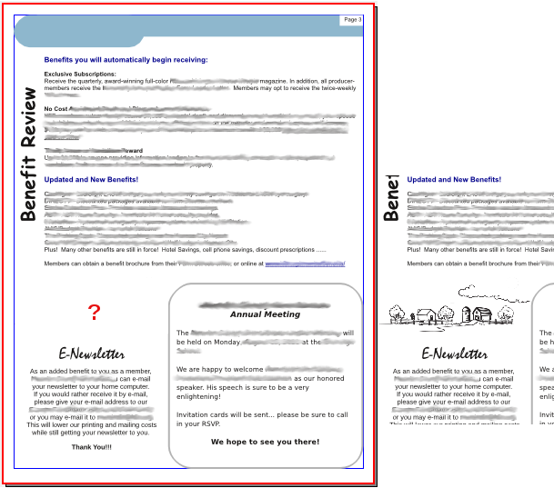
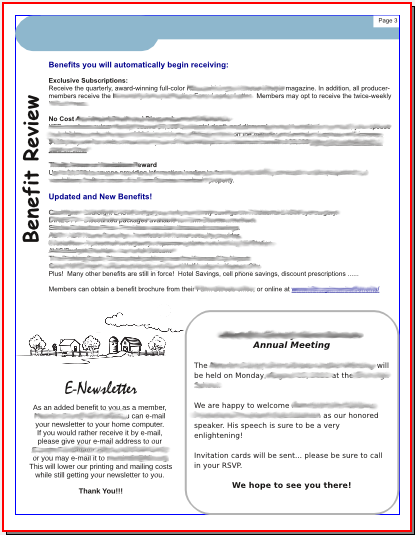
Many of your articles probably have photos, but what about that page with purely informational pieces that are graphics-free? Sometimes the page will have a spot or two that look bare, even though there are several articles. Sometimes you don’t want to start another article on that page, but prefer to start on a new page, and you have room left over. Magazines, even this one, have ads they can put in the open spaces, but in your newsletter, you may not sell ads, so you could find some graphics, clipart or even logos that will fill a small space and dress up your document.

However, take care not to fill up every single inch with text or graphics, or jam your articles so close together that they are un-readable. Leave a little ‘white space’ so as not to overwhelm your reader. White space is a design element, too.
Fonts
A font that is different from all the rest can draw the reader’s eye. If you have a notice or announcement you want everyone to read, you might put the title in a different font to draw the reader’s eye to that announcement. However, be careful, since the use of too many ‘different fonts’ can have the adverse effect of making your newsletter difficult to read. In this example, there are only two fonts that differ from the ‘regular’ title and body fonts. They are the two titles at left.

Also, if you are announcing an event you want people to attend, make sure the “Who, What, Where, When and Why” are in a prominent place so your readers won’t have to search for it. I actually read an announcement recently for a local meeting which did NOT include the date of the meeting! If the writer had put those items in a prominent place rather than the body of the notice, he probably would have seen that the date was missing. (Yes, he got loads of calls.) In the newsletter above, I just gave the date and location of the Annual Meeting. Another thing I use Scribus for is the invitation postcards, which have a section where the date, place and time are clearly listed. Another use is an advertising flyer or brochure, where the facts should be more clearly stated.
Borders
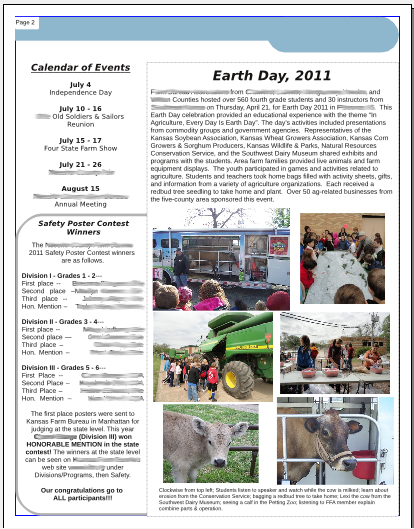
Borders can draw the reader’s eye as well. You can put a border around an article on a page that you want to emphasize. Some of my newsletter pages have two articles with borders, but the more important one is usually surrounded by the darker or thicker border. In the example, the contest winners are the information that I wanted to be emphasized, so that article has the thicker border.

Borders can be any design from a very thin line to starbursts or thick polygons. If you want some information to stand out, use the starburst or a thick polygon, keeping in mind not to overwhelm your information with the border design.
Color
If you are doing a newsletter or brochure you may want your company logo on it. Make an effort to choose the other colors you use so they don’t clash with the colors of the logo. That way your finished document will look unified. If your main logo has very bright colors, the choice of complementary colors is especially important.
Choose your photos so they are bright enough to be easily viewed whether the document is viewed on a computer or printed and mailed. I have some members that want theirs sent by email and, for the rest of the members, it is printed in black ink on colored paper and mailed. The photos have to be bright and clear enough to be seen either way.
Next month we’ll examine a few more items you need to complete your project.