From Sproggy's Video, "Glass Panel Tutorial"
Transcribed by Meemaw
Hello, my name is Kori, pet name is Sproggy. This is a tutorial for Inkscape, my favorite application for artwork. The version I used for the tutorial was 0.46. Let's just give it a check. [You can check yours by clicking Help > About Inkscape].
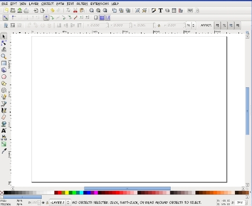
This is my drawing template I created — [Inkscape opens up a new document when it starts — go to File > Document Properties] Set custom size 1600 pixels width and 1200 pixels height — make sure there is a check in the box before "Show Page Border" — save as DrawingTemplate.svg, and you can just open it up when you want to start a basic project.

Inkscape Main Toolbars
To start a glass panel wallpaper, draw a rectangle in the center of the page. Up above, change the width to 1600 and height to 1200 [above your drawing is a tool bar with numbers you can edit — X and Y settings show where on the page your object is measuring from the bottom left corner of the page. W and H settings are the width and height of your object, so you don't have to strain with the mouse to get something a certain size — you can put in the size manually.] Change W to 1600 and H to 1200. Then we're going to change the position, so click on the toolbar button for "Align and Distribute" and center the rectangle on the page.

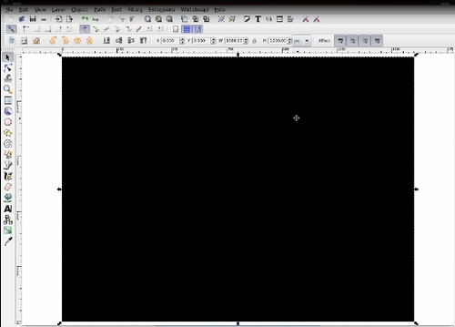

Edit Object
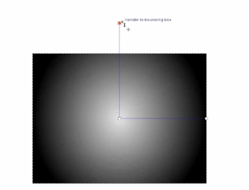
I know this may be a bit silly, but I always add a base background to what I create so should there be any transparency I can see if there are any errors with it. I'm actually going to use this object for my background but I'm going to click on "Edit Object" and change a few settings on this rectangle area. [In Stroke Paint he chose none by clicking on the X.] In Fill, I'm going to choose a radial gradient using these boxes. As you can se, it automatically puts a gradient here, but that's not the gradient I want for this image. I'm going to duplicate it and then I'm going to edit it. [Click Duplicate, then click Edit….] This is how the gradient looks now, dark to light from center to outside. We're going to reverse that. Click on the stops [you should get a dropbox with 2 stops.] Choose the second stop — go to the bar at the bottom and move the slides over to the right so the stop is completely black. Then choose the first stop and change the number to the right of the slides to 25. [Now your gradient should have the gray oval shape in the center and be dark at the outside.]
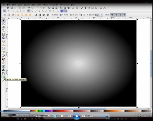
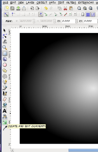
Over here is the "Create and Edit Gradients" tool. [towards the bottom of the left side of your page] I'm going to slightly zoom out… Click on that and you'll see lines inside your gradient. Hold down CTRL and click on one of the endpoints and slide it away from the center to make the lighter part of the gradient larger. Do the same with the other endpoint as well. [Save your work.]
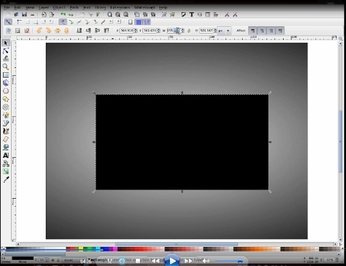
Click on draw rectangle again and draw another. This one will be 1000 x 500. Once again I'm going to align this to the center of the page. I'm going to duplicate this rectangle by clicking on it, holding down CTRL and pressing D. Then I'm going to click on the white [the color swatches at the bottom] to change the color of the top rectangle. Now I'm going to make the white rectangle lie behind the black one, so up here we have four little buttons that we can click to position the layers. I'm going to click the "lower one level" button to move the white rectangle behind the black.
Now I'm going to make the white rectangle a little larger than the black one. Click on Path > Dynamic Offset, then grab the top left corner [there should be a 'grabber' there] and pull out to about there [gives it a kind of wide border.] Then I'm going to duplicate it [CTRL + D] Go back and click 'Select' [arrow at top left] because I'm going to drop it down as well. Then change it to black. [It should be behind the white rectangle.] Click on Path > Dynamic Offset again, but when you grab it, just pull it out enough so that it looks like a black line border. Click on Select again and go to Edit Object again. When you see the fill, click that off [click on the X for none] because I don't want fill on this object. You'll see it disappears.
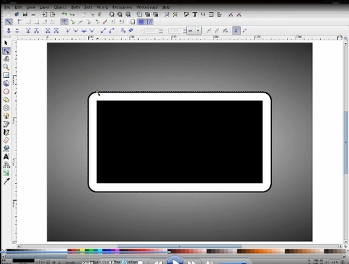
Now I want Stroke Paint and choose to have it as a flat color [black] — then I need to click on Stroke Style and change the width of that to 5 [highlight the 1.000 in width and type in 5] — Now the width of the line alone is not too exciting, but if I put in a blur of 2.5, that slightly changes the image and it looks like you now have a complete drop shadow around the white border. [Save your work.]
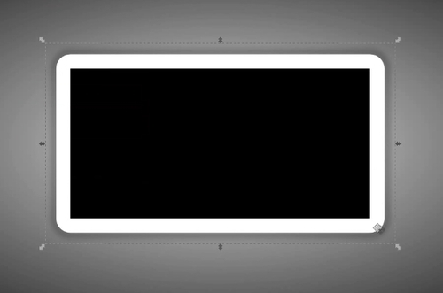
Now that we've gotten that far we're going to click back into the center rectangle again. We're going to click on Edit Object, change the fill to none, the Stroke Paint to white and check that the Stroke Style width is 1.000. Now we have a white rectangle and a smaller rectangle with a white border. Now click on the white rectangle. We need to add a gradient to this to make it "glassified" — we don't want a stroke on it but we do want a fill. Choose the linear gradient and click on that. I don't want the default one that shows up first, so I'm going to duplicate it, then edit it. As in the first we see there are two stops here, so we're going to add five more stops to it [click Add Stop five times.]
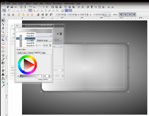
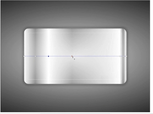
We should now have seven. We're going to go in and adjust the values for these stops. We'll change the second one to 25, and so our two gradient values will be 25 [light gray] and 255 [white]. The third one will be 255 and the fourth will be 25 and so on. As you can see, it doesn't look quite like glass yet, so what I'm going to do is click on Create and Edit Gradients [there will be a line across your rectangle with a 'handle/grabber' at each stop.] Drag the grabbers — slide them and even them out across the rectangle to give it a slightly better, glassier look. Try to even them out as much as possible. [Save your work.]
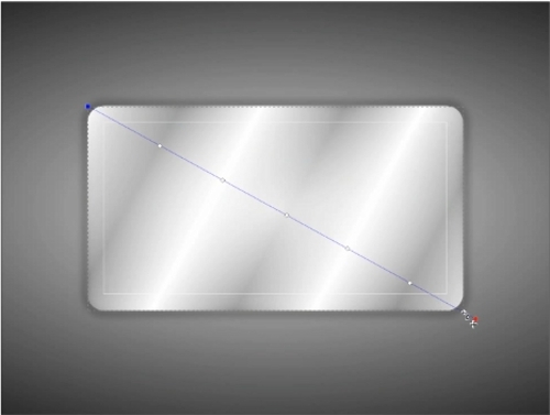
Now I'm going to take the end grabbers and move them diagonally from corner to corner. We're starting to get a glassy fill but it's still too heavy on the color, so we're going to select the object and edit the fill, changing it to 25%.
We are nearly there. As with the white line, we're going to put a line around the edge, so duplicate the white rectangle. You'll notice it looks slightly different, but in this case, I'm going to select it and remove the fill, then set the stroke at 1 and leave the opacity at 25%. [Save your work.]There you have the glass panel. You can't really appreciate its full clarity or transparency here, but I have one I made earlier, so I'm going to minimize Inkscape and the one I made earlier is on my desktop. It has my favorite Linux distribution's name emblazoned across it. As you can see, it's very effective.

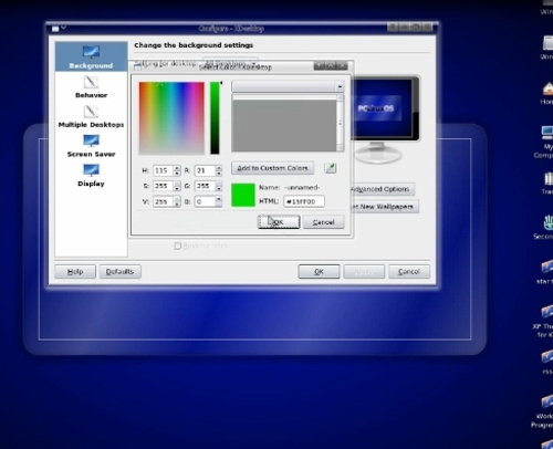
With it being transparent when you export it as a png, you can set it as your desktop background with no color, then all you need to do is adjust the background color to the one you want. [Started red, then changed to blue, then to green.] See? No need to change the image, just change the background color.