Using Scribus, Part 3: Text, Text, Text!
by Meemaw
In the second part of our Scribus series, we did a basic header, and got started putting news stories into our newsletter. Since it is a newsletter, we should have lots of text frames that contain our stories. A few extra bits of knowledge will help make our newsletter easier to assemble, and hopefully, easier to read.
Title Shadow
When you created your heading 'Newsletter' or 'Club Newsletter' or whatever you chose, I'm sure you found the button in the text configuration that would automatically put a drop-shadow on your text. The line of buttons in Color & Effects has Underline, Subscript & Superscript and several others, even Reverse. The next to last button toward the right is DropShadow. However, we have found that some of the pdf readers (kpdf for sure) have problems loading and printing pdf's with the shadow made in this manner. Some computer lock-ups have even occurred. So, instead of just clicking the 'Drop Shadow' button, we do ours a little differently for The PCLinuxOS Magazine. It might take a few more seconds, but it is just as easy, and it doesn't tend to cause our readers' computers to lock up.
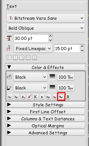
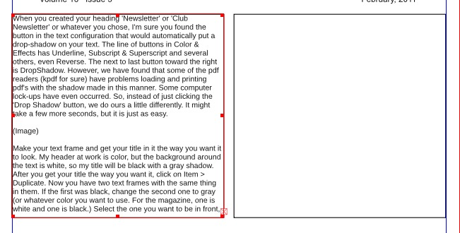
Make your text frame and get your title in it the way you want it to look. My header at work is color, but the background around the text is white, so my title will be black with a gray shadow. After you get your title the way you want it, click on Item > Duplicate. Now you have two text frames with the same thing in them. If the first was black, change the second one to gray (or whatever color you want to use. For the magazine, one is white and one is black.). Select the one you want to be in front, and in Properties, click on the up arrow with the line across the top of it (bring to top). Note what the X-pos and Y-pos of your text is, then choose the other text frame. Your drop shadow can be in any position and as close or as far away as you wish, just by manipulating the X-pos and Y-pos of the other text.
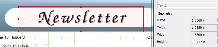
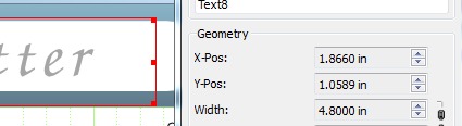
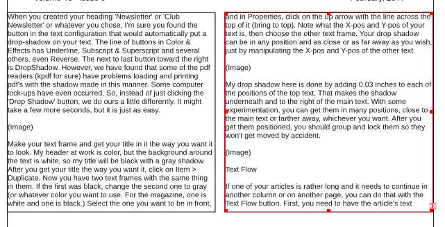
My drop shadow here is done by adding 0.03 inches to the X-pos and 0.02 inches to the Y-pos of the top text. That makes the shadow underneath and to the right of the main text. With some experimentation, you can get them in many positions, close to the main text or farther away, whichever you want. After you get them positioned, you should group and lock them so they won't get moved by accident. (You could actually move these off the page and get them positioned there if you wish. After they are grouped together, you can move them back onto your page and position them properly in the header, then lock them to the page.) Save your work.
Text Flow
If one of your articles is rather long and it needs to continue in another column or on another page, you can do that with the Text Flow button.
First, you need to have the article's text frames already in place. (In the illustrations, the text frames have borders around them for visibility.) In my newsletter I generally have two columns. Choose the first text frame, then open the story editor screen and put in your text. When you click the ok button (checkmark) your story editor will close and you will see your text in the frame. Since you have too much text for that one frame, you will see a box with a red X in the bottom right corner of your frame.
Click on the Text Flow button (hovering your mouse over it will show 'Link Text Frames'), then click the text frame where you want the rest of your text. You should immediately see your text in that frame.
You can flow it to yet another frame, or resize the two frames you are using, whichever works best for your document. Just remember to click the frame you are going from, then the Text Flow button, then the frame you are going to.
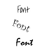
Fonts
While we are talking about text, it might be a good idea to mention that, although you want to 'dress up' your newsletter, you probably shouldn't make it too 'busy'. What I mean is that there are thousands of fonts you can use, some plain and some fancy, but it's a better idea if you stick to two or three readable fonts for most everything, and only use one or two 'offbeat' fonts to draw attention in a certain spot in your newsletter. That way you preserve the flow of the newsletter while giving it an added spark here and there. In my work newsletter, I have used a couple of different fonts for article titles, but left the standard font for the body of each article so it's easy to read. The title font draws the reader's eye, and then they read that article easily. Using a different font for each article may sound good, but it would distract the reader too much, so it is probably best not to do it. After all, that's why you are doing a newsletter; so people will read it.
Next month, we'll talk about layers.