WindowMaker On PCLinuxOS: WindowMaker
Themes
by Patrick G Horneker (phorneker)
This is the WindowMaker article we have all been waiting patiently for: How to create and use themes. First, themes for WindowMaker will work on any operating system that can run WindowMaker.
(Historical Note: The Linux distribution that was supplied by Sony for its PlayStation 2 back in the late 1990s used WindowMaker for its default desktop.)
Where to Place Themes
The first thing we need to know about themes is where WindowMaker expects to find them on your system.
For PCLinuxOS, themes that are accessible to all users on your machine are stored at:
/usr/share/WindowMaker/Themes
Each user on your system can install themes for his/her own use in the following directory:
~/GNUstep/Library/WindowMaker/Themes
In an earlier article, I showed you where you can download themes from the Internet. In this article, I will show you how to create your own themes. When you download themes from the Internet, you download a .tar.gz file containing an archive of the theme to be installed.
About The Theme Archive (.tar.gz file)
The ~/GNUstep/Library/WindowMaker/Themes directory can be populated with theme archives. You can leave them as it is (in compressed form), or you can unpack the archives (using tar -zxvf <theme archive>.tar.gz). WindowMaker can work with these files either way.
We could leave the theme archives in compressed form to save disk space, but WindowMaker would have to decompress the file every time we change the theme. On newer laptops and desktops (with 2GB or more of memory), this should not really be a concern. However, if you have an older PC (about Pentium IV or earlier) with 512MB or less, there will be some delay due to the overhead needed to decompress the theme archives.
Uncompressing the theme archives allows us to modify the contents of the theme.
So how do we start a new theme?
First, create a new directory in your userspace. Be sure to append .themed to the end of your directory name so WindowMaker will know that this directory contains the contents of a theme. For example: If you call your theme MyCoolTheme, then you would create a directory named MyCoolTheme.themed somewhere in your userspace.
Tip: Create an empty directory in your userspace where you can build new themes. Then when you are ready to deploy your themes on your system, simply copy the contents of that directory to ~/GNUstep/Library/WindowMaker/Themes to make your new themes available for use with WindowMaker.
Tip: Do not use ~/GNUstep/Library/WindowMaker/Themes to create new themes. First, anything that goes into that directory is immediately available to WindowMaker. Second, if you compress the .themed directory to an archive (i.e. a .tar.gz file), your theme will be listed twice when you go to select a theme (one entry for the .themed directory, and one for the archive file).
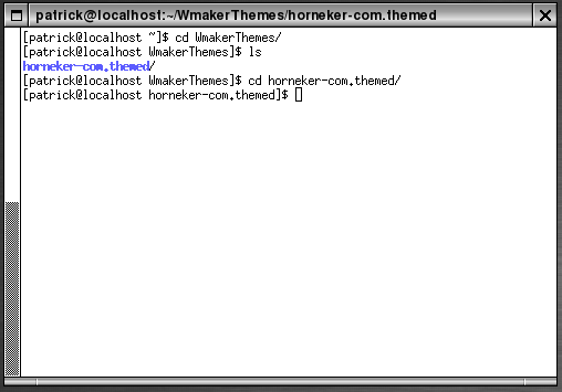
If you have a graphical file manager installed, you may use it to create an empty directory to store your created themes. However, I recommend using a command line on a terminal such as xterm, konsole, or gnome-terminal because of some of the commands we will be using when we create WindowMaker themes.
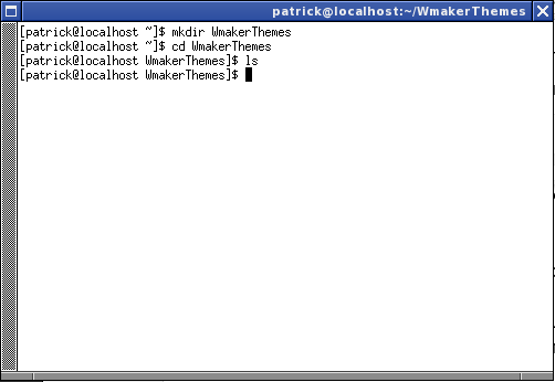
In this example, I used xterm to create an empty directory (called WmakerThemes) for creating WindowMaker themes.
Tip: Creating an empty directory allows you to package themes for distribution (as .tar.gz files) without disturbing WindowMaker itself. Themes created here can be used on any computer running WindowMaker, whether the underlying operating system is PCLinuxOS, OpenSuSE, Slackware, FreeBSD, or other any other UNIX dialect.
What Makes Up A Theme?
A WindowMaker theme consists of:
- A directory with the name of the theme followed by the .themed for the required extension.
- A file called style, containing data that describes how WindowMaker’s window elements are displayed. This is required in every theme, and the file must be named style for the theme to work with WindowMaker.
- Graphics that are to be used by WindowMaker. These graphics are loaded according to the contents of style, and must be in the same directory as style.
- Optional: Text files that describe the contents of the theme, copyright and licensing information, contact information, etc. These files are for documentation purposes only, and are recommended so others who want to know more about the theme can do so.
In this example, we are in the WmakerThemes directory. To create a new theme, we shall create a new directory within WmakerThemes. You can name this anything you like. Just be sure to append .themed to the name when you create the directory so WindowMaker will recognize the theme.
As we have seen when working with WindowMaker Configuration Manager and Wprefs.app, most every element that goes into a WindowMaker window is very configurable. For instance, the title bar can be a solid color, or it can be a part of a photograph, or it can be a gradient. A theme can be as creative or as plain as you want it to be.
An Example Theme
Let us say that we want to create a theme to match my website. Then, we shall call this theme horneker-com. With the terminal window open and the current working directory being ~/WmakerThemes that we created previously, we create a new directory, then change to that directory by typing the following:.
mkdir horneker-com.themed
chdir horneker-com.themed
Now we are ready to design our new theme.
Note: You can minimize the terminal window to minimize distraction when creating our theme, but the terminal will be available when we need it later.
I could have named this horneker.com.themed, but I have never seen a theme with multiple dots in its name at any website that hosts WindowMaker themes.
We have two tools at our disposal to begin the design: The Configuration Manager, and the Preferences Applet (WPrefs.app). The latter is accessed by double clicking on the GNUstep Icon on the upper right hand corner of the screen (where the Dock resides).
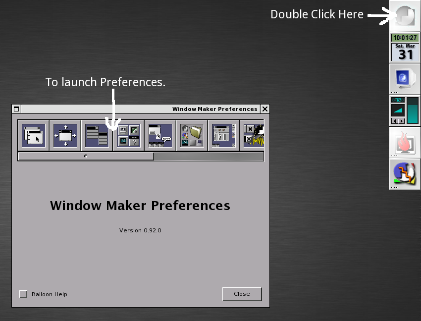
With the Preferences open, slide the scroll bar to the right where the tools we need will show in the window. The second and third buttons to the right of the toolbar give us what we need, namely colors and fonts. This is where we go to start the design.
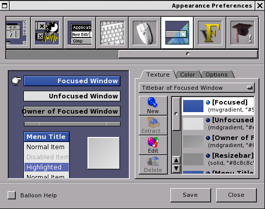
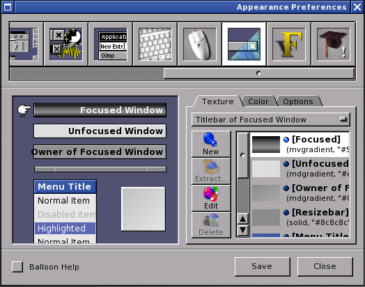
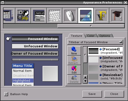
Here we have selected Appearance Preferences. What we see is a visual tool where we can select desktop elements to modify. The box on the left allows you to con the desktop element you want to work on. As we are editing these elements, changes appear in this window so we can see what we are doing.
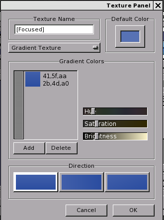
Here, we have the Focused Window titlebar selected as the element we are working on. The right side box contains a visual tool made up of popup menus, tabs and buttons. To edit this element, click on Edit in the right box.
Here, we can get into further detail. In this example, we have a vertical gradient of two colors, with each color represented as values of red, green and blue.
Selecting the left direction button changes the gradient to a vertical gradient. The middle direction button selects a horizontal gradient. The right direction button selects a diagonal gradient.
Default Color allows you to select a base color of which you can use in your theme design for each element.
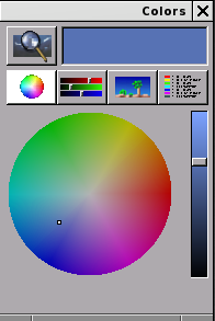
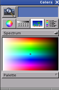
Clicking on Default Color opens a color palette window. Here, we get a color wheel from which to directly select a color.
The slider on the right side adjusts the brightness of the currently selected color. Notice that as you use the slider, the selection is modified to reflect the change you make.
The magnifier on the upper left hand corner allows you to pick a color from the desktop using a “magnifying glass”. You see a closer view of the desktop where the mouse pointer is located. Clicking at this point will select the color of the pixel where the mouse pointer is currently located.
The currently selected color is displayed on the color swatch to the right of the “magnifying glass”.
You can also select colors using sliders. Below the swatch and magnifying glass are four buttons. The first button selects the color wheel.
The second button selects sliders you can use to select your colors.
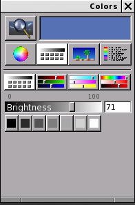
There are four sliders for this tool. The first (displayed here) allows you to select the brightness of the color (as a percentage of white on the greyscale).
The second slider allows you to select red, green and blue values for color. The RGB model refers to basic components of color for displays and photographic transparencies.
The third slider allows you to select cyan, magenta, blue and key (black) values for color. The CYMK color model refers to the basic color components used in printing. (This is also why the colors used in your inkjet printer are cyan, magenta, yellow and black, and not red, green and blue.)
The fourth slider allows you to select color in terms of hue, saturation and brightness.
The third button displays the spectrum of colors instead of a color wheel. There is only one palette to choose from, and only one spectrum to choose from at the moment.
To this date, I have not seen any installable palettes for this tool.
The fourth button is used to store names of colors often used.
For purposes of this article, we shall not worry about this feature, as there has hardly been any recent development on this tool.
Changes you make here immediately take effect. To exit, simply close the window by clicking on the X in the upper hand corner of the window.
There is a popup menu where you can select the type of texture you want to use for the desktop element. Currently, Gradient Texture is selected. You can select from the following:
Solid Color: Here. you can only select the color to use.
Simple Gradient Texture: Here, you select two colors, namely the color where you start the gradient, and the color where the gradient ends. You can also select the direction the gradient is displayed, namely vertical, horizontal or diagonal.
Gradient Texture: Similar to Simple Gradient Texture, the difference being that you can select which colors are to be included in the mix, and which order the colors are to be displayed. This is the default setting when you open Appearance Preferences.
Textured Gradient: Similar to Simple Gradient Texture, the difference here being that the simple gradient is overlayed on top of an image that you supply as a parameter. This image must be in XPM, XBM, JPEG, PNG, or GIF format. You also get the option of whether to tile the image, center the image, rescale the image to fit (with cropping possible), or maximize the image to fit the element. You can also select how much of the gradient you want to show on top of the image (the opacity option).
Image Texture: Here, you supply an image in the XPM, XBM, JPEG, PNG or GIF format. The image can be tiled, centered, rescaled (with empty space possible), or maximized to fit the space. Any space unused is filled with the color option, that you select similar to the other options.
With all of these options available, only your creativity can limit what you can do with a WindowMaker theme.
Back to our example theme. The graphics on my website are primarily greyscale images. This is part of my preference in website design, and greyscale works with most any device that can display web pages, including some e-Readers such as the 6-inch Pandigital Novel (which can only display in greyscale).
Notice that each element is configured separately. There are seven desktop elements available, namely:
Focused Title Bar: This is displayed for the window that is currently interacting with the keyboard and mouse.
Unfocused Title Bar: This is displayed for other windows on the current desktop, except for the parent of the window that has the keyboard and mouse focus.
Owner of Focused Title Bar: This is displayed for the window that has control of the window that currently interacts with the keyboard and mouse.
Resize Bar: Appearing at the bottom of windows, this element allows you to resize windows on your desktop (where possible).
Menu Title Bar: This is the background for the header of menus that are displayed by WindowMaker.
Menu Item: This is where the background for menu items is displayed.
The color and options tabs provide more configuration options, including color of text items, and text alignment.
For this theme, I want to use greyscale elements. Let us start with the title bars. I would like to do greyscale gradients with the title bars and with the resize bar. Since the current element being edited is the Focused Window, we shall start with that. For this process, we shall click the Edit button to work on the Focused Window.
For the title bars, I want to create gradients that have a glossy look. What I am editing now are the title bars for windows that interact with the keyboard and mouse.
The colors shown here are from the default theme for PCLinuxOS. We shall use the Gradient Texture option rather than the Simple Gradient Texture option as we will be expanding on the list of colors shown here.
First, let us edit the basic colors shown here. To edit a color, simply select a color on the list and use the slider in the same window.
Tip: To achieve the greyscale effect on colors used here, set the Saturation level to zero (0), i.e. remove any intensity of the color hue. When this is done, the value of hue can be anything you want. For greyscale values, the hue value is irrelevant.
For most everything in WindowMaker, colors are represented as rr,gg,bb where rr, gg and bb contain red, green and blue values (respectively) in hexadecimal format ranging from 00 to FF.
Mathematical Note: For those of you who are not familiar with hexadecimal numbers, here is an explanation for what hexadecimal is. The decimal numbers is a base 10 system, that is there are ten numbers possible for a digit whose range is from 0 through 9. Hexadecimal numbers have sixteen possible values for a digit. We have all the digits of a base 10 number, i.e. zero through nine. To represent values of 10 through 15, the letters A through F are conventionally used.
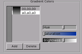
Here, I set the saturation to zero (0) to obtain the greyscale values (of which there are 255).
So far, I have edited the current values so the gradient starts at (00,00,00) and ending at (a0,a0,a0). For those of you who are familiar with CSS stylesheets in website development, (00,00,00) equates to #000000 and (a0,a0,a0) equates to #a0a0a0.
We can add (and delete) colors to this list to adjust the final gradient to what we want. Feel free to experiment with color choices here. When you have what you want for the gradient, click on OK to commit the changes.
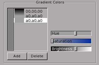
To add a color, highlight the line where you want to insert the new color. Click on Add. A copy of the highlighted line is made and inserted above where you highlighted (as shown here).
Add as many lines as you want, then edit each line so you can build your gradient the way you want it.
In my example, I added two lines and edited the list so it reflects the following:
00,00,00
60,60,60
90,90,90
20,20,20
...and here is the result of this list.
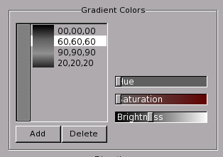
As we build this list, we can immediately see how the finished gradient will look.
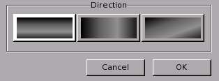
Next, we need to choose the direction the gradient will be displayed.
Clearly, we can see which variant can best be displayed on a title bar.
Since this has already been selected when this dialog box was opened, we can click on OK to commit the changes.
As we can see, the change to the theme we are building is immediate. However, the change does not take effect in the WindowMaker session until we click on Save.
After clicking on Save, we can see the changes to the current WindowMaker session are immediate. We can do the same with the other elements of the desktop.
For the Owner of Focused Window, I used the following gradient:
40,40,40
60,60,60
90,90,90
40,40,40
For the Unfocused Window, I used the following gradient:
80,80,80
a0,a0,a0
e0,e0,e0
80,80,80
All title bars display their gradients horizontally.
For the Resize Bar, I use the following gradient:
10,10,10
90,90,90
e0,e0,e0
b0,b0,b0
00,00,00
This gradient, when displayed horizontally, produces a 3D effect for the resize bar.
For the menus, I used the following gradient for the title bar:
00,00,00
40,40,40
a0,a0,a0
The gradient here was displayed horizontally.
For the menu itself, I used the following gradient:
00,00,00
00,00,00
40,40,40
a0,a0,a0
With the color tab, I made the following settings:
Menu item text: ff,ff,ff
Disabled item text: a0,a0,a0
Highlight Text: 40,40,40
The options tab provides three settings for how the menus are displayed:
- Item dividers displayed, with the gradient displayed inside each item.
- Item dividers displayed, with the gradient spanning the entire menu.
- No item dividers displayed, the gradient spans the entire menu.
In addition, items can be aligned to the left, centered, or right justified. For this example, menus have no item dividers displayed, and the gradient spans the entire menu.
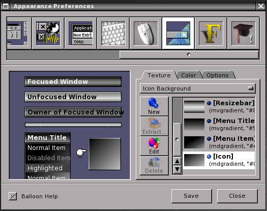
Finally, I created the following gradient for the Icon background:
00,00,00
60,60,60
c0,c0,c0
and made the gradient diagonal, which is best for a 64x64 tile.
Here is the result of the changes to the desktop elements after going through this example.
Customize the Fonts
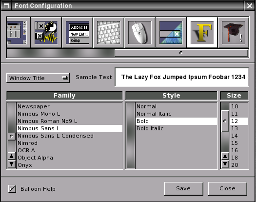
WindowMaker allows you to change the fonts displayed. Sans-serif is the default font used with WindowMaker as it is available with most any Linux distribution, as well as FreeBSD, NetBSD, OpenBSD, or any other operating system that can run WindowMaker as a desktop.
Here, I have used Nimbus Sans as it is a clean and attractive font that comes standard with PCLinuxOS, Ubuntu, Fedora, OpenSuSE and many other Linux distributions.
Fonts can be changed for the following:
- Window Titles
- Menu Title Bar
- Menu Text
- Icon Titles
- Title on the Clip
- Desktop Caption (that appears on the center of the screen when desktops are switched)
Once we have the theme configured so far, we can close out the Preferences tool.
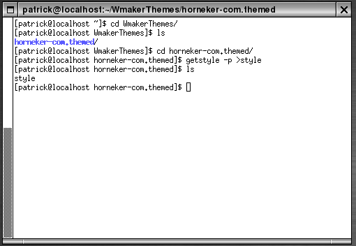
Create the Style File
Earlier, we opened a terminal window to create the directory to store the theme. We are going to need that terminal to create a file called style. This is a required file for every theme so WindowMaker can properly use the file.
Creating the file requires a command line interface. First, open a terminal window and change to the directory where the theme is stored.
Next, type the following:
getstyle -p >style
Type ls to verify the style file has been created. The -p creates a compressed version of the style file. Normally, this is done to save space. Your terminal window should look something like the following:
At this point, we have created a basic theme. To package this for distribution, type the following:
chdir ..
tar -cv horneker-com.themed/ >horneker-com.tar
gzip horneker-com.tar
We have just created a theme that can be used with any machine running WindowMaker. Type ls to verify this.
About the Style File
Typing getstyle (without any parameters) in the terminal window will display the following with the newly created theme:
{
LargeDisplayFont = "Nimbus Sans L:slant=0:weight=80:width=100:pixelsize=72";
HighlightColor = "#404040";
MenuTextExtendSpace = "-1";
FTitleColor = "#eeeeee";
MenuTitleExtendSpace = "-1";
MenuTextFont = "Nimbus Sans L:slant=0:weight=80:width=100:pixelsize=12";
UTitleBack = (mvgradient, "#e9eae9", "#808080", "#a0a0a0", "#e0e0e0", "#808080");
IconTitleFont = "Nimbus Sans L:slant=0:weight=80:width=100:pixelsize=10";
PTitleBack = (mvgradient, "#000000", "#404040", "#606060", "#909090", "#404040");
WindowTitleFont = "Nimbus Sans L:slant=0:weight=200:width=100:pixelsize=12";
UTitleColor = "#000000";
MenuDisabledColor = "#a0a0a0";
ClipTitleFont = "Nimbus Sans L:slant=0:weight=200:width=100:pixelsize=10";
MenuStyle = flat;
MenuTextBack = (mdgradient, "#e6e7e6", "#000000", "#000000", "#404040", "#a0a0a0");
PTitleColor = "#000000";
IconBack = (mdgradient, "#0000ff", "#000000", "#606060", "#c0c0c0");
MenuTitleBack = (mvgradient, "#5772b4", "#000000", "#404040", "#a0a0a0");
DisplayFont = "sans:pixelsize=10";
FTitleBack = (mvgradient, "#000000", "#000000", "#606060", "#909090", "#202020");
WindowTitleExtendSpace = "-1";
TitleJustify = left;
CClipTitleColor = "#a4a4a4";
ResizebarBack = (
mvgradient,
"#8c8c8c",
"#101010",
"#909090",
"#e0e0e0",
"#b0b0b0",
"#000000"
);
MenuTextColor = "#ffffff";
ClipTitleColor = "#000000";
IconTitleBack = "#2b4da0";
HighlightTextColor = "#ffffff";
IconTitleColor = "#ffffff";
MenuTitleFont = "Nimbus Sans L:slant=0:weight=200:width=100:pixelsize=12";
MenuTitleColor = "#eeeeee";
}
Colors here are represented as hexadecimal values formatted the same as hexadecimal values supplied on a CSS stylesheet, except the values are enclosed in double quotes.
Font names are enclosed in quotes and contain the following parameters:
- Font name
- Font style. slant=0 means the font is of normal type. slant=1 means the font is italicized.
- Font weight. This determines the thickness of the font being used.
- Font width. A value of 100 means normal width. Smaller values mean compressed type (in terms of the space occupied by the text). Larger values mean wider type.
- Pixel size refers to the size of the font in terms of the height of the typeface. Usually, this refers to the point type (72 points to the inch).
For the attributes containing ExtendSpace in its name, these are boolean values, i.e. the only valid values are TRUE and FALSE. A value of -1 represents a TRUE value. A value of 0 represents FALSE (as one would expect).
Programmer’s Note: Whether we are working with a 32-bit processor or a 64-bit processor, a value of -1 is represented in binary as a string of 1s. For example, a 32-bit representation of -1 is read as 11111111111111111111111111111111. Adding one to this value resets all bits to zero.
Gradients are represented as lists with the first parameter being one of the following:
- mvgradient: vertical gradient
- mdgradient: diagonal gradient
- mhgradient: horizontal gradient
WindowMaker reads and processes gradients as lists. This list is used to render the gradient for the graphical elements.
Overall, this file looks like a piece of CSS code from a stylesheet. This is because much of the software the drives projects like WindowMaker, as well as standards of the Internet have their roots in the C programming language, and UNIX in general.
Also, the first web browser (Mosaic) was initially developed on a NeXT system, which ran NeXTStep (using a Mach kernel), which was an inspiration for WindowMaker itself, with a difference being that NeXTStep (as well as successors Mac OS-X and iOS) and GNUStep were developed with Objective C, whereas WindowMaker was developed in C.