KompoZer, Part 2: Let's Get Started
by Paul Arnote (parnote)
Last month, we took a “get acquainted” look at KompoZer. Now that we have the “tool,” it’s time to set up some kind of blueprint for our web site. In the same manner that you wouldn’t expect a builder to build you a house without a set of blueprints, you also shouldn’t expect to build your home on the web without a blueprint. Planning is key to a functional and well organized web site.
Before you start gathering your text and graphics, you need to have an idea of how you want to present your home on the web. Nothing has to be “set in stone,” but you should at least have a vision of what you want things to look like when you’re through. Often, your “plans” will have to be flexible and you may find yourself changing some details of your plan as you progress through the site planning and site preparation stages. Sometimes, you may find yourself scrapping your initial plan and replacing it with a different one.
I know I said in the first KompoZer article (June 2012 issue) that we’d start learning to create our first web page—and we will, later on in this article. However, there’s a lot more to creating a website than just throwing a bunch of text and graphics together. If you just throw some text and graphics together, you will likely cause yourself more work in the long run. You will find yourself having to redo things you’ve already done if you proceed without some semblance of a plan. Plus, your website will likely look as if you just threw some text and graphics together. The planning stage is much too important to skip over.
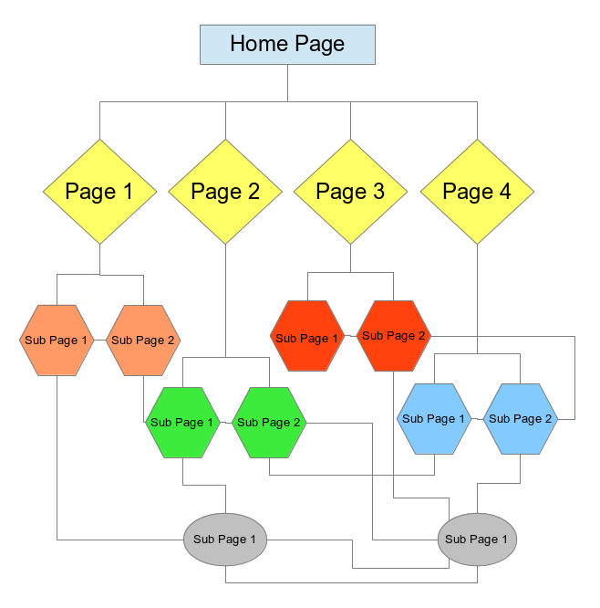
One good way to plan out your website is to make a representation of the site structure (site map) with a diagram or flowchart. Similarly, you could use Post-It Notes plastered on a wall, with each Post-It Note representing one link. You could get fancy and represent links to external sites with one color of Post-It Notes and represent internal links to pages on your site with a different color of Post-It Note. Below is one example of a possible web site.
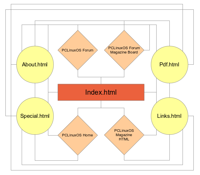
Here’s another example, using the website for The PCLinuxOS Magazine as an example (a couple of pages/links were omitted to help improve clarity).
As you can see, things can get fairly complex very quickly. You have to think out and plan the navigation for your site. It’s best to do this from the perspective of a typical user. Try to anticipate how a user might want to navigate your website.
With the magazine website, I’ve made every attempt to prevent a visitor to the site from heading down a “dead end” link. That is, they can access every other part of the site from wherever they may happen to be, at least in regards to the local pages. Whenever I link to an off-site web page, I create the link to the off-site web page to open in a new window or tab. This allows my users to remain on my site, and to return to where they jumped off when they are finished with the off-site content.
You will notice that in the first example diagram, things link to the “Home Page” at the top. In the abbreviated site map for the magazine website, you notice that everything revolves around the “index.html” page. There is no one “right way” to organize your website.
Standard use of HTML has always dictated that your “Home Page” is named “index.html.” This is so that if a user simply enters your web address into their browser’s address bar without a specific page, their browser will automatically look for and load the file named “index.html.” As such, “index.html” should be the filename for the “Home Page” of your website.
Once you
have your website structure planned, it’s time to gather and
organize the elements that will make up your website content,
and make some decisions about its appearance. These include, but
are not limited to:
- the text for your site
- images for your site
- background for your site pages (solid color vs. background image)
- the font for your page
- the width of your pages
- whether there will be files offered for download
As you can see, creating an organizational plan is very important for your website. It’s certainly worth the effort, since having a decent organizational plan can actually make it much easier to create your website.
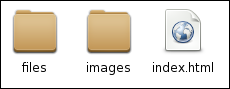
Once you have your website structure set up, you will also need to set up the directory structure for storage of the files that make up your website. Above is a snippet from Thunar of our sample website. The “files” directory is where any files you might offer the user an opportunity to download are stored. The “images” directory is where the images that are displayed on the website are stored. I strongly suggest mirroring the directory structure of your website in a folder on your computer.
Creating Our First Page
Let’s start off by first setting the background color for our web page. Select “Format > Page Colors And Background” from the KompoZer menu. You will see the window below.
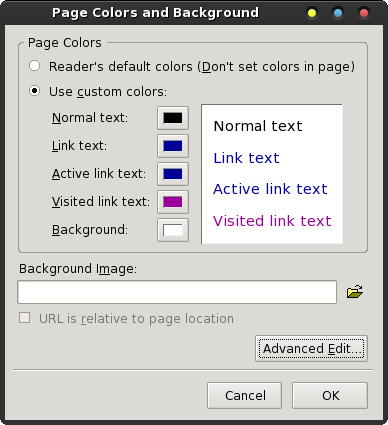
Select the “Use custom colors” option, then select the color swatch after “Background.” You will be presented with the typical color selection dialog box.
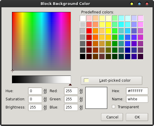
You can now select the color you want to use from the color swatches at the upper right corner of the dialog box. For my demonstration, I chose the blue color in the third column from the right, third down from the top. If the color you want to use isn’t displayed in one of the default color swatches, you can specify the specific color.
The easiest way is to pick a “close” color, then adjust the Hex or Red, Green and Blue values until you get the precise color you want. The selected color is displayed in the color swatch (white in the image) that appears between the RGB settings and the Hex value for the color. Another easy way to fine tune your color selection is to adjust the black slider in the color bar just above the Hue, Saturation and Brightness values.
If you’d rather use a background image, you can specify the image location in the text entry box at the bottom of the first dialog box. So that the image can be found when needed, place the image in the location it will be in on the server – on the mirrored copy on your hard drive. Check the “Url is relative to page location” checkbox. Be careful using background images, as many images will render your web page difficult to read (like when you’re attempting to display black text over the top of a dark area of the image) and may be a distraction.
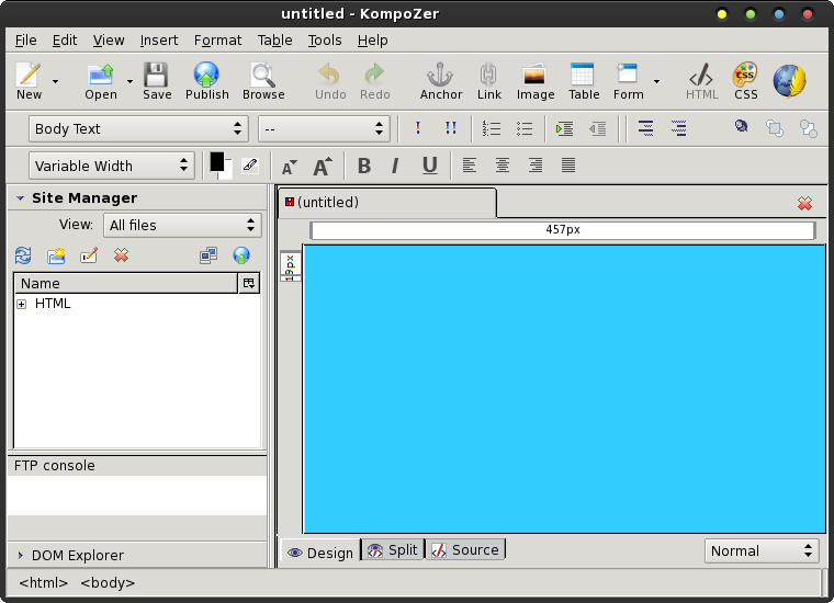
Below is what my KompoZer window looks like after selecting the background color:
Next, select “Format > Page Title and Properties” from the KompoZer menu.
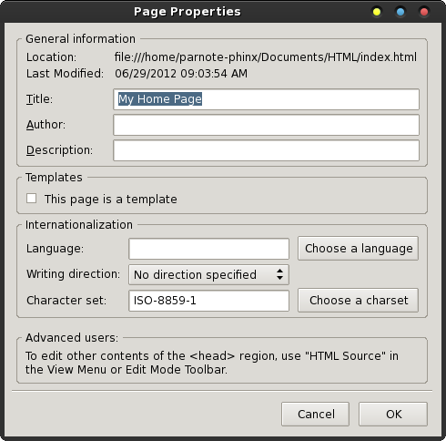
Enter the title for your new web page, and set the language and text direction. I’ve entered the page title as “My Home Page,” but you should call it whatever you think is most appropriate.
Next, set the font information for your web page. The default value is “Variable,” but I prefer to set a particular font. My personal preference is for “Helvetica, Arial.” It’s the font that has been rated as the easiest to read by various independent surveys.
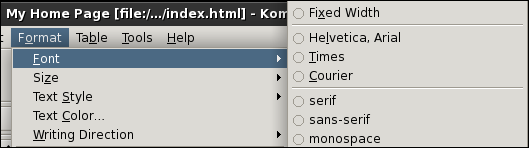
Select “Format > Font” from the KompoZer menu, then select the font you want to use. Although listed, it’s probably best to not select the listed fonts that are installed on your computer. You cannot be sure that your website visitors will have that particular font installed on their system. As a result, your website may not appear as you intend it to. It’s best to restrict your choices to only the first eight choices, since those will display as intended on most any web browser and platform.
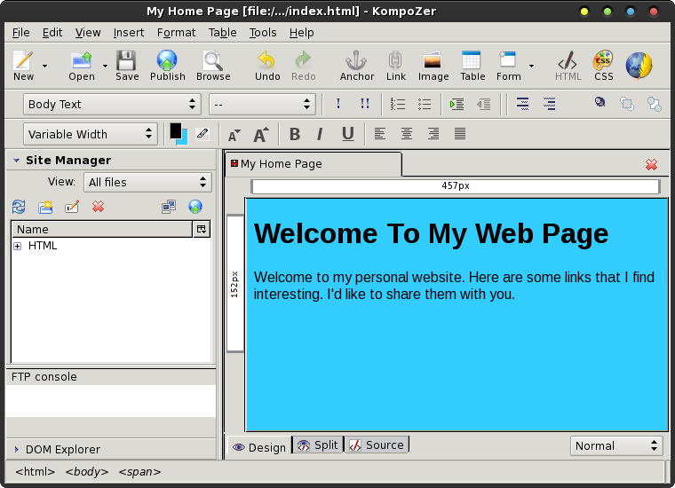
Next, select the text formatting dropdown list that says “Body Text,” and change it to “Heading 1.” Now, place your cursor in the text editing portion of the KompoZer window, and type “Welcome To My Web Page” (without the quotes). Press <Enter> at the end of the line. Notice how the text formatting dropdown changes back to “Body Text.” Also, if you notice that your text isn’t formatted to use the font you previously selected, don’t fret. Just select that text and reformat your text to use your preferred font.
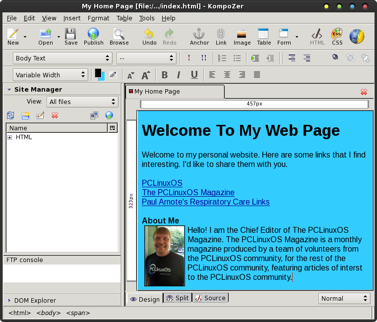
Now enter some text into your web page. Just type in some brief, introductory text. Your KompoZer window should look something like the following:
Now, type in the names of a few of your favorite web sites, one per line. Then, let’s highlight each one of them, one at a time, then click on the “Link” icon on the KompoZer toolbar.
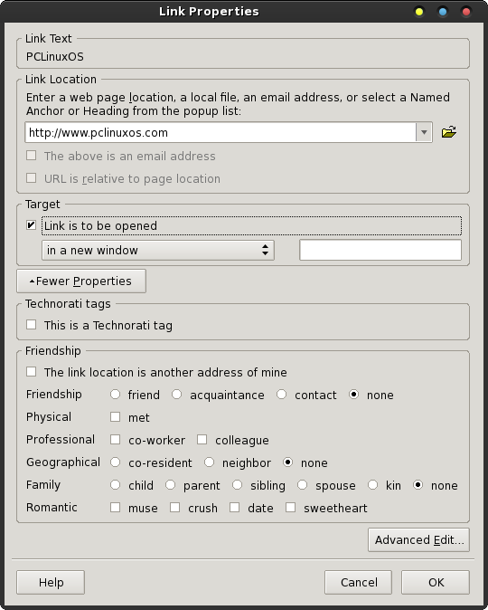
This brings up the “Link Properties” dialog box, as shown above. Since we’re linking to external sites, enter the full URL of the website in the top text entry box. If we were linking to another page on our own site, we would enter only the filename of the page we’re linking to (e.g., links.html).
In the “Target” section of the Link Properties dialog box, place a checkmark in the “Link is to be opened” check box, and make sure “in a new window” is selected. This will cause the external website to open in a new browser window, keeping your website visitor connected to your website.
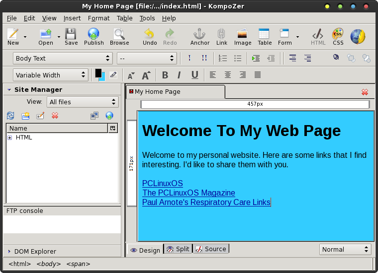
Repeat these tasks for each of the links you have inserted into your web page. Your window should look something like that shown below.
Let’s Insert A Picture
Now, hit the <Enter> key twice. Hold down the Ctrl + B key to start boldface text, and type “About Me” (without the quotes). Depress the Ctrl + B key combination again to signify an end to the boldface text, then hit the <Enter> key.
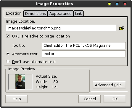
I have already placed an image in the “images” folder, within my HTML directory structure. Select the “Image” icon on the KompoZer toolbar, and select an image in your “images” folder in your HTML directory structure. You’ll notice after you add it that the “URL is relative to page location” checkmark is activated, to indicate that the image is in the directory path where your HTML file is (will be?) stored. Enter the tooltip text you want to appear whenever a visitor hovers their mouse cursor over the image. Then, enter the alternate text to display while the visitor is waiting for your image(s) to load.
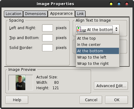
Next, under the “Appearance” tab of the Image Properties dialog box, select for your text to “Wrap to the right” from the dropdown list under “Align Text to Image.” You might also want to insert the number of pixels to pad the image edges, so that the text doesn’t butt right up against the image. I usually use a five (5) pixel padding. It’s not too much and not too little, for my tastes. You can also place a solid pixel border around your image. I like to use a one (1) pixel border around my images. It helps to prevent the image from bleeding off into the background.
My image was already pre-sized to the size that I wanted, and I usually prefer to pre-size my images to the size I need. It helps prevent unnecessarily large downloads for my site visitors. However, another way to get smaller images is to use a larger image, and under the “Dimensions” tab of the Image Properties dialog box, enter the dimensions you want to display the image at. Keep the “Constrained” checkbox marked if you want the image to be resized proportionally (height and width are kept proportional to keep the image from appearing skewed).
Now, click your mouse cursor to the right of the image, and start typing a brief introduction to yourself. The text you type will now “wrap” around the right edge of the image you inserted. You should have something that looks somewhat like that below.
Save your file in your HTML directory as “index.html.”
Summary
So far,
we’ve learned about the features of KompoZer (in the first
article in the July 2012 issue of The PCLinuxOS Magazine), and
in this article, how to create a rudimentary web page. As you
can see, KompoZer is a quite capable HTML editor. Next time,
we’ll learn a bit more about KompoZer’s capabilities.