
| Previous
Page |
PCLinuxOS
Magazine |
PCLinuxOS |
Article List |
Disclaimer |
Next Page |
GIMP Tutorial: A Simple Floating Logo |
|
by Meemaw I saw a tutorial about a "floating" logo in GIMP.org/tutorials and thought I'd share it.  Create a new image and fill it with black. You can choose the size you want - mine is 800x600px. Add some text and format it the way you want it. I'm using the font A&S Speedway, size 120. Do not merge your layers.  Once you've gotten the text how you want it, create a new layer from all the visible layers so far. On your Layers tab, right click on the text layer you just made, and choose New from Visible. Apply a slight Gaussian blur to this layer. 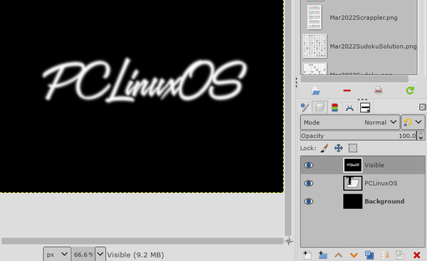 Now, add a new layer. It doesn't matter what background you choose this time because we're going to change it. Click on Filters > Render > Clouds > Plasma, and apply. You can play with this, clicking on "New Seed" until you find a cloud you like, before applying. 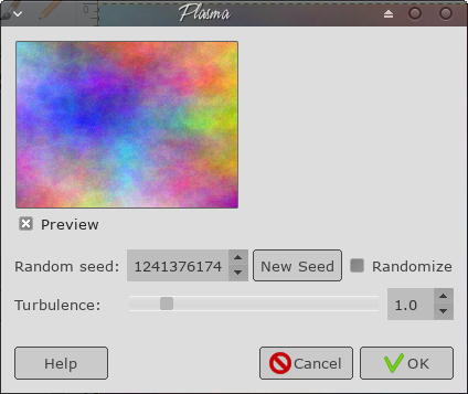 We want to use the text we created earlier to generate a fake 3D shape on this plasma layer using something called bump mapping. Open the Bump Map dialog through the menu Filters > Map > Bump Map. Click on the Aux. Input for the Bump map, and choose your "Visible" layer from the list. In the settings, I chose 40 for Elevation and 5 for depth, but this is something you could play with to get it the way you like it. 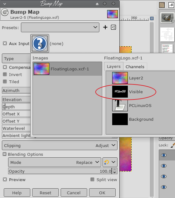 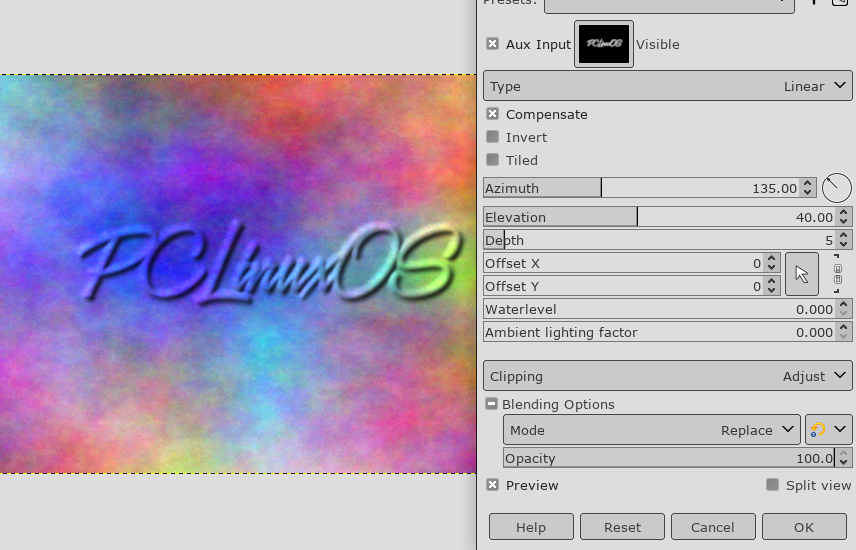 Now, add a Layer Mask to the plasma layer by clicking Layer > Mask > Add Layer Mask,or right-click on the plasma layer and choose Add Layer Mask from the context menu. In the settings, Initialize Layer Mask to: White (full opacity). We are going to copy the Visible layer, and paste it into the layer mask for the plasma layer. First, left-click on the Visible layer in the layers palette to activate it, then choose Edit > Copy. Then, make the plasma layer mask active by Left-Clicking on the mask. Now, choose Edit > Paste to paste the Visible layer into the Layer Mask. You will now see a Floating Selection (Pasted Layer) into your image and your drawing will look like this. 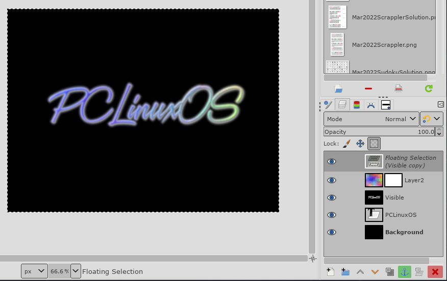 This layer needs to be anchored by choosing Layer > Anchor Layer. Now the layers should look something like this: 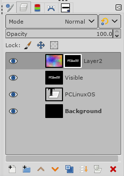 Add a new layer to the image, and place it below the plasma layer. You can click and drag layers to change their order in the layers dialog or use the arrows at the bottom. Whatever background you chose will be there, along with your text. You can bucket fill with a new background color if you wish. 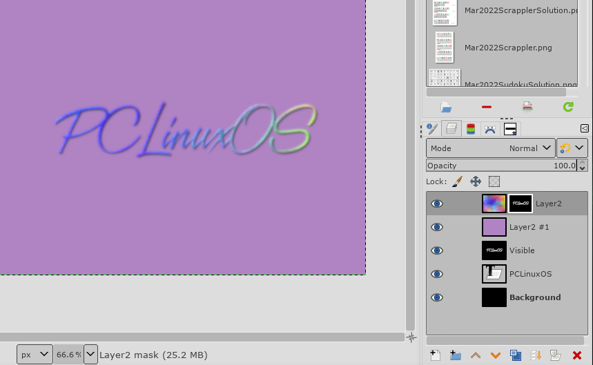 Let's clean up the edges of the text. Right now, the mask being used on the plasma layer is a copy of the gaussian blurred text. We want to make it sharper, so we are going to adjust the levels on the mask for that layer. Activate the layer mask by clicking on it. Then open the Adjust Color Levels dialog by clicking Colors > Levels. With the Adjust Color Levels dialog, we now want to sharpen up the edges of the mask a little bit: 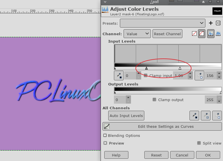 What we want to do is adjust the two sliders. One is the White point slider which will increase the prominence of the plasma layer, one is the Gamma slider which will emphasize it more. This is also something to experiment with, but in the original tutorial, the settings ended up as 0.27 Gamma and 115 White point. Make a copy of your Visible layer that had your original blurred text on it. Select the layer first to activate it, then you can click on Layer > Duplicate Layer. Move this layer above your background color layer to just beneath your plasma layer as shown (you can left-click and drag the layer in the palette or use the arrows in the layer dialog). 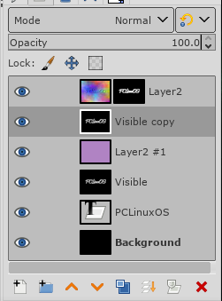 I know our background doesn't show, but we're going to use this layer to make a drop shadow. First click on Colors > Invert. Now, we need to change the layer so that all of the white areas will be transparent. This can be found in the menu Layer > Transparency > Color to Alpha. The layer should now have black text over a transparent background. If you aren't sure, turn off the visibility of your top layer and see. We now want to shift this layer a bit to simulate a height by offsetting it down and to the right a bit. To do this we can use the Move Tool. Click on Tools > Transform Tools > Move or choose the Move tool in your toolbox (the one with the 4 arrows). Drag the layer to the right and down a bit to simulate the shadow. You can also add a Gaussian Blur to the shadow to spread it out a little more. This step is one where you will decide on the appearance. My shadow might be too much for you, but you do have to admit, the logo does look like it's floating. 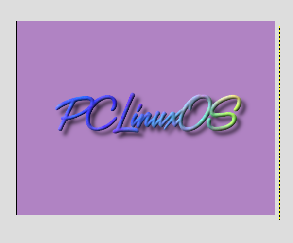 Now you can crop your logo, and use it that way, or put a different background in, or even do away with the background, and the effects and shadow will still be there. Be sure to export it as a .png file. 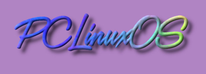 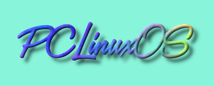 |