Using Scribus Part 9 - Tips & Tricks
 by
Meemaw & Paul Arnote (parnote)
by
Meemaw & Paul Arnote (parnote)
We have gotten our newsletter created, converted to a PDF and published (or mailed.) However, here are a few last little things that will make the next newsletter, brochure or magazine a little easier to create.
Linking the Table of Contents to the Article
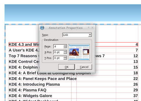
If you have a large newsletter or magazine, you can link each article listed in the table of contents (of the PDF) directly to the page where that article starts. Just like doing a web link, use the link tool (the pair of shoes) and draw a frame around your article name in the table of contents. Double-clicking the frame gives you the link window. Rather than choosing ‘Exterior web link’, you will choose ‘Link’. When you do that, you will see the first entry says ‘Page’. If you have all your pages in order the way you want them, put the page number of the article into that box and click OK.
Be sure to change the last number in the page positioning from 612 points to 0 points. Otherwise, the link will point to the bottom of the page, instead of the top of the page.
Spacing for Text and Images
When you place an image, and choose the text to wrap around the image, you will notice that the text is usually ‘crammed’ right up against the edge of the image. We will need to space that out a bit so your article reads better, and it helps give your document a more polished appearance. There are a few ways to do this, depending on where the space between the image and text is located.
For the first method, note the size of the image, and place a polygon or text frame in the image layer, with text flow around it. Then, change the size so that it's three (3) points wider or longer on the side you need it to space against the text. You may have to slightly alter the position of that item to accommodate the spacing, if it's on the left side of an image, by reducing the X-Pos setting by an equal three (3) points.
For the second method, if you need the extra spacing along just one side of an image, because the text is butting right up against one edge of an image, the easiest way is to duplicate the picture, change it to a polygon (or text frame), then increase the height or width of the image by three (3) points. (I increased it by much more for the purposes of this article).
Finally, another way to do it is to place a very thin invisible polygon along the edge of the image where the spacing is needed. You guessed it: the height or width of the invisible polygon (made by setting the border and fill color to “none”) is three (3) points.
Of course, you can always increase the size of the “border space” if you want. Just be sure to be consistent throughout your document, so you preserve that polished appearance and so that your document doesn’t appear amateurish.
Remember, everything is done in the image layer.
Dropcaps and Alignment Issues
Dropcaps are occasionally used in documents. They are done exactly like placing a small picture at the beginning of an article, except that it's text; typically a different font, but a much larger size and color. Just as with pics, you can set the alignment to the baseline or the top of the character you use as a drop cap.
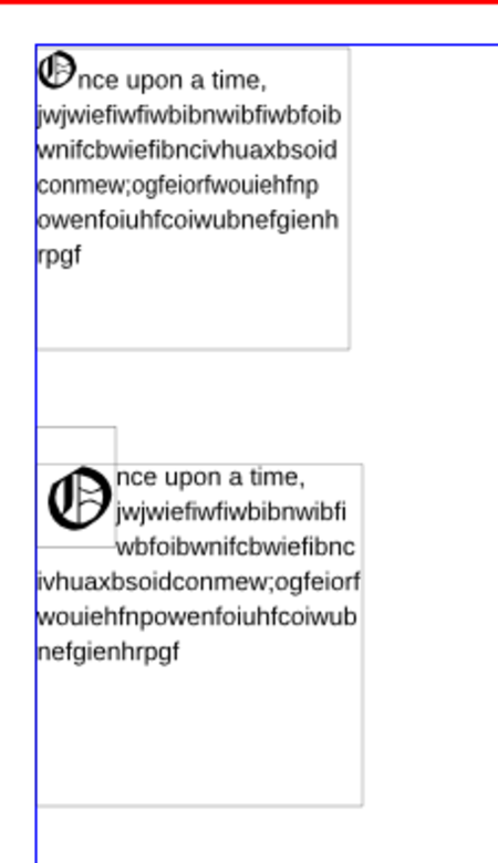
In the example, I just
changed the first letter in the top box to a different
font and size. If you do it that way, it will
automatically align everything with the bottom of the
text. On the second example, I placed a separate text
box with the first letter in it. (You an see the
boundaries of the text frames.) I also defined the text
flow in the ‘Shape’ section of the ‘Properties’ window.
You have to work a little bit to line up things as they
need to be. While it does offer a different appearance
for the beginning of a paragraph you probably should
only use dropcaps sparingly.
Groups: What’s the Best Way?
Grouping items is really the best way to make sure something looks the same every time you use it. The header for my newsletter is several items all grouped together. We see the screenshot showcase in this magazine every month, and it is also many items grouped together. If you design something with many parts and want to make sure they all stay together when moved, you should group them. If you are going to want to reuse something multiple times, the best way to keep it is to group it first, then add it to your scrapbook. When you reuse it and need text flow, there are some options on how to do that.
The Scribus developers are working on fixing the option to apply text flow around a grouped object, but it is not “scheduled” to be “fixed” until Scribus 1.5.x (it was working up through Scribus 1.3.4, but then stopped working in subsequent releases, including the current one, 1.3.9). Despite the Scribus developers being rather unresponsive to requests to fix this problem and dragging their feet on providing a solution (What? Another 12 versions of Scribus before we can finally have this once-working feature fixed?), there are workarounds.
First, you can use the options listed above to provide that extra space around an image.
Second, you can ungroup it, and make the background of the grouped object only have textflow around it.
Boxes!
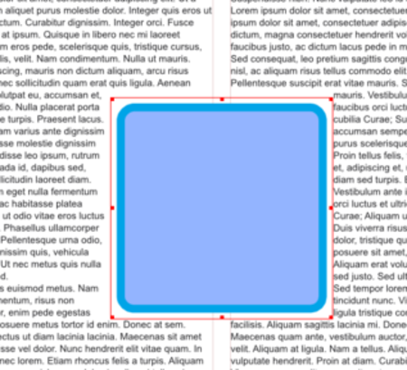
Everything doesn’t always have to be square! Some of the boxes in my newsletter have rounded corners. I think it softens the look of the document. For that reason, you want to use them sparingly, or only on documents that aren’t required to be very sharp and precise. (I usually have only one on each page).
Insert the polygon where you want it to be, then click on ‘Shape’. Towards the top, you will see a box titled ‘Rounded Corners’. You can use the up arrow to designate the amount of rounding you want, and you can keep clicking the up arrow until you have a circle!
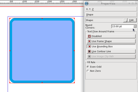
You can see the corners changing as you click on the up arrow, so you can stop when it is the way you want it. After you get used to the setting, you will probably know what number you want in that box.
Notice that you can do this with shapes AND text frames. I generally use a polygon if I want a rounded border, and put the text frame over it. That way, my left-aligned text is straight at the left edge. If you round off a text frame, your text will follow the rounding at the corners. You may want to use this for a different look in your document. After you experiment a little, I’m sure you will find something that looks the way you want it to look. If you round off the box, you can round off your text flow as well by clicking ‘Use Frame Shape’ (but you’ll have to experiment with the flow to make sure it looks right, too).
Layers, Layers, Layers … and more Layers
When I started using Scribus, it seemed like one layer was good enough. However, as I have continued to use it, I use more layers than ever. Sometimes it seems like it’s more work to use more layers, but that isn’t the case.
One of the major reasons to use more layers is that each feature of your document (text, images, links) are contained in one spot. This means you can’t click and drag an image out of place if you are adding links, and you cant move a link if you are adding another image.
As I said in an earlier article, the company I work for has a brochure they print in English and Spanish. Each language is on its own layer, and the images are on another layer. They can work on them both at the same time and make visible whichever language layer they need to convert to PDF.
Say they want to update the brochure with edited text and new images. They can delete the image layer and start again, or just replace the images in the document with new ones. They can even have different images in their Spanish version than they have in their English version. That would required another graphics layer, with the Spanish layers visible in one PDF and the English layers visible in the other.
We can’t emphasize this one enough! The more layers, the better. As you can see from the example above, it adds a lot of flexibility to your document. Plus, in the end, it makes laying out your document much easier and adds a lot of organization to the process.
Workspace Arrangement
Generally, the arrangement of your workspace depends on your screen size, but on all the computers I use, Scribus seems to be the most usable to me when the main document window is at the left of the screen and the Properties and Layers windows are at the right side of the screen. They are the two windows you will use the most besides the document window. All the other windows you will use are available in the ‘Windows’ menu.
Our Chief Editor uses a slightly different arrangement, where he has his Properties window at the left side of the screen, the Layers window at the right edge of the screen, with the Scrapbook window then positioned just to the left of the Layers window. He leaves both of the windows on the right shaded up until they are needed. Often times, he also leaves his Properties window shaded up until he needs to access the data displayed there, so he can see the entire screen when he’s laying out the magazine’s articles every month.
The point here is to take the time to arrange your workspace in a manner that fits best with your workflow habits in Scribus. If you are a new user, you might not have yet discovered your workflow habits. There is no one “right” way to arrange your workspace, so don’t be afraid to experiment until you find an arrangement that best suits you.
Choices of Graphics File Formats
Some graphics formats look better than others (have a higher image quality), and take up more space. Others save space, and sacrifice image quality. The preferred graphics format is to use PNG graphics, due to their lossless compression. In fact, the Scribus developers recommend using the PNG graphic file format whenever possible. Yet, due to their lossless compression, PNG files tend to be a bit larger than equivalent JPG files – which use a lossy compression algorithm. The JPG lossy compression algorithm causes small details to be dropped out of the final image each time it is saved. The result is that the PNG file has much better quality, but JPG files have much smaller files sizes.
For The PCLinuxOS Magazine, we use a mixture of PNG and
JPG files. Where quality matters most (and that is for
the graphics that accompany most of the articles you see
in the magazine), we use PNG files. However, to save
space (and to help reduce the file size of the PDF file
you have to download), all of the Screenshot Showcase
files are changed to 600 pixel wide JPG files.
While we’re talking about graphic file formats, Scribus can import SVG vector graphic files. However, use caution when using SVG files. Pure SVG files can be quite small in relation to the image information they contain. Plus, they are scalable without a loss of image quality. However, their file sizes can be quite large, especially if a number of PNG files were used to help make the background of the SVG file. Because the entire SVG file is imported, part and parcel, into the Scribus document, the size of your Scribus document grows by the exact same amount. Even when you compress the PDF output from Scribus, you’ll end up with an enormous file size for your PDF.
A better option is to export your SVG file from Inkscape (or other vector graphics application) to a PNG file that is closer to the image size you need in Scribus. Then, use that PNG file in place of importing the actual SVG file.
Scribus Resources
Certainly, there is far more information available about Scribus than we’ve covered here, in our Scribus series. If you want to learn more about using Scribus, here is a short list of additional resources that you might find helpful:
Getting Started With Scribus:
http://wiki.scribus.net/canvas/Get_Started_with_Scribus
Scribus How-To:
http://wiki.scribus.net/canvas/Category:HOWTO
Scribus Links:
http://wiki.scribus.net/canvas/Scribus_Links
ScribusStuff.org:
http://scribusstuff.org/index.php?xsortmode=alpha&logpage=0&xcontentmode=642&page=1 Contains all sorts of predefined templates for Scribus, including those for CD case inserts, newsletters, magazines, flyers, brochures, and all sorts of other cool things.
Scribus User’s Manual: http://docs.scribus.net/
LinuxJournal.com: Go to http://www.linuxjournal.com, and enter “scribus” (without the quotes) into the search box. There, you will find all sorts of articles on Scribus, written at all different user skill levels.
Summary
As you can see, Scribus is a very capable desktop publishing application. It’s open source and free, which is hard to beat. Unfortunately, most desktop publishing applications, such as Microsoft Publisher and Adobe PageMaker, use closed, proprietary file formats that are not well documented. As a result, it’s virtually impossible to open the file from one desktop publishing application on a different desktop publishing application. This is one area in the software arena where standards have not been established.
We hope that all your questions have been answered throughout this series, and that it has spawned several other questions of your own. Scribus is not a difficult application to use. Rather, it requires a lot of planning and forethought.
So, unleash your inner publisher and creativity, and enjoy using Scribus!