
| Previous
Page |
PCLinuxOS
Magazine |
PCLinuxOS |
Article List |
Disclaimer |
Next Page |
Inkscape Tutorial: Sliced Text |
|
by Meemaw I saw a cool tutorial a couple of months ago, and I wanted to share it with you. This will make a line of text look like it has been cut apart. 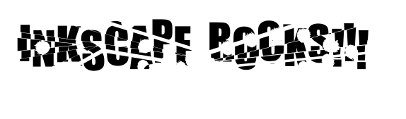 Create the text you desire. Then, single click the canvas with the text tool to create a normal text object (not a flowed text object). Don't change tools yet.  With the text tool still selected, place the cursor in between two of the letters in the text. Then hold down the ALT key and then press an arrow key on the keyboard. This will manually adjust the spacing between the letters (Kerning). Repeat this process for all the letters in your text. Wherever you place your cursor will cause all letters to the right of the cursor to be changed, so you will have to do each letter from left to right, depending on how you want it to look. 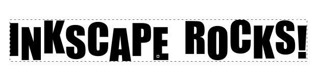 To make make our effect, we'll have to duplicate some of it, so let's first draw a triangle over your text using the path tool. I changed the color of the triangle to make it easier to see.  Next, select both the triangle and the text, and duplicate them (Right click > Duplicate or Edit > Duplicate). Make sure that you do not deselect them after the duplication. With one copy of the text / triangle combination still selected, choose Path > Intersection, to create the first piece to cut out. Click in the color bar and change the colour of the triangle to something that will stand out (I chose green).  Finally, select the leftover red triangle and the other text path and choose Path > Difference. This will remove the triangle from the text. Repeat these steps on the black text as many times as you want. Then, move the green sections out a bit to create the "shattered" or "sliced" look. Save your work, if you haven't done it already. 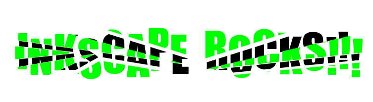 Now, you can combine all these separate pieces together by pressing CTRL + A to select all (or draw a box around them all with your cursor), then choose Path > Combine. After you do that, you can click on the color bar to change the text to your desired color.  We could stop here if we wanted. However, something else we can do is apply a "grunge" look to the text. We can use a splatter pattern and layer it over the text. You can create a splatter pattern and use the Path Effects menu to put the pattern onto a path. We did this in another tutorial, but we can do it here, too. Create some sort of splatter object and edit it so it looks the way you want (I did a rough circle that looks like a drop of paint). Now, using the pencil tool (or bezier tool) draw a path. Mine was kind of squiggly. Choose your splatter object and copy it to the clipboard (<CTRL> + C). Click on your path and go to Path > Path Effects (near the bottom of the menu). Click on the plus sign to add the effect Pattern Along Path. 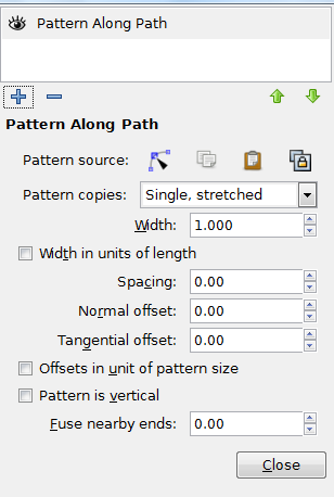 You will want to set your parameters before anything else. You should probably change your Pattern copies to Repeated so there will be more than one of your pattern on your path. I also set my Spacing to 1.00 so the path wouldn't be one continuous pattern. Then click the clipboard towards the top to indicate the pattern is on the clipboard and is the one that should be used. I got one similar to this: 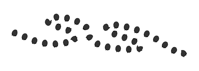 Place the pattern over your text. 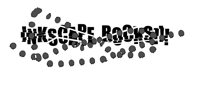 Finally, select both the grunge and your text path, and choose Path > Difference to finish. The text will now look even more broken. Have fun with this one! You can do as much or as little as you want. Depending on your triangle locations, it can look more or less "sliced". Remember, both of these items need to be paths for the effect to work correctly. |