| Previous
Page |
PCLinuxOS
Magazine |
PCLinuxOS |
Article List |
Disclaimer |
Next Page |
GIMP Tutorial: Editing Your Vacation Photos |
|
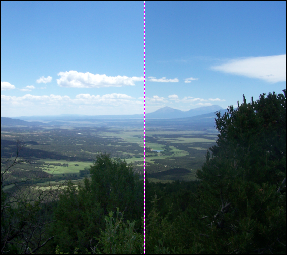
by Meemaw Everyone takes vacation photos, and I'm sure yours are wonderful. We've seen some really great photos in the forum as well, and I'm sure that yours are among some of the great ones. If you don't think they are, and you're wondering how to make improvements to some of them, I'm going to show you a few things you might do to make your photos "pop." In the July, 2015 issue I did a short tutorial about editing photos. This one expands on that a bit and gives you more choices. In the earlier tutorial, I used a photo I took at Monument Valley in southeast Utah. I'm going to use a different one this time. This one was taken in Colorado from an ATV trail. 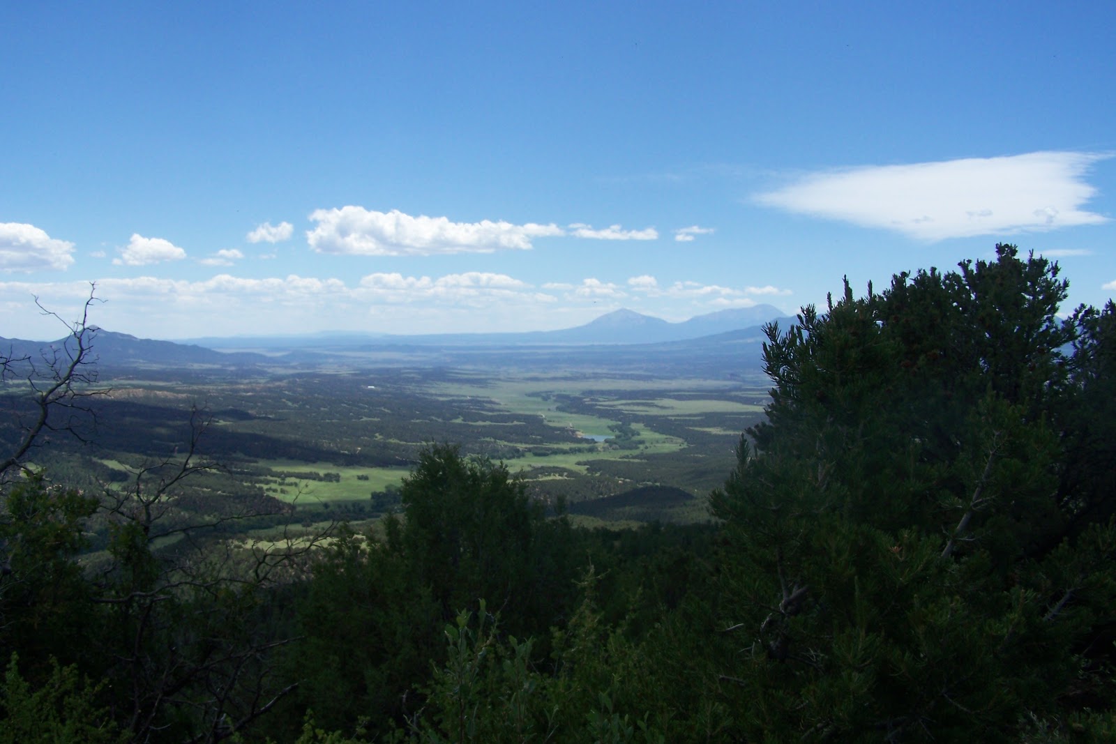 The first thing you can do is adjust the Levels. Click on Colors > Levels and you'll get the histogram showing the color graph. 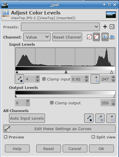 As you can see there is a low spot on each end of the histogram. Start by moving the arrows underneath the histogram inwards towards the spot where the curve starts extending upwards. This helps to even out the light and dark areas of the picture. Then, move the center arrow left or right until you are satisfied with the result. This changes the midtones. If you will check "Split view" at lower right, you can see the changes in the left half of the picture with the photo's original appearance on the right half.
That has brightened up the colors a bit. The next thing we want to do is edit again using Colors > Curves. When the window opens, you will see the histogram again, but it doesn't look quite the same because you've already edited a bit. On top of the histogram is a straight line from bottom left to top right. You can use this line to fine tune the areas of your photo. Pulling down on this line will darken things and pushing up on it will lighten things. Depending on which end of the line you move and which way you move it, you can change the darkness and lightness more than you would if you quit at editing levels. Also, when you click on the line, it will create a node which will stay when you release it. Now you can click elsewhere and move your line again to edit other aspects of your photo. Lightening dark areas and darkening light areas may improve your photo greatly. (Check "Split view" to see what's happening.) 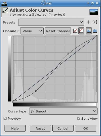 As you can see, my line ended up as an "S" shaped curve. My photo looks a bit better, too. 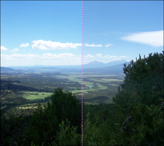 The next thing you can do is adjust any color you think shouldn't be there. This uses Colors > Color Balance. In this one, you can edit three different ranges: Shadows, Midtones and Highlights. You might have to study your photo to see if your colors are the way you want them. This is especially helpful if you think your photo is too red or green (or if your photo is old and has turned that reddish brown that some of them turn). Again, click "Split view" to see what you are doing. I wanted just a little more green in my photo, so I increased the green. 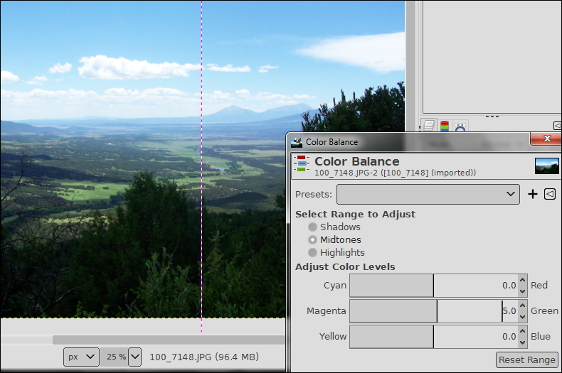 Saturation is the intensity of the color in your photo. If you click Colors > Saturation or Colors > Hue-Saturation, you can adjust the colors so they are more intense. If your photo is dull, this is one of the best ways to enhance it. Using Saturation is easier because there is only one slider, but to fine tune things, you could use Hue-Saturation as there are many different settings. If there is a certain color you want to emphasize, you can do it there. 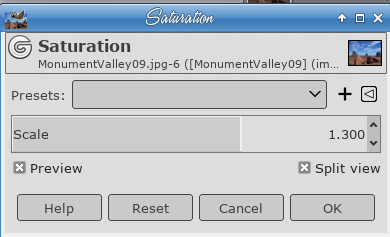 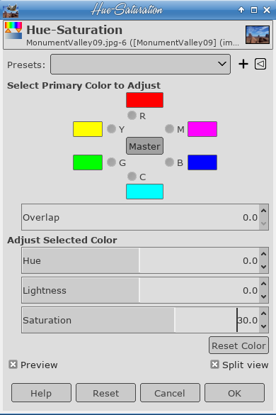 I used Hue-Saturation and set the saturation up to 30. 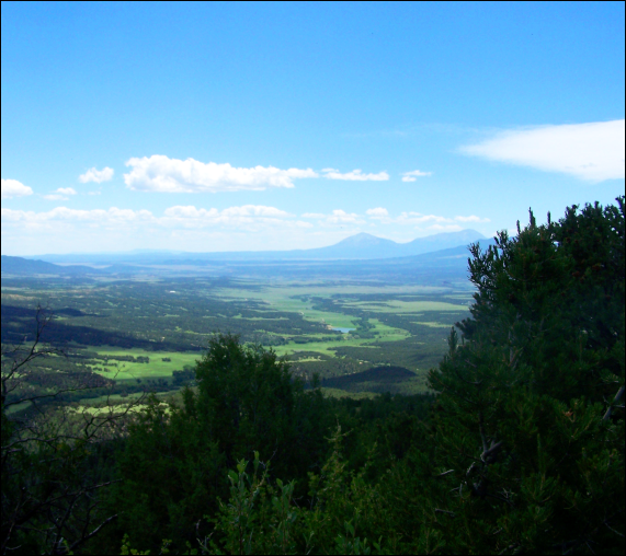 One last thing you can do is use Sharpen or Unsharp Mask to sharpen your photo, being careful not to go too far, as your photo may end up with little white halos on the edges of things. This is Unsharp Mask that has been taken to excess: 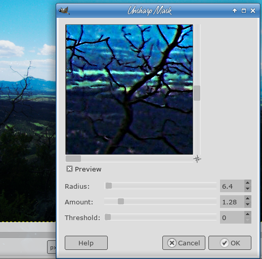
In an article I read, it was summarized as follows:
My mountain photo looks better, in my opinion. 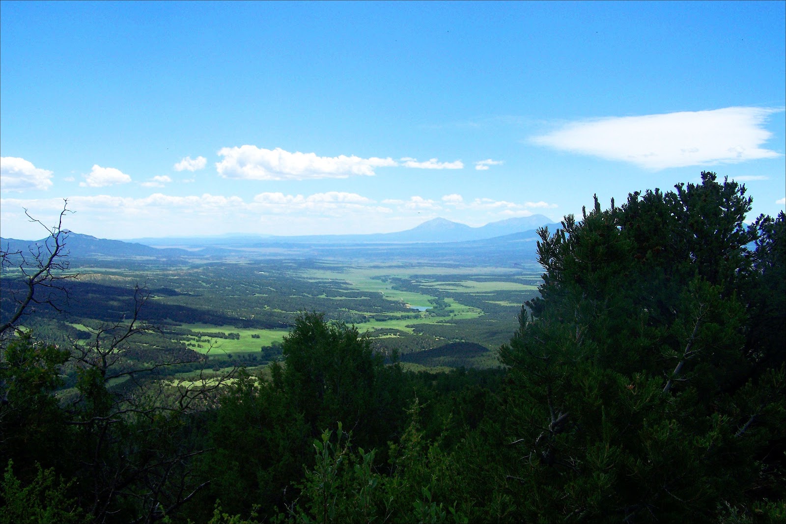 It might be too green for you, but as I remember the trip, everything was very green and lush. Oh, my Monument Valley photo from the last article? I did it again and I think it looks even better. I'll show both so you can compare. 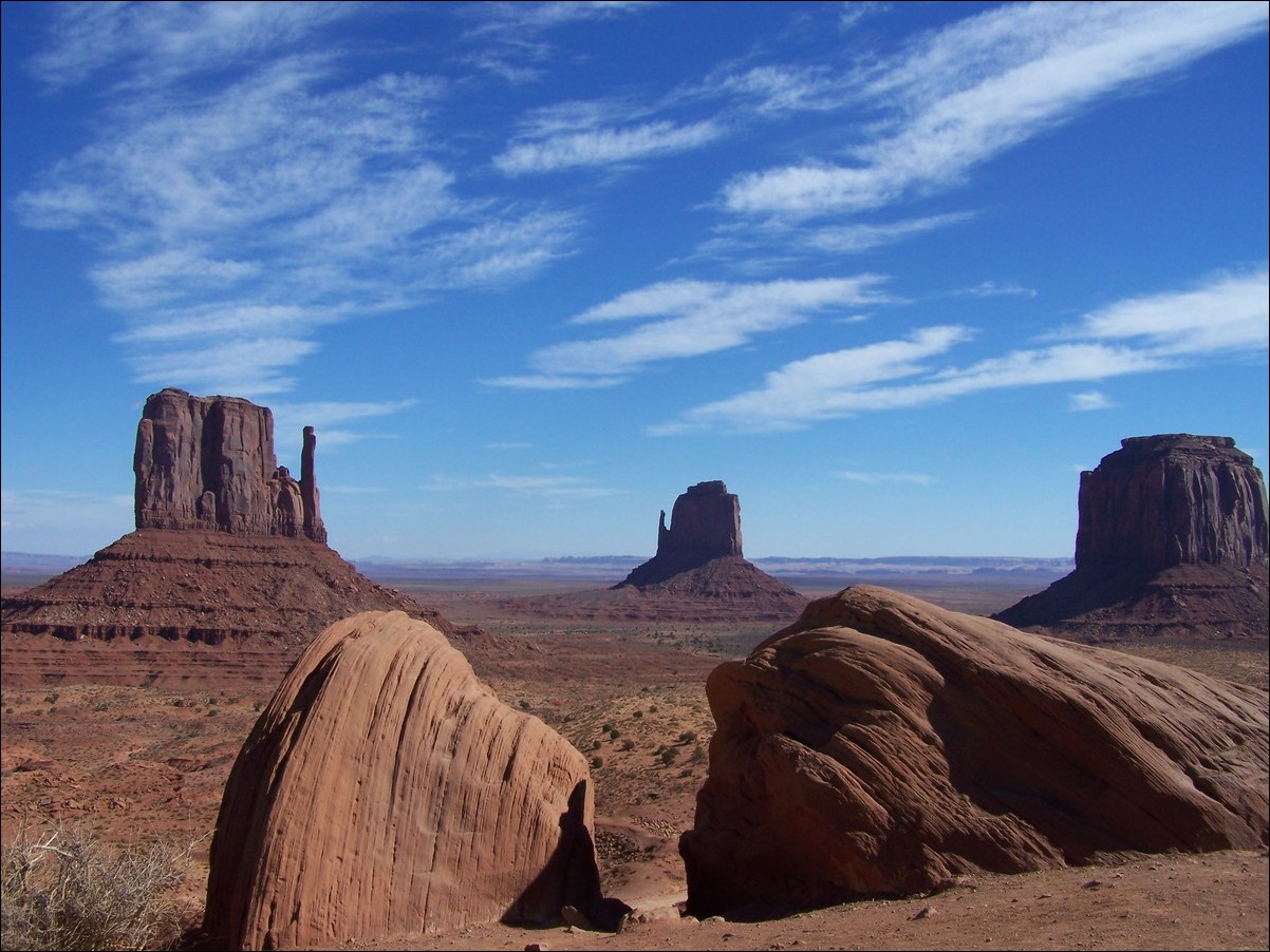 Before 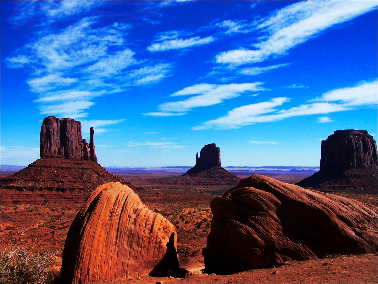 After I can tell you that when you are there, the colors are vibrant like in the second photo. Following these steps has helped me immensely! I hope they help you edit your photos like they helped me. Your photos will look awesome, too! By the way, we have a new version of GIMP as well, version 2.10.6. Some people have told me that while editing photos, their systems have slowed down a lot. While it hasn't happened to me, you could experience some slowdowns. Some of it also depends on your system capabilities (memory, CPU), the size of your photo (bigger takes longer and uses more resources), and what steps you are performing. If you are just cropping your photo or resizing it, you should be fine, but if you are using some heavier filters, it may take a while. Also, the status bar shows a completely different number than your image size: it shows the amount of system memory used by your image. I was working on an image that had a file size of 2MB, but the status bar showed 47MB! That's the memory my system is using while I edit the photo. I'm sure if the GIMP developers get complaints, they will address it quickly. I know there have already been a couple of posts on our forum. Hang in there, guys, I know they'll fix it. |

