| Previous
Page |
PCLinuxOS
Magazine |
PCLinuxOS |
Article List |
Disclaimer |
Next Page |
Inkscape Tutorial: Create A Custom Calendar |
|
by Jimlw1 (with a tiny bit of help from Meemaw) In this forum post, Jimlw1 wrote: I don't have an article, but I have designed a Money Holder in LibreOffice Draw [may be of interest to MeeMaw] that my wife and I use every Christmas for gift money to family members. It also has a tiny calendar that I make [needs to be copied and rotated to make a full page of next year's Calendar for cardstock printout]. The calendar for printout is made in Inkscape. While reviewing his artwork, I remembered that Khadis described how to make a calendar in the January, 2015 issue. However, Jim's is a bit different. With Khadis's summary of the extension Calendar (found in Extensions > Render > Calendar), I found that the calendar could only be made for one year. In Jim's project, he makes a calendar for 14 months, including December of this year plus January of 2022, so as to overlap calendars (in case you don't get a new calendar right away for 2022). That also allows him to make a 4 x 4 grid and add some graphics. It also allows him more flexibility in his design. Let's mess with it a bit. 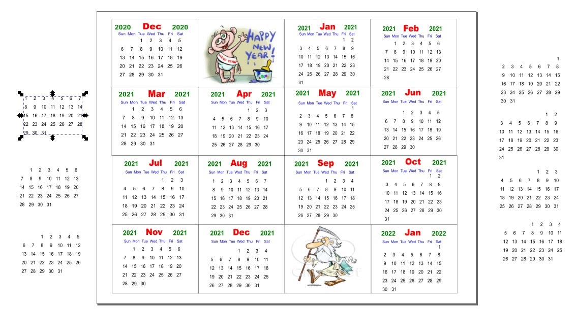 In Jim's calendar project, he has text boxes with the dates already laid out (at the sides), one for each starting day. Using these, he creates a month at a time, putting in the day and month names as well as the year. In order, he creates the frame for the month, adds the text box for the month and year, then one for the weekdays, and then adds the correct date box he created for that month (editing out the dates he doesn't need, like the 31st in a month with only 30 days). Then, he groups those together to make one month. 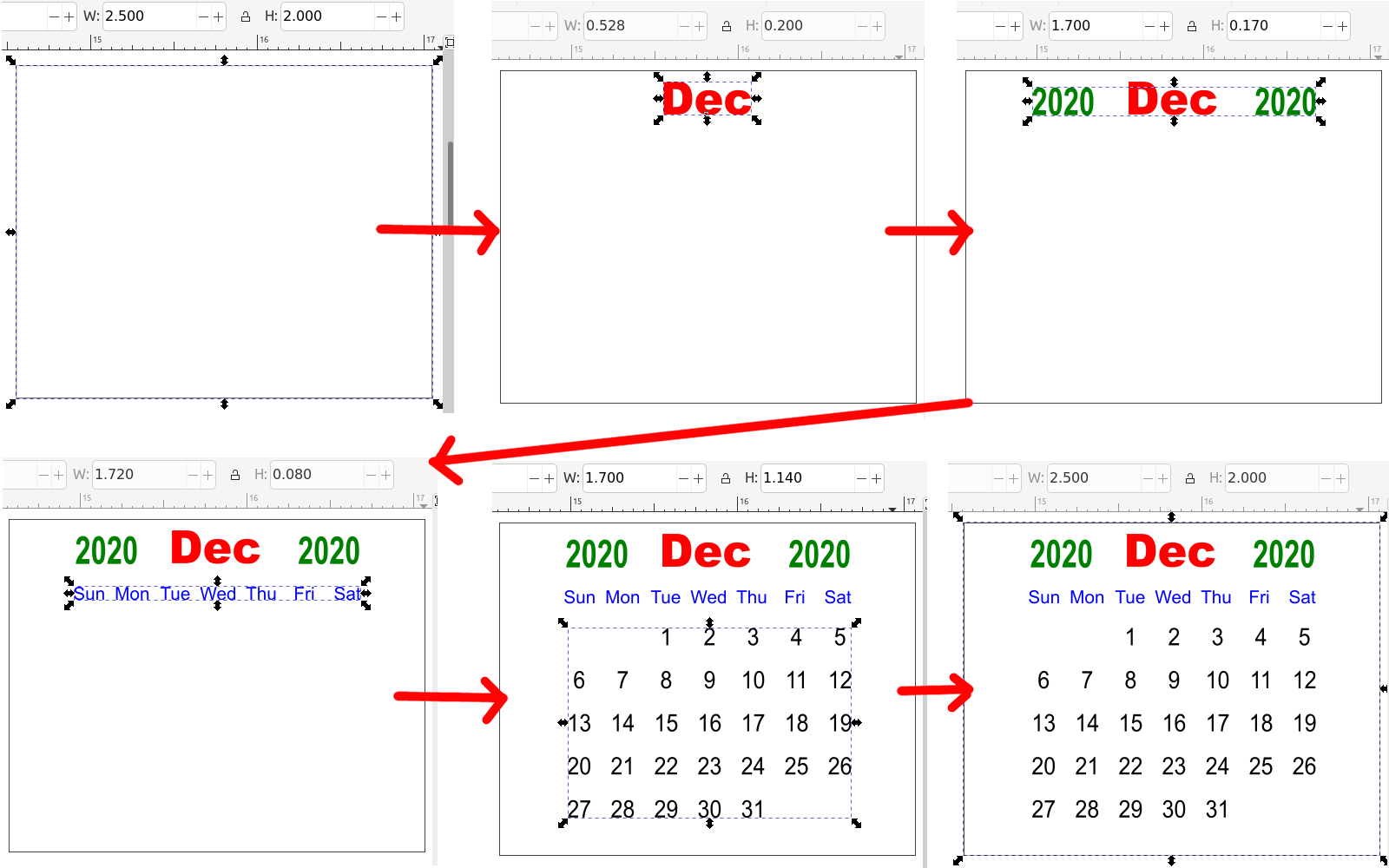 Note that each finished month is 2.5 x 2.0 inches (6.35 x 5.08 cm). I'm sure it was an arbitrary choice to make sure they were all uniform. Since he's going to put this on a tri-fold sheet of cover stock to make a money gift card, he needs to make it small. We know it will end up smaller, but we also know by now that graphics look better when they are sized down rather than up. You could probably make them any size that is easy for you, as long as they are ALL the same size. At this point it might be good to use Align and Distribute to make sure they are all lined up the way you want them. Jim had 16 rectangles (including a couple of holiday images), all the same size, and wanted them all touching, in a 4 x 4 grid. After getting it just the way he wanted it, he exported the calendar page as an image.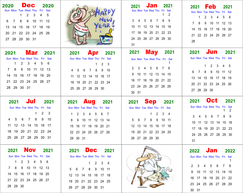 That looks awesome! If you just wanted the calendar, you're finished. However, Jim still wanted the tri-fold money card, so his next step was to open a document in LibreOffice Draw. Now, Jim used Landscape orientation to make his card, but I changed mine to portrait. Since it's your project, you can do it any way that makes sense to you. Insert any text or images to dress up your card. Here is Jim's: 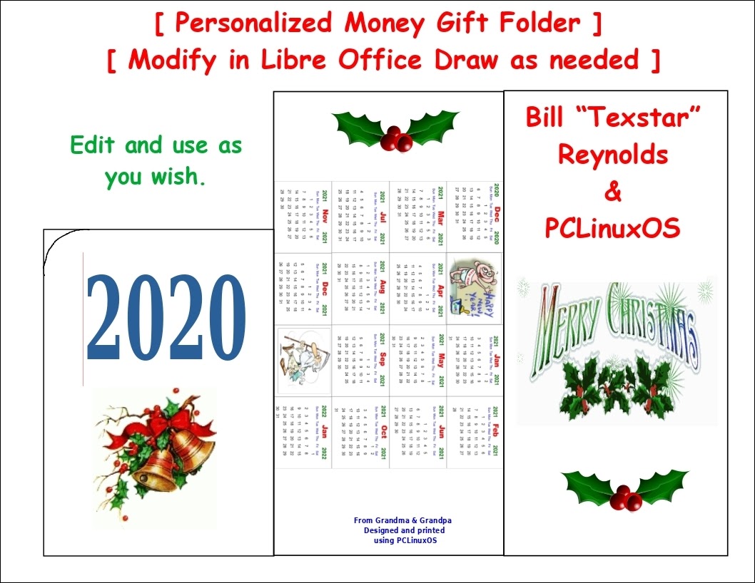 His document has items added which can be changed for your card. Here is mine: 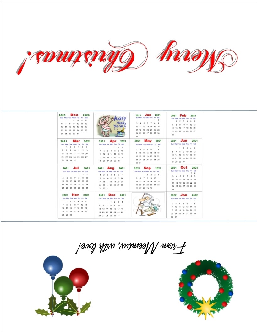 I rotated the text and images so that, when it's folded, the text and the calendar are all the same orientation. 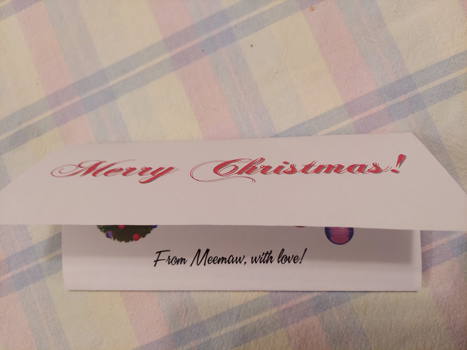 We're finished! This is a project that you can customize for yourself. If you want to use our documents, they can be accessed here. |
