
| Previous
Page |
PCLinuxOS
Magazine |
PCLinuxOS |
Article List |
Disclaimer |
Next Page |
GIMP Tutorial: Top GIMP Filters, Part 1 |
|
by Meemaw While on the internet, I came across the site Davies Media Design. Michael Davies has several awesome GIMP tutorials. I particularly liked the one where he discussed his top ten favorite GIMP filters (#11). Let's explore part of his list, which is these filters:
1. Gaussian Blur We've used this filter (Filters > Blur > Gaussian Blur) to soften photos just a bit, so I'm going to skip this one for now. 2. High Pass I hadn't used High Pass (Filters > Enhance > High Pass) before now, but it can be used to sharpen an image. Let's look at a photo I took in Alaska a couple of years ago. This eagle was sitting on top of a sign on a peninsula in the harbor. I got a photo of the eagle, but it's not very sharp. 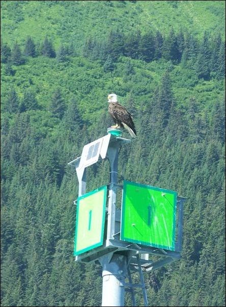 To use High Pass, first make a duplicate of your photo layer. Change the mode on the duplicate layer to Soft Light. With that layer still chosen, click on Filters > Enhancer > High Pass and mess with the settings. Every photo is different, so this is a process that needs your judgement. In my photo, I noticed that setting up the Standard Deviation and the Contrast brought out the detail in the trees in the background. I left the split view on so you can (hopefully) see the difference. The changes are on the left. 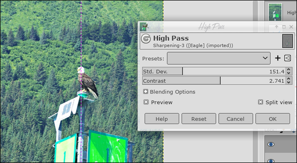 In the image below, the original is on the left. You can see the image on the right has more detail and is sharper. It's a small difference, but sometimes one doesn't need much of a difference. 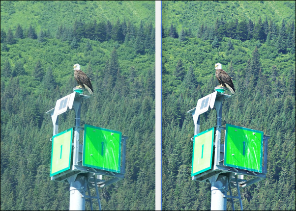 3. Unsharp Mask I have used Unsharp Mask (Filters > Enhance > Unsharp Mask), and it does a good job of sharpening a photo. I'll load the same original of the eagle and let's look at it. Click on Filters > Enhance > Unsharp Mask and a window will appear. Make sure Preview is checked. In this window you have 3 settings: Radius, Amount and Threshold. The default settings are 5. 0.5 and 0. You can see what the new settings below do in the preview. Again, every photo is different, so you'll have to trust your own judgement of the settings for your photo. 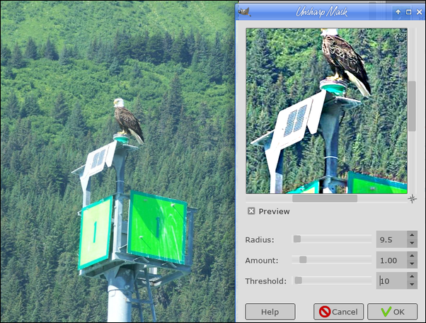 4. Newsprint This is an interesting filter (Filters > Distort > Newsprint). I loaded a piece of clipart and will illustrate with that.  Clicking on Filters > Distort > Newsprint, you get a window with several settings, which can make your image look many different ways. 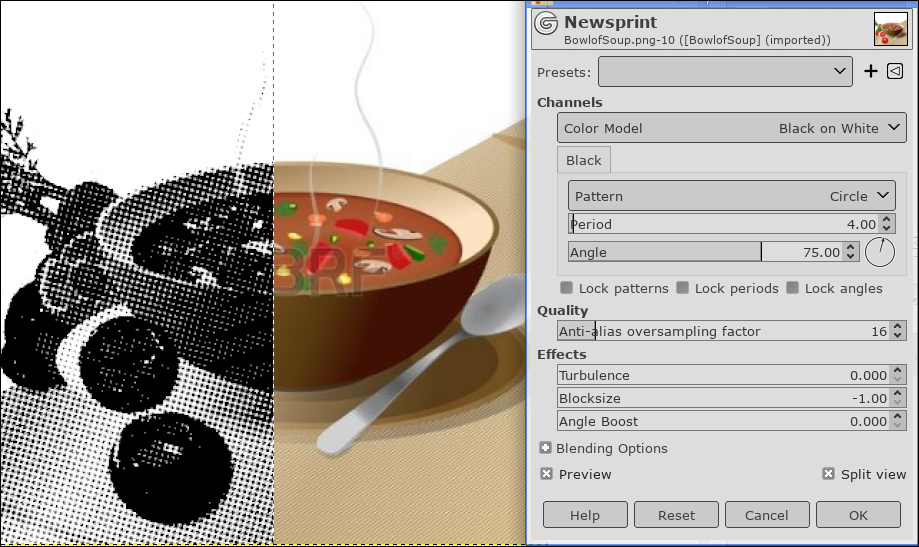 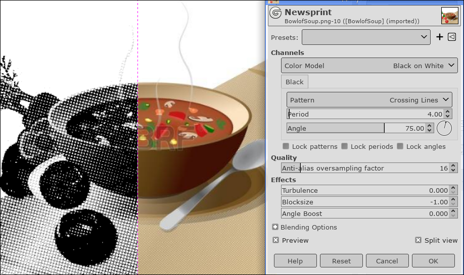 Though it's not so very different yet, the pattern in the first image is Circles and the second one is Crossing Lines. Changing the Period (how large or small your pattern is) can make a great deal of difference. To change it even more, there are effects settings as well. Angle Boost changes the direction of your pattern, Turbulence seems to make things a bit messier, and Block Size compresses your pattern. At the top is a Color Profile setting as well (Black on White, White on Black, and two color settings). 5. Drop Shadow I think this is one of the most-used filters in GIMP (Filters > Light and Shadow > Drop Shadow). Shadowing gives your project depth, and just makes it look better. This is most commonly used on text, but can be used on images as well. For this, I'll apply it to some text. 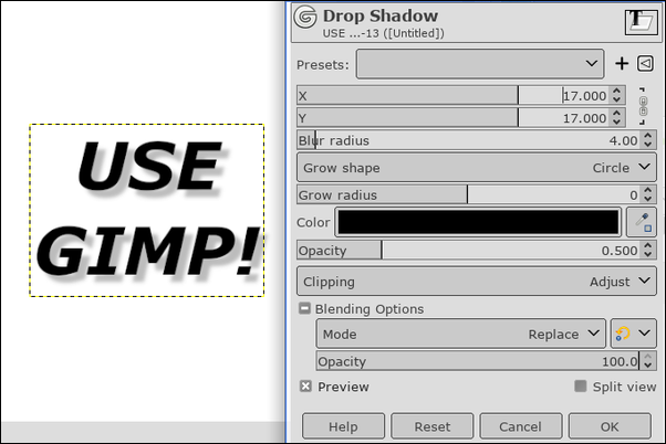 I believe the default settings for X and Y are 20. This sets where the shadow goes. Positive numbers set the shadow down and to the right, a negative X setting changes it to down to the left and if both are negative, the shadow will be above and to the left. The higher you go on Blur Radius, the blurrier your shadow will be, and if the radius is zero, you will just have your text in a lighter shade. Opacity (under the shadow color) is how transparent the shadow is. You can also choose the shadow color. Grow shape lets the shadow be more than just the text shape. A new feature of this filter is the clipping option below the color setting. In the example below, you can see that I used the grow shape, but the shadow now overflows on the right side of the text frame. If the clipping option is set to Adjust, the text frame will adjust to include the overflowing shadow so it isn't just cut off. 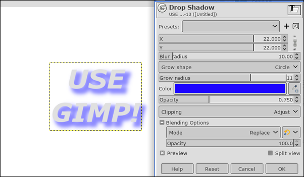 As you can see, the text box has adjusted to include the whole shadow. 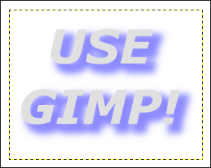 Well, hopefully, we learned a bit about some of the GIMP filters. We'll do more of the list in the next GIMP tutorial. |