
| Previous
Page |
PCLinuxOS
Magazine |
PCLinuxOS |
Article List |
Disclaimer |
Next Page |
Inkscape Tutorial: Chrome Text |
|
by Meemaw I saw this tutorial a few months ago and thought it was nice. When you get finished, your text should look like polished chrome. First, open Inkscape and select a font. My example uses "God of War" stretched to 144 points. The original tutorial used Impact. This probably works better on a thicker, poster-type font, rather than a thin, handwriting-type font, but try whatever you want! The original tutorial put each text clone on a separate layer. Layer 1 will be the basic text. After you get it written, select your basic text and choose Path > Linked Offset from the path menu (the paths tool will have to be on). This will create a 'cloned' offset attached to your basic text. Inkscape will locate the clone below the basic shape. After selecting the clone, fill it with pure white and raise it to the top of the stack. I gave it a hairline black stroke, too, but you do what you want. Cut this object and paste it into a new Layer 2 above Layer 1. Create a three dimensional effect by slightly shifting the white object up and to the left. 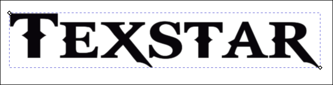  Now we'll create a bit more of the 3D effect. Create another Linked Offset from the basic text on layer 1 object already created. Set this object's fill to black, cut it, and paste it into a new Layer 3. You can name your layers to keep things straight if you desire … basic, 3D and 3D2 might work … or stick with 1, 2 and 3. On this layer, you want to shrink your text by applying Path > Inset. If you apply it once and don't think it's enough, apply it again to get the top layer small enough to see the 3D effect.  Now we'll add the chrome! First, we'll create a multi-purpose gradient. Select the bottom layer and open the Fill & Stroke toolbox. Change the Fill from color to Radial Gradient and set the Repeat combo box to Reflected. Click the Edit button to pull up the gradient editing tool dialog. Add two stops by clicking the Add Stop button in the dialog. Choose the Gradient tool from the toolbox on the left to bring up the gradient editor. At this point you will have the 'L' shaped gradient tool visible. The first stop at the centre will be black – our original fill. Select the second stop from the centre, and choose white. Select the third stop, and choose black. Finally, select the fourth and last stop and choose black again. Play with the offset of the white stop and the offset of the black stop. Stretch the gradient out so you achieve a smooth gradient across your object. Move the source of your repeated gradient outside of the text. Most of this is a judgement call on your part. 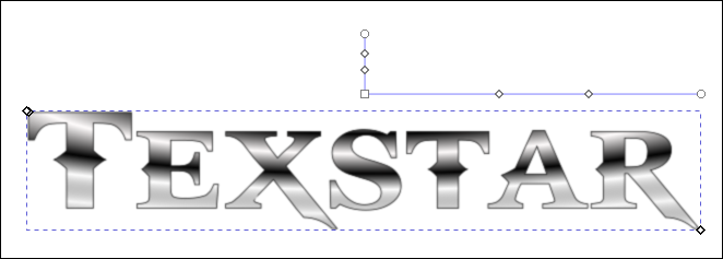 Now you want to select the top layer (where the text has been inset) and apply the gradient to it as well. You can choose the same gradient, but tweak the stops so it's not exactly the same as the other gradient. 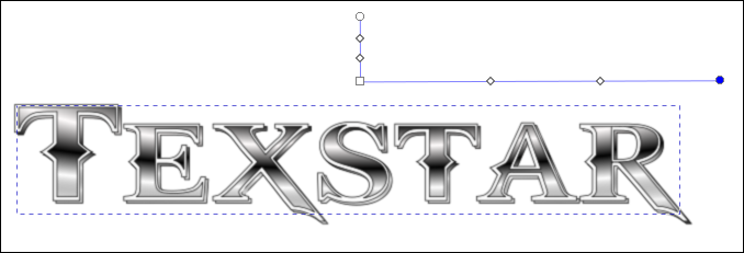 Select the top layer and blur it. You will want the gradient to remain inside of the white Layer 2 object. Now, choose the text on Layer 2 and blur it just a little as well.  Using the layer's fill opacity slider, make Layer 3 less visible. Try approximately 40%.  In our final step, we will choose the bottom layer, Layer 1 (unless you named it something else) and apply a drop shadow to it.  Now, the reason we did linked offsets is that all the layers are linked. If we have done it right, we can go to the Basic text (Layer 1) and change our text, and it will change all the layers to match. As you can see, I got layers 1 & 2 done correctly, but layer 3 didn't change. 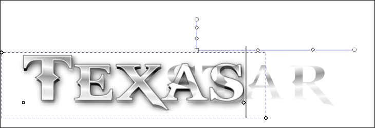 I'll have to do it again and see what I did wrong. I hope yours works! You can always do this with simple duplicates, but when you change the text, you'll have to change each duplicate or create new text. |