
| Previous
Page |
PCLinuxOS
Magazine |
PCLinuxOS |
Article List |
Disclaimer |
Next Page |
GIMP Tip: Join Text |
|
by tuxlink When I first registered for PCLinuxOS and started getting more involved in the community, I noticed how in the artwork of the distro logo, two letters in the middle are cleverly 'joined' to look like only one letter or character. The U and the N look like they are merged or magically melted together. Being a fan of graphics, in time when I needed to use the logo, I wasn't sure how to go about joining the two letters. I asked in the forum, but the answers I got didn't yield a good enough result. There was always something sticking out of place, or something didn't look quite right. In time, I eventually figured out how to join the two letters seamlessly. Here, in this Gimp tip, we'll see how I made it work for me. I am sure there are many other different ways to accomplish the same task, but this is how I do it. (See samples A1, A2, A3) 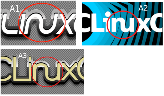 When you open up Gimp, choose a New project, and you'll see the default size will be the size of your monitor resolution. If you prefer a size that's smaller, by all means choose that. Just make sure it's wide enough to hold the word PCLinuxOS in a fairly large sized font. I will leave you to choose the background color, it can be black or white, or any other color. Just make sure you use a contrasting color for your font and characters, ie, white background, black font. The larger the font size you use, the easier it will be to move characters around, and the better the final result will be. I am going to purposely pick a font that is standard in all PCLinuxOS systems, New Century Schoolbook Bold. In the size box, insert 200 pixels. I also chose this font because it has clean edges. There are no serifs or other pieces that might stick out and ruin our 'joining' project. Using the Text tool, and aforementioned font, type out the word PCLinuxOS in caps and lowercase. This step is to make sure yours looks like the font used in the screenshot. Next, over on the bottom right corner is the layers tab. The text layer should be sitting on top of the background layer. Right click that text layer, and choose, Delete Layer. (See samples A4, A4b, A5.) 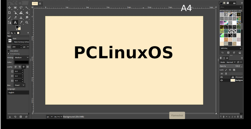 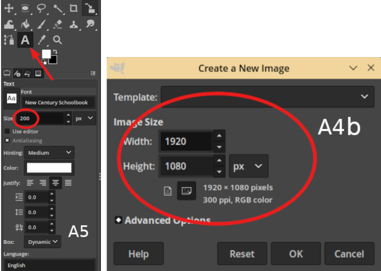 The next step is to choose your Text tool, on the left side close to the edge of the page, type in PCLi only! Take your mouse and point it unto a different part of the page, then, just type the character 'n' in lowercase only. Then again on a different part of the page, lift your mouse and point again and type a 'u' by itself. The rest of the word will be by itself also, type xOS. By now you should have 4 individual pieces of text on the page. If you look in the Layers tab there should be 4 layers of text on top of the background layer. (See samples A6_A7.) 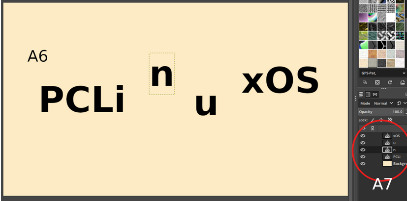 Next, we're going to be using the Move tool. It's in the top left corner of the Tools tab. To move anything in Gimp, you must first select it in the Layers tab. After selecting the Move tool, click on the text layer containing the lowercase 'u'. This allows you to move just that item on the page. Move it close to the lowercase 'n'. Because I'm using a black font on a cream bright background, I can easily drop the u on one side of the n and it looks like it could fit together. But when we line them up with the other pieces, the corners will protrude and look ugly. To fix this, I use the Eraser tool. Choose a hard round brush set to 70 pixels and 100 hardness. Make sure the letter 'u' is selected in the layers tab, and then with the Eraser, remove half of the left side of the letter 'u'. Then do the exact same with the right side of the letter 'n'. It should now look like this. (A12) Now it's simply a matter of selecting the '>b>u', and with the Move tool, move it over the 'n' section. Now comes the accuracy part. You have the choice of using your eye for alignment, (Bless your heart and eyesight, I wish mine was still as good!) but if you need assistance with alignment, a horizontal guide line will help with accuracy. (See A9, A10, A11, A12) 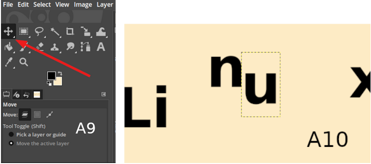  A guideline will allow you to line up the various parts that we want to join together accurately. Reach up above the numbered grid at the top of the page, and click your mouse and drag a line down to about 3/4 of the page and release it. Now you have a straight edge to place all characters on a line for alignment. (See A5b)  When you are satisfied with the two pieces, next we need to keep them from moving apart again. To do this, we simply right click on the 'u' in the Layer tab, and choose Merge Down. This action fuses both characters together so they now move as one item. They also become one layer. From here, we simply use the Move tool to line up the other pieces to spell out the complete word. Use the guideline. If you need to make fine small movements, use the up and down and left and right arrows on the keyboard. When you are satisfied with how it all fits, making sure that all spaces between each character are equal, you can then right click on the xOS Layer, and once again choose Merge Down. One more time and you should have the complete word as one item, and just 2 layers left in the Layers tab. The text layer, and the background. With your Move tool, you can now click on the text layer and move the finished word anywhere you need it. Lastly, you need to save the completed text word as a PNG file. I usually delete the background layer, and save the singular text layer as a PNG. That way, I can use it as an individual piece on many other projects. (See A13, A14.)  |