
| Previous
Page |
PCLinuxOS
Magazine |
PCLinuxOS |
Article List |
Disclaimer |
Next Page |
Typst Cookbook: Part Three |
|
by David Pardue (kalwisti)
The first printed books, or incunabula (from the Latin word incunabulum ['cradle' or 'swaddling clothes', hence 'beginning']), did not have title pages. The text simply begins on the first page, and the book is often identified by the initial words—the incipit (from the verb incipere ['to begin'])—of the text proper. Other older books may have bibliographic information in the colophon (derived from the Greek word κολοφών ['summit' or 'finishing touch']) at the end of the book. Early printers produced the pages of a text: the text block. The text block was sold unbound, as a stack of pages. Since print shops were physically demanding, messy environments, the first page of a text block often became scuffed. Printers began making cover pages with some basic identifying information, for convenience and protection of the actual pages. This cover page gradually evolved into a full title page with publication details as well as the author and title. A title page typically includes the document title, author name(s), institutional affiliation, publication date and other relevant information (such as a translator's name, illustrator, edition statement). The appearance of title pages has changed according to period fashions, e.g., the elaborate title pages of the 17th – 19th centuries, with their extensive subtitles and detailed author/publisher information (often set in multiple typefaces within decorative frames): 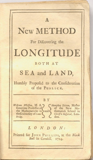 Below is the title page of a monograph by French entomologist Jean-Henri Fabre (1823–1915). In addition to the typical information, it lists the translator, the author of the preface and the illustrator. The realistic spider illustrations also convey a sense of the book's style: a non-fiction work intended for adults. 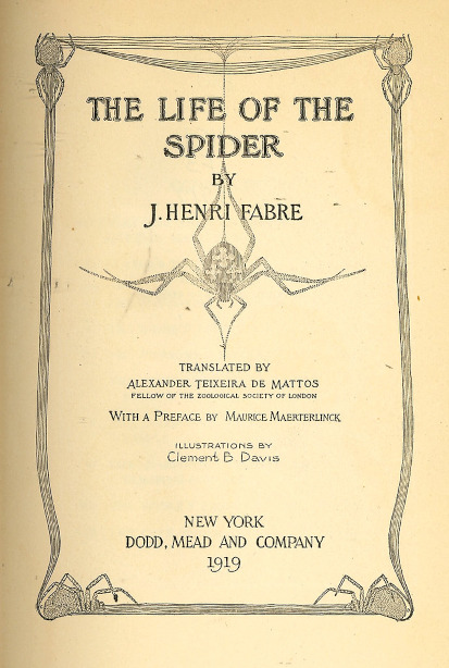
The title page sets the tone for your document and makes a first impression on your reader. Besides providing essential bibliographic information, it establishes credibility and guides the reader into your document. Readers typically form judgments about document quality within 7–10 seconds of viewing the title page. A cardinal rule is to avoid inappropriate font choices that do not match your document's tone. For instance, using decorative fonts—such as Comic Sans—in academic papers or overly formal typography in creative projects undermines your document's purpose. Your readers may take you less seriously if your title page showcases Microsoft Word's Rainbow Text and WordArt effects.  
Avoid overcrowding your title page with unnecessary information; white space is as effective in a layout as type. Avoid excessive artwork or embellishments—complex fonts or too many fonts. A clean, simple layout is preferable. Another point to remember is that typography is a craft, not a science; it can be tricky to discern what is appropriate and what is not. Disclaimer: I have a long-standing interest in typography, but I am not a book designer. I worked as a cataloging librarian for thirty years, so I have seen my fair share of title pages, half-title pages, frontispieces, title page versos and book covers. (For printed books, the title page is the “chief source of information” or the “preferred source” of bibliographic data which catalogers use to prepare a bibliographic description.) The examples below are not professional grade, but I believe they will give you reasonable templates upon which to build.
The simplest way to create a serviceable title page is to use the “Customize a template” option in Typst's web app. It features a wizard with a checklist of various elements in your document and allows you to configure how they will be laid out. 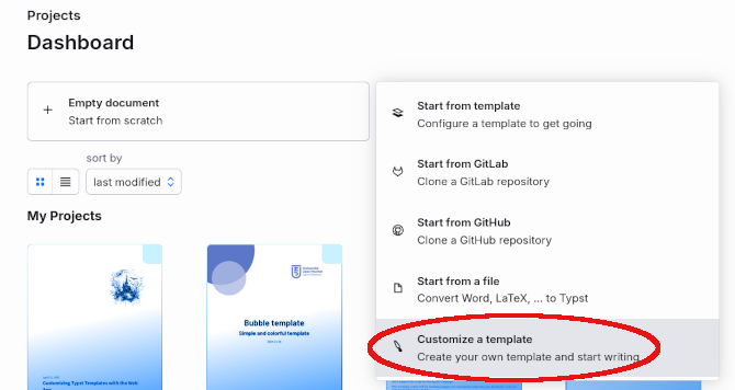 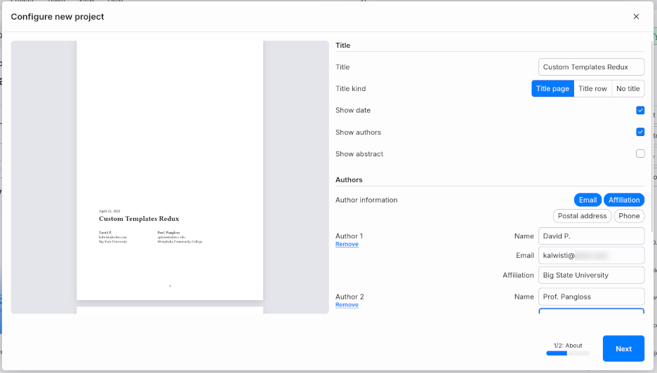 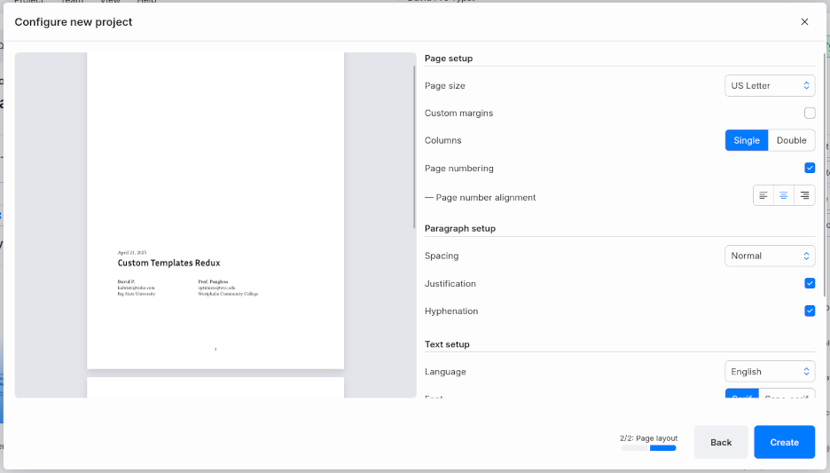

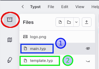 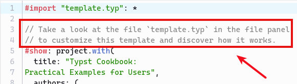 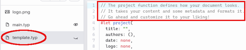 To achieve my title page result shown in the screenshot, I only had to make two modifications to the files. To add the Typst logo (the stylized “t”) in the upper right corner, I first downloaded its .png file from Typst's GitHub page, then renamed it as “logo.png” and uploaded the file to my project. In the main.typ file, I added a line with the argument logo: “logo.png” (as indicated in the code below):
#show: project.with( The width of the logo can be adjusted by the image's width parameter in the template.typ file—16% in this case:
// Title page. I also decided to modify the arrangement of the Author Information by shifting the E-mail address to the line below the Author Affiliation. This was easily done by changing the order listed in the template.typ file:
// Author information. I encourage you to experiment with the “Customize a template” wizard and see the different layouts that you can generate. If you are writing a document that does not require a title page, you can place a headline-style title on the first page by choosing the option “Title kind: Title row ”.
You can use the background parameter of Typst's page function to place content—such as a background image or a watermark—behind the page's body. This feature allows you to create some interesting graphic effects on your title page. In case you would like to try replicating these examples yourself, I uploaded the backgrounds and logos to a compressed archive in myto a compressed archive in my personal Box.com account [9 images, 5.9 MB].
#set page(background: image("blue-swoop-bkgd.jpg", width: 80%,),numbering:none)
#set page(foreground: none, background: none) 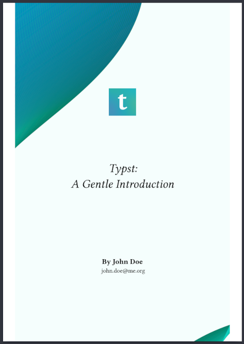 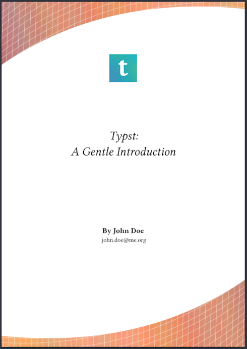 (Note: The title page on the right is a variant that uses an orange grid as the background.) It is possible to set a photographic image as the background, if you wish. The background photo in the example below is a clay tablet. The typeface is Libre Caslon (released under the SIL Open Font License), which I downloaded from Font Squirrel and installed via the PCLinuxOS Control Center [PCC] (System menu > Manage, add and remove fonts > Import).
#set page(background: image("clay-tablet.jpg", width:210%,),numbering:none)  Title Page with #grid() ToniGL68 designed a nice title page using Typst's grid function, which he published in his Typst: Primeros pasos handbook (p. 30–32). Such wizardry is beyond my skill set, so I am grateful to him for creating this layout. With some trial and error, I was able to slightly modify the template to suit my needs.
#set page(margin: (x:0mm, y:0mm))
#grid( columns: (3cm,1fr), rows: 1fr, //stroke:1pt +red, 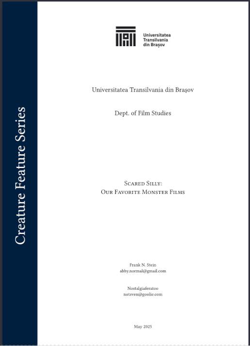 By adding a color stroke/line, we can better visualize the page's grid structure:
#set page(margin: (x:0mm, y:0mm)) 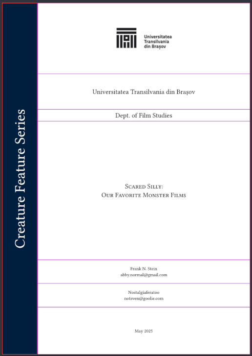
The example below uses a plain block layout. Its major feature is a horizontal rule that separates the document title from the (smaller) subtitle. The heading area crisply displays the business name and its logo. The author information is shown at the bottom of the page, in a small block.
#set page(numbering:none)
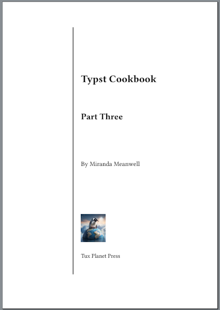
 Title Page with Vertical Rule This title page attempts to replicate the example given in Peter Wilson's booklet (p. 15). The design is asymmetrical, but the elements are aligned along a vertical rule, which helps guide the reader's attention. The grid layout is a modified version of a structure posted by user PgBiel in the Typst article.
#grid(
v(7em), [], v(3em),
 By placing a stroke/line with a 1-point thickness around the block element, we can visualize the page's grid structure more clearly:
#grid(
v(7em), [], v(3em),
align(left+horizon)[#image("penguin-atop-earth-sm'er.png",height: 11%)], 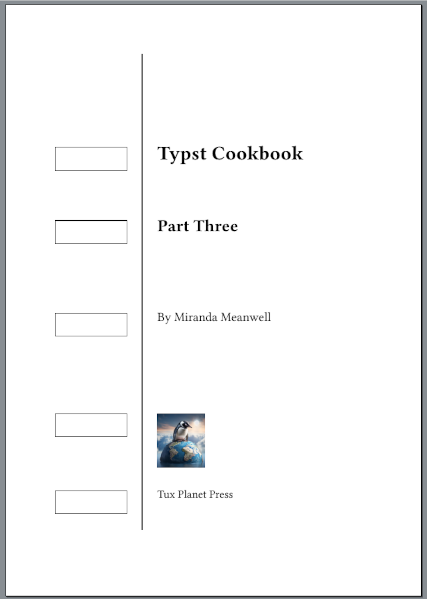 Fauxreilly Package O'Reilly Media is famous for the animals on its tech book covers. Their distinctive design is immediately recognizable and has become part of the publisher's branding. A subpage of their website lets you sort books alphabetically by the name of the cover animal. Typst user Dei Laborer wrote a clever package called fauxreilly for creating O'Reilly-style cover pages. Although it is limited to niche use cases, you might enjoy experimenting with it. After importing the fauxreilly package into your Typst document, the sample code below produces the output shown in the screenshot. (Note: I changed the default publisher from "O RLY?" to "Tux Planet Press" by inserting the " publisher: " line.)
#import "@preview/fauxreilly:0.1.1": *  More Design Ideas For more ideas about possible title page layouts, Peter Wilson's "Some Examples of Title Pages" (2010) is available via CTAN. It displays forty different designs of title pages taken from a selection of books and theses (using a variety of colors and fonts). Wilson's background includes engineering, physics and computer science; in the TeX world he is perhaps best known for having written LaTeX's memoir class.
Bringhurst, Robert. The Elements of Typographic Style. 3rd ed. Point Roberts, Wash.: Hartley & Marks, 2004. A classic work, which type designers Jonathan Hoefler and Tobias Frere-Jones consider to be "the finest book ever written about typography." Bringhurst's style is a bit florid, but he is a passionate expert who loves to share his knowledge. Butterick, Matthew. Butterick's Practical Typography. 2nd ed. https://practicaltypography.com/ A good introduction for beginners. An online book that is ad-free and (voluntarily) supported by reader donations. If you do not have time to read the whole book, I suggest reviewing his basics and his summary of key rules. I hope these examples will provide you with some practical templates, if you need to create a title page with Typst. If you would like to see a Typst-generated replica of this article, I have publicly shared my project from the web app. The document's body typeface is Source Serif Pro, and the headings use Source Sans Pro. |