| Previous
Page |
PCLinuxOS
Magazine |
PCLinuxOS |
Article List |
Disclaimer |
Next Page |
GIMP Tutorial: Create A Gold Paint Effect |
|
by Meemaw
There are several places you can find a gold foil texture to use. Nick even provided one in his tutorial. I got one from Pixabay. Start by loading your gold foil texture. Add a layer above, filled with black. Now add white text, using a brush or script style. I did this several times, using Great Vibes and A&S Speedway fonts. In the layers dialog, select the text layer, right-click and choose Alpha to selection. Now, delete the text layer using the tool in the layers dialog. On the black layer, press the delete key to let the gold show through. Now choose Select > None to clear your selection and proceed. Click on the gold layer and then choose Color > Levels. Adjust levels, so the gold has more varied colors. How far you move the slider depends on how varied you want your colors and how light or dark your background is. 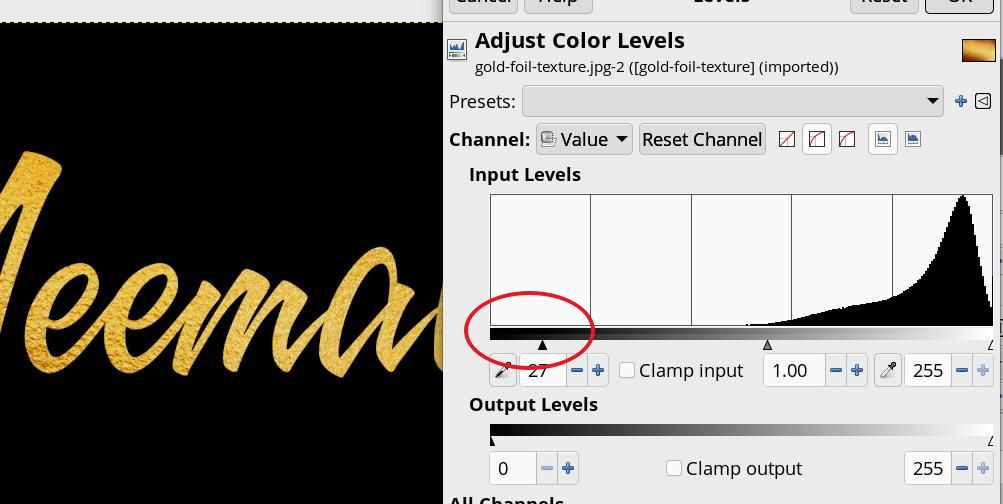
We’re going to use the Warp transform tool. Set it to Move Pixels. Choose a hard brush. Tool Settings should be: Paint with the brush to make the gold look more streaked, like the text was written (one gold leaf pattern looks kinda bubbly, and the other looks kinda glittery). Painting with the Warp Transform tool is a bit fiddly, and it’s your choice how much you want to do.  Using the black layer, choose Alpha to selection. GIMP will choose the text. Delete the black layer. Now you’ll have what looks kinda messy with the text selected. 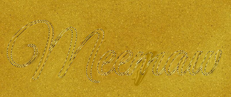 Add an Alpha channel to the gold layer, then press Delete. You will get gold text on a transparent background. 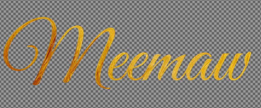 Choose Select > None again. You can add another layer with the background you want.  We could stop here, if you’re happy with what you have. You can also do another step to give it a sort of oil paint texture. Duplicate the gold layer & select the new layer. Remove the saturation by choosing Colors > Saturation and move the slider left to 0. Now choose Colors > Curves and move each end toward the other side along the window edges. This brings more dark out (moving the bottom left curve) and more white (moving the upper right curve). How far you go is up to you. 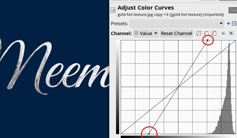 Add a slight Gaussian blur, choosing Filters > Blur > Gaussian Blur. Set it to 1.0. Now choose Filters > Distorts > Emboss. Keep the defaults and click OK. Go to the Layers dialog, and change the blend mode to Soft Light. 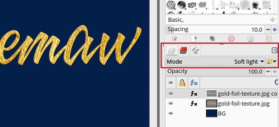 The last one I did ended up having a purple background. 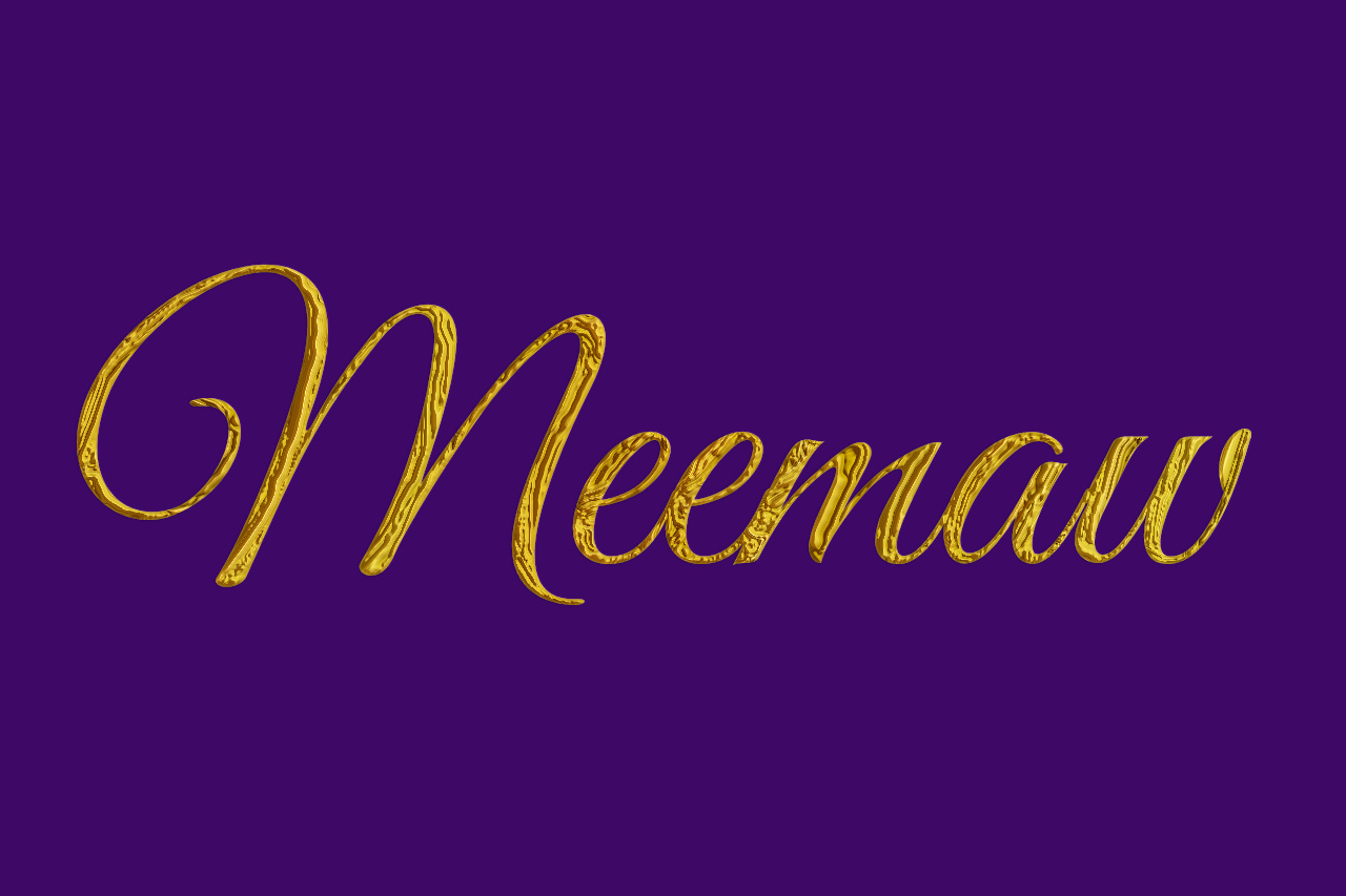
|