| Previous Page |
PCLinuxOS Magazine |
PCLinuxOS |
Article List |
Disclaimer |
Next Page |
Inkscape Tutorial: Turn Your Initials Into A Logo |
|
by Meemaw  I found this tutorial a couple of months ago. It allows you to use your initials to create a logo. I was having computer problems at the time, so it didn’t work correctly then, but the problem is fixed now, so let’s do it. My first and middle initials are PJ, so I used those. Open your Inkscape and create the letters. The tutorial used a font called Winner, but I didn’t get it. There’s a link in his tutorial, and if you want to set up an account, it’s free. I used Impact, which is a default font, I think. 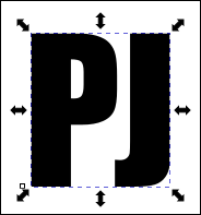 When you create the letters, choose Path > Object to path in order to edit them. Then choose Path > Split path to edit them one at a time. We’re going to edit them so they are a bit stretched out, and can overlap each other. Using one letter at a time, choose the Nodes Tool. When you’re editing, you can make the letters wider and longer. I made mine bigger, and, choosing the nodes shown in blue below, pulled the front of the “P” out so it was longer. Then I edited the “J” so it was longer, and the curl at the bottom was longer as well. 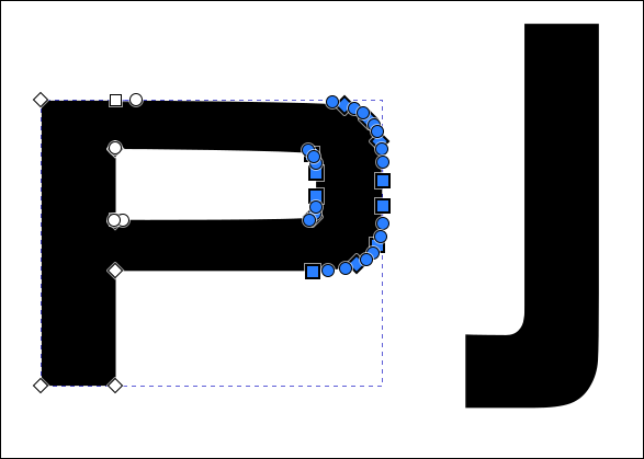
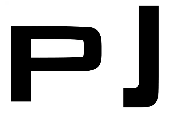 Then, when you have them edited, go ahead and arrange them the way you want to have them overlapping. You can always edit more if you need to, but get them as you want before starting the next step. 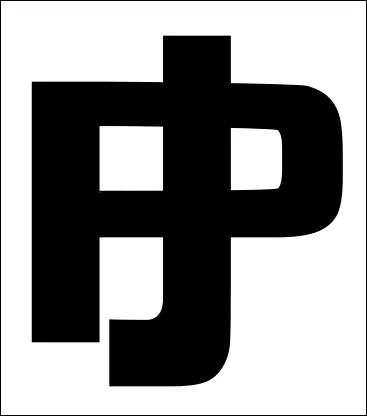 Now, choose both letters, and duplicate them. The program will keep the duplicates chosen, but just to make sure, your status bar will say 2 paths in Layer 1. Using those two, choose Path > Outset. This will make them bigger, but that’s where the spaces will be. Do Path > Outset 2 or 3 times, depending on how big you want the spaces. I did 3. 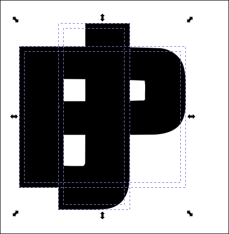 Now choose all 4 paths to work the magic. You can use your selection tool and outline them all. Your status bar should say 4 paths in Layer 1.
Choose the Shape Builder tool. 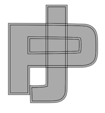 Now, you want to select the areas that you want to keep. Make sure the Add button is selected up above in the tool settings. Click and drag your mouse over the parts of the letters that you want to be visible. Be careful because whatever you touch with the mouse will be included. Those spaces will turn blue to let you know what you’ve chosen. The trick here is to choose the centers that give the impression of the letters overlapping in different places. If you make a mistake, you can choose the Subtract option and take it off, but it was easier for me to change to the Selection tool, then back to the Shape Builder tool and start over. With something bigger you want to be really careful. Here, I have selected my areas.  You can see that the top of the J will overlap the P and the bottom of the P will overlap the J. When you get it the way you want it, click the Finish button in the tool options. 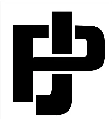 With a different font, I used the initials that were used in the tutorial. It looks good, too. 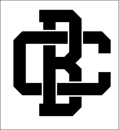 I think you’ll have fun with this one! |
 This is a relatively new tool, and I’m sure we’ll make some awesome things with it. When you choose it, your drawing will change to look like this: