Graphics Tutorials: GIMP, Part 3
by Meemaw
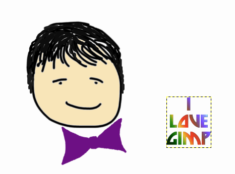
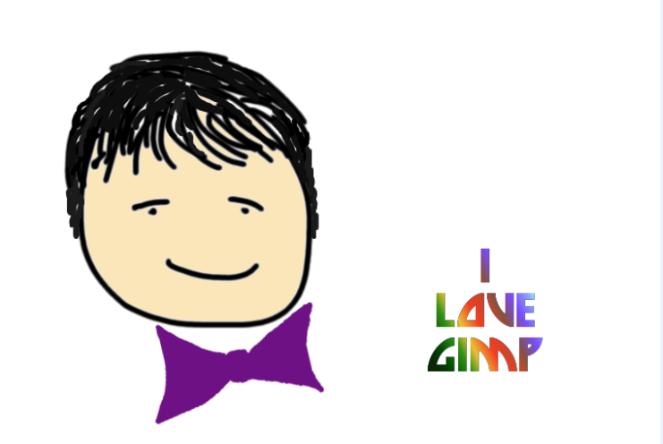
So far we’ve learned a little about the layout of the Gimp, and used some of the tools to draw a face and a bow. Let’s experiment a little more.
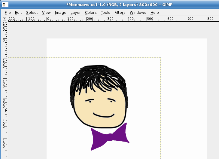
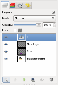
You may wonder what is going on with the Bow layer because we can see the edge of it on our drawing. That is because that layer is selected at the moment. When you choose or create another layer, that line won’t show.
Let’s create another layer named “Text” (you can rename it or leave it as “New Layer”). Make it transparent as well, so we can see our drawing through it. Click on the Text tool, and you will see another window pop up. It is the text editor window and, working together with the toolbox window, it contains anything you might want to use to edit text in your image. In the text editor box, you should type the text you want. I typed, “I Love GIMP” in the box. Notice that I spaced it the way I want it as well (with each word on its own line). In the tool box are the text formatting tools (font, size, color, alignment, etc) so you can make it look however you want.
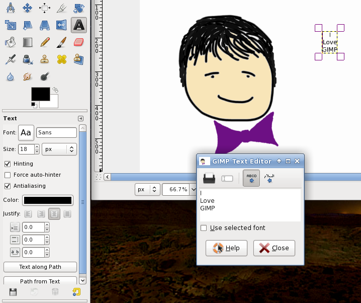
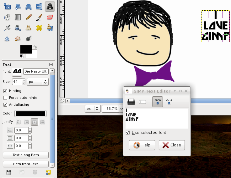
I chose the font called Die Nasty, size 44, black, centered. If you check the box “Use selected font” in the text editor box, you’ll be able to see what it looks like in the editor. This is good if you want to try different fonts.
Notice in your layers window that your text is not on the layer you created, but rather it is “Floating” above it. Until you are finished editing your text, it will remain as a Floating layer.
Let’s do something different to our text. Right-click on the floating layer in your layer window and choose “Alpha to Selection”. You will now see that your letters of text are outlined with dotted lines. Click on the gradient tool in the toolbox and pick one of the gradients there. (I picked dark blue to light blue.) Click on one side of your text and drag to the other side. The gradient you picked should be inside the text outlines now. If you click in the top left corner and go to bottom right, your gradient will be diagonal. If you don’t like it you can press <CTRL> + <Z> to undo it and try something else. After I chose the blue, I changed it to a tropical gradient.
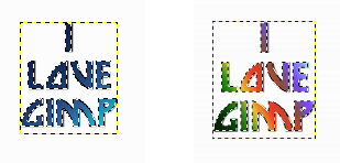
When you have it colored the way you want it, go to Select > None in the menu. This will change your floating text to an image file, which can be moved to any place you want in your drawing.
All this time, you have been saving your creation as a Gimp native .xcf file. This is good, because it preserves the layers for you so you can make changes to any of them. So what do you do if you have your drawing finished and you want to post it on the Internet as a .jpg or a .png file? With the new version of Gimp, the File menu is a little different. Save... means save your drawing as an .xcf file. Save As... means save it as an .xcf file (still) but with a different file name. If you want to save it as a .png file (or any of the other recognized file formats), you will have to Export your drawing. It is easy, though: go to File > Export... and edit the entries that are there.

The folder location can be changed, but will probably be the same folder that your .xcf file is in. The program will assign the same name to this file as the name of the .xcf file you’ve been editing, but that can be changed as well. In the drop-down at the right side of the window, you will see all the file formats you can use. I use .png and .jpg most of the time, but use what you want. You will probably get at least one window with options. I generally use the defaults that are there. You will now have your basic file to edit however you want, and also an image file you can insert into another document, use as wallpaper, or print.
The new version of Gimp has the single window display. You simply Click on Windows > Single Window Mode. When it is checked, your windows are fused together. When you uncheck it, the sections are separate. You should choose whatever mode you are most comfortable with.
Next time
we’ll explore more tools.