
| Previous
Page |
PCLinuxOS
Magazine |
PCLinuxOS |
Article List |
Disclaimer |
Next Page |
Inkscape Tutorial: Fun With Shapes
|
|
by Meemaw Messing around with some of the tools in Inkscape can be fun! I started with a simple 12 point star (below, left) and made so many other designs. 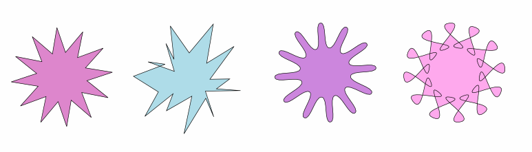 All of these started out with the Spoke Ratio 0.5, Rounded 0.0, Randomized 0.0 (left end), then I changed the settings for different effects. The second from the left is Spoke Ratio 0.5, Rounded 0.0 Randomized 0.25.The third one is Spoke Ratio 0.5, Rounded 0.25, Randomized 0.0. You can put negative readings on Rounded or Randomize and it will result in other effects. The fourth one has Rounded setting of -0.75. Another thing you can do is grab one of the handles you see when you select your shape and click on the Nodes tool. 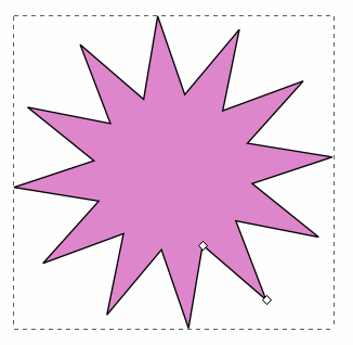 You can see in the example that there is a "handle" or "Node" on one of the outer points and another on one of the inner points. Grabbing the outer handle and moving it can change the direction of your spokes (center). The one at right is the result of grabbing the inner handle and moving it across the star until it crosses the other sides. 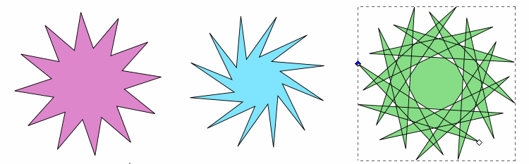 Here are more examples of moving handles/nodes: 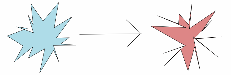 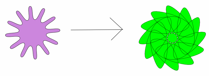 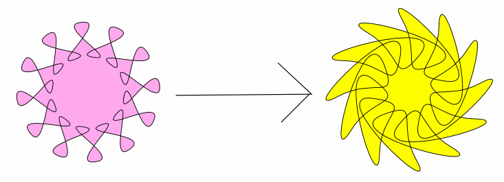 Believe it or not, both of these were made with the same 12 point star, just by moving the inner node: 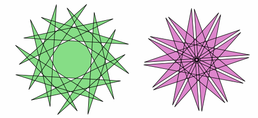 Where am I going with this? 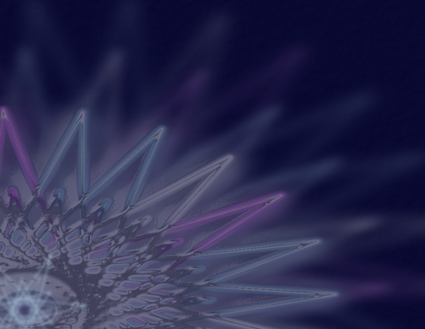 Using just a few of the shapes I showed here, I made a wallpaper. On this one I started with a six-point star and then moved the nodes until I had this: 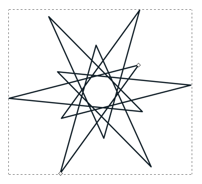 Duplicating and rotating can give you the starburst. 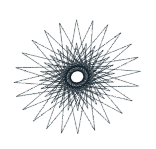 While I was duplicating, I also changed the colors to pink, blue & grey. I also used the rotate handles to change the starburst so it wasn't exactly round, but more elliptical. (The side arrows will skew the object, while the corner arrows will rotate the object around the plus sign, which is in the center, but can be moved.) 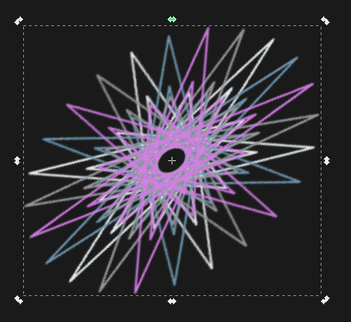 Then, I put a dark blue background behind everything so I could see the lighter colors. Actually, I put the dark blue background on it's own layer, so I wouldn't move the background while selecting something else. After that, I duplicated the starburst at least twice and made them all huge, then moved them so the center of the starburst was in the bottom left corner. On those duplicates I set the blur up (like 4 or 5) and the opacity down (like 50%) so they are not as visible. I added a circle in the center of the top starburst to make it more the same color instead of having a dark center. To do that, I changed the blur and opacity of the circle until it was similar to the starburst, then grouped them. On that starburst, I made sure the blur was less (like 1) and used Filter > Bevels > Stained Glass to make it shiny. Then I added one more of the basic stars on top, then put another dark blue rectangle at opacity 60% on top so everything looks a little darker. You should save each time you are happy with your work, and if you are closing your drawing. When you get it just right, save it again, then use the File > Export Bitmap. Since part of your drawing is outside the page border, you want to export the page instead of the drawing (choose the appropriate button from the top of the export window). You can experiment all you want. Some projects are just for fun and even though you use very few items or even commands, you can still come up with something you like. If you design something you think you will use a lot, duplicate it and set it to the side of your page. Also, you can do something interesting with any shape. One of the first Inkscape projects I did was to transcribe Sproggy's Glass Panel Tutorial from the video he made. In it, he used mostly rectangles to get his effect.Have fun! |