| Previous
Page |
PCLinuxOS
Magazine |
PCLinuxOS |
Article List |
Disclaimer |
Next Page |
GIMP Tutorial: Graffiti Text |
|
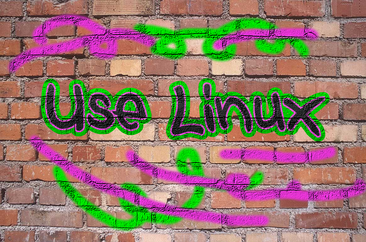
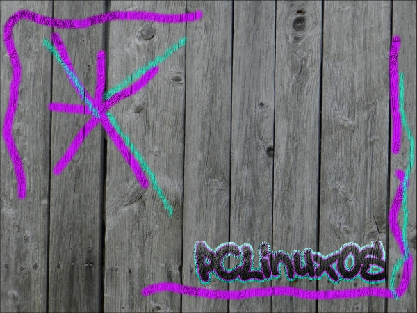
by Meemaw I saw a neat tutorial not long ago that featured another text effect to make graffiti. You will need two things: some sort of image to put your graffiti on (I’m going to use a brick wall or wood siding), and some sort of font that looks like it could have been made by a spray paint can. I have a font called A.C.M.E. Secret Agent, and another called Style Wars, and you may see either of them. While I hate to see graffiti on walls, train cars or other property, painting graffiti in GIMP is allowable, and very fun!  Open the background you want to use in GIMP. Click on the Text tool and choose your desired font, then type your graffiti. With your layer still chosen, right-click the text layer (in the Layers dialog) and select Alpha to Selection. Duplicate the text layer and send it under the original text layer. Click on Select > Grow. In the window that appears, you will see the number 1, but you want the layer you are growing to be larger. I used 15, but use whatever looks good to you. While your grown text is still selected, choose a couple of colors for it - one light and one darker. Click on the Blend tool, choosing Normal Mode, gradient FG to BG, and Shape to Linear. Draw a line from top to bottom to create the gradient. Click on Select > None. 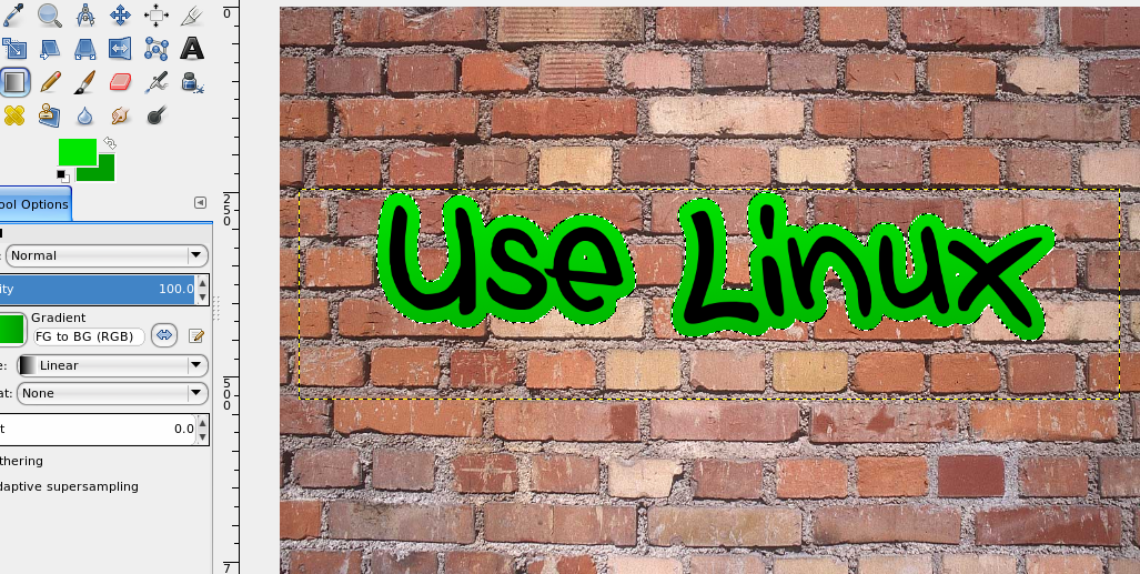 Go back to your original (black) text layer, and do the same steps again. You will right-click and choose Alpha to Selection in your Layers dialog again, then duplicate the layer and send that layer down a layer. This time, however, when you choose Select > Grow, change your setting to about one fourth of the original setting. I used 15 the first time, so I changed the second setting to 4. Choose two more colors, and create the gradient just as you did before. Click Select > None, then merge this layer down onto the other color layer. 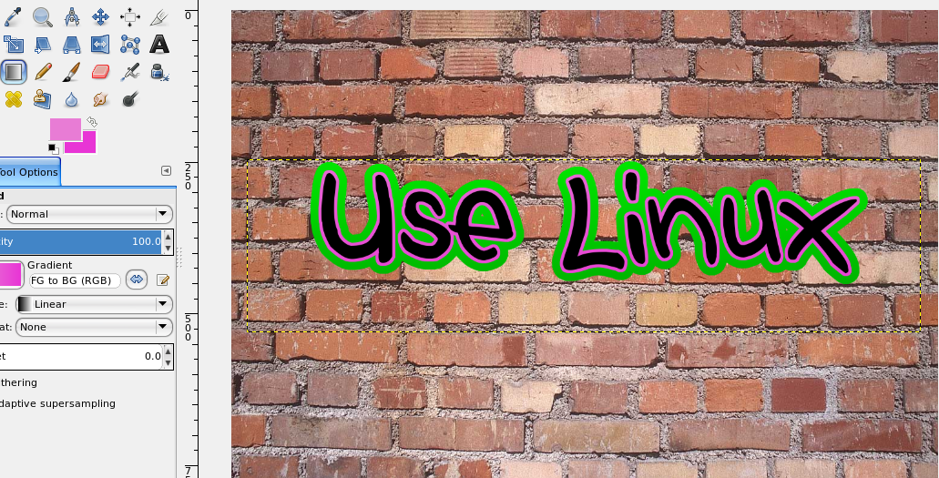 So, now we have our graffiti, but it just looks like a text box created in front of an image of a brick wall. Let’s fix that. Choose your original (black) text, then right-click the layer again and choose Alpha to Selection. Change your gradient colors to gray and a darker gray, and draw your gradient line so the lighter gray is on the top. Now, go to Filters > Map > Bump Map. You will see a dropdown with your layers in it. Click on the dropdown and choose your brick wall layer. Change the Depth setting to 10, then click OK. You should notice that the paint now looks as if it is painted on the brick.  Since this is supposed to be black paint, we need to darken it back, so click on Colors > Brightness and Contrast. Set the Brightness down to about -115 and the Contrast up to about 40, but you can play with these until you like them. Now, choose your color layer and repeat the process without changing the gradient colors (Alpha to Selection, Filters > Map > Bump Map, choose brick wall layer, check to make sure Depth is 10, then OK.) 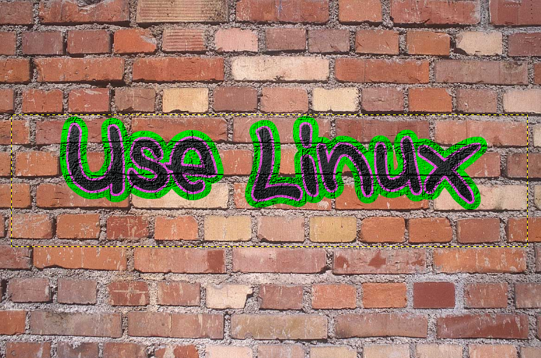
We can merge the text layers down, but it isn't necessary.
|

