| Previous
Page |
PCLinuxOS
Magazine |
PCLinuxOS |
Article List |
Disclaimer |
Next Page |
Inkscape Tutorial: Highlighted Text |
|
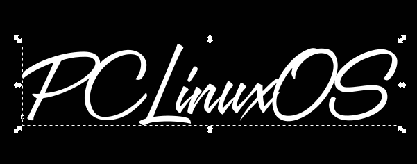
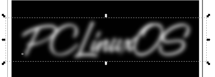
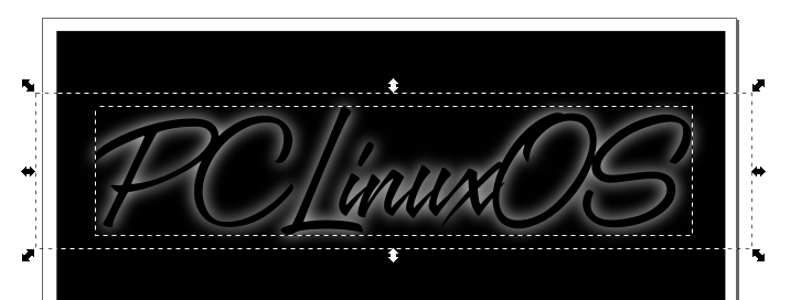
by Meemaw The other day I was reading the on forum and came across phorneker's excellent post about redesigning his website. When I clicked on the link to go to his homepage, I thought his title text was very cool. This tutorial is to make something similar to his.  This is a quick tutorial, easy to do but very striking. You can make this any size or font you want, but it's easier to reduce the size than it would be to increase it (depending on the file format you are using). If you use it on something big, like a wallpaper, you'll want it big. Open Inkscape and choose your canvas. I usually start with one the size of a piece of US Letter-sized paper (1056 x 816 px), but I know folks who start with a minimum of 1600 x 1200 px. Start with a rectangle filled with black. It doesn't have to cover the whole page unless you want it to. Set it to the side, and change to the text tool. Decide on your desired text and enter it in the font of your choice. I used a font called A&S Speedway.  Duplicate your text and make the duplicate white. Put it behind the original, or put your original off to the side, and bring back your black rectangle.  Go to Filters > Blurs > Blur. When the window comes up change the blur radius on each to 3. Click Apply. Then close the window.  Now move your black text back, and make sure it's on top. Choosing the black text and the blurred text, use the Align and Distribute tool to center them both ways.  You're finished! You can group it all and export it. This makes a wonderful image, and you can change it up by changing the font or the colors. Phorneker's had a smaller blur radius, so you could use 2 instead of 3, and it would be fine. This is a font called Patriot using blur radius 3, a red background and blue text.  |


