| Previous
Page |
PCLinuxOS
Magazine |
PCLinuxOS |
Article List |
Disclaimer |
Next Page |
From The Chief Editor's Desk |
|
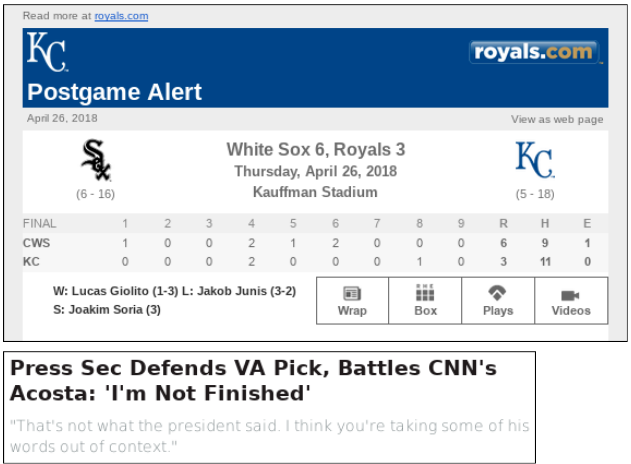
Every now and again, you just have to question what people are thinking. Let me show you a couple of examples. I've taken screenshots of some offending "designs" that have come across in my email, and they aren't even the worst offenders.  WHO thought it was a good "design" to make the text on web pages the lightest gray possible on a white background? In the post game box score of the first image, that is about as light of a gray text on a white background as anyone should go ... and that shade of gray text on a white background is difficult enough to read. But no, some of these ijits had to have an even lighter gray text on a white background (second image). It's so light that unless you're looking for it, you hardly notice there's any text at all below the headline. Let's put it to you another way: how would you like for the text of this magazine to appear the same way, light, light gray text on a white background? In case you missed that, here it says again, but readable and without the "artistic" element of light gray text on a white background: how would you like for the text of this magazine to appear the same way, light, light gray text on a white background? In my humble opinion, it's next to unreadable. That is, unless you highlight the text, as if you're selecting it to be pasted to your computer's clipboard. Maybe I'm getting old and my eyesight isn't what it used to be. Nah, that can't be it. That statement is only half true. I *am* getting older, but I had the Lasik procedure about 20 years ago, and I still have 20/20 vision. More likely than not, I grew up in a time when if you had something to say, you said it boldly. It's almost as if they are afraid to say what they have to say, as if they are trying to whisper. That doesn't mean that you type in boldface (which is equally as annoying), or in all caps (Heaven forbid!). Reading text on a webpage shouldn't cause you more eyestrain and headache than staring at a computer display already does. There's absolutely no reason to make readers squint at the text of a webpage as if they're trying to figure out the grand cosmic meaning of ancient Egyptian hieroglyphics, or as if someone is trying to read an ancient Babylonian text. Readers shouldn't have to feel as if they are going blind when they read the text on your page. Putting light, light gray text on a white background makes about as much sense as putting dark, dark gray text on a black background. And no, I'm not advocating the latter, either. Both are incredibly DUMB ideas. What is wrong with using just plain black text on a plain white background? Or, if that isn't your style, then can't you at least provide a reasonable amount of contrast between the background and the text so that the text can be read without squinting and unnecessary eyestrain? It is true that many have called this the "Information Age." So provide us the information you want to share or disseminate, without causing more undue and unnecessary stress with your color choices.  ******** This month's cover, designed by Meemaw, pays homage to the Mexican holiday of Cinco de Mayo. Contrary to popular belief (misconception), Cinco de Mayo isn't a celebration of Mexican independence. Mexican Independence Day is actually on September 16. Cinco de Mayo is a celebration of a poorly equipped Mexican army of 2,000 men defeating a superior force of 8,000 men from France's Napoleon III in May, 1862 at Puebla de Los Angeles when the French arrived to collect on a debt owed to them by Mexico. Within Mexico, Cinco de Mayo is primarily observed in the state of Puebla, although celebrations occur across the country. In the United States, Cinco de Mayo is largely observed to celebrate Mexican culture and heritage, especially in areas with large Mexican-American populations. In the U.S., the celebrations include parades, parties, mariachi bands, Mexican folk dancing, and plenty of Mexican foods, like tacos and mole poblano. Oh, and lots and lots of beer. If you want to learn more about Cinco de Mayo, you can check here, here or here. These should get you started, as there are many other resources available for inquisitive minds. So, until next month, I bid you peace, happiness, serenity and prosperity. |


