| Previous
Page |
PCLinuxOS
Magazine |
PCLinuxOS |
Article List |
Disclaimer |
Next Page |
GIMP Tutorial: Create A Mandala Using Your Name |
|
by Meemaw 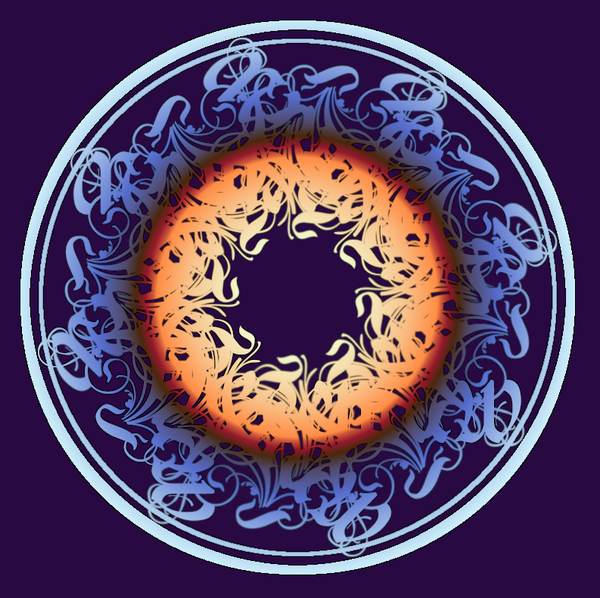 I haven't been to some of my favorite sites for a while, having other events that were keeping me busy - you know, Life. However, I happened to go to one of my favorite GIMP sites the other day - GIMP Learn. I know I can always find something new to learn, and that day was no exception. One of the most talented people on the site, a lady named Pat625, had posted a fine tutorial a while back, and I was just now able to go through it. The actual tutorial is here, and it is wonderful, so I thought I'd share it with you. Create a new file, 1,000 px X 1,000 px, with a white background. Using the guides you can pull from the left-side and top rulers, place them at 500 px. If you will check the bar at the bottom of your window, you will see "Add Guide" and it will show you when your guide is at 500 px. Your canvas will look like this: 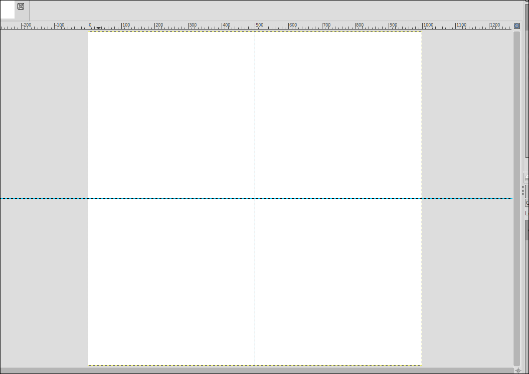 Create a text box and put your name in it using a fancy font. Pat625's suggestion was Rothenburg Decorative or Strassburg Fraktur, and included them in her tutorial package. I used Rothenburg (it has more swirls), but you could use any font you'd like. The swirly ones make great mandalas! Depending on how long your name is, your font size should probably be between 100 and 150. Mine was 150 but could have been a bit more. 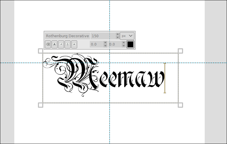 When you get it on the canvas, center it in the background, and move it so the top of the text is just touching the horizontal guide. 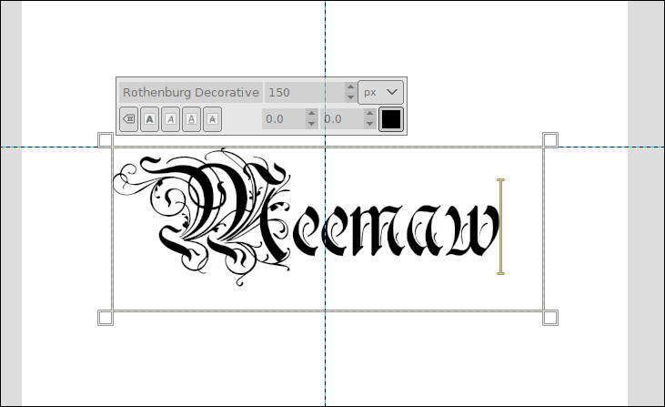 When you get it where it needs to be, right click the text layer in the layer dialog and choose "Discard Text Information" since we now need this to just be a layer. Right click again and choose "Layer to Image Size". Now we'll use this layer to make our mandala. Choosing the text layer, duplicate it by clicking on Duplicate Layer in the Layers dialog. With the duplicate chosen, click on the rotate tool (GIMP 2.10.22 groups the tools, so it may be in the transform group depending on your version.) Put your cursor in the middle of your layer and rotate it 180o. It will look like this now: 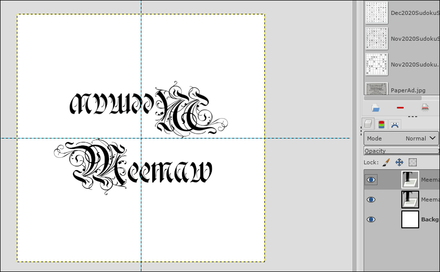 Now, right click the top layer and choose "Merge Down". NOTE - Keep the text layers separate from the background (don't merge all the way down.) Duplicate the text layer, then rotate the duplicate 90o. 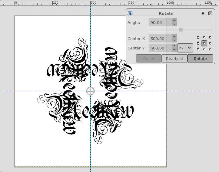 Now, merge that layer down, then duplicate it again. This time, rotate the new duplicated layer 45o. You should end up with something that looks like this: 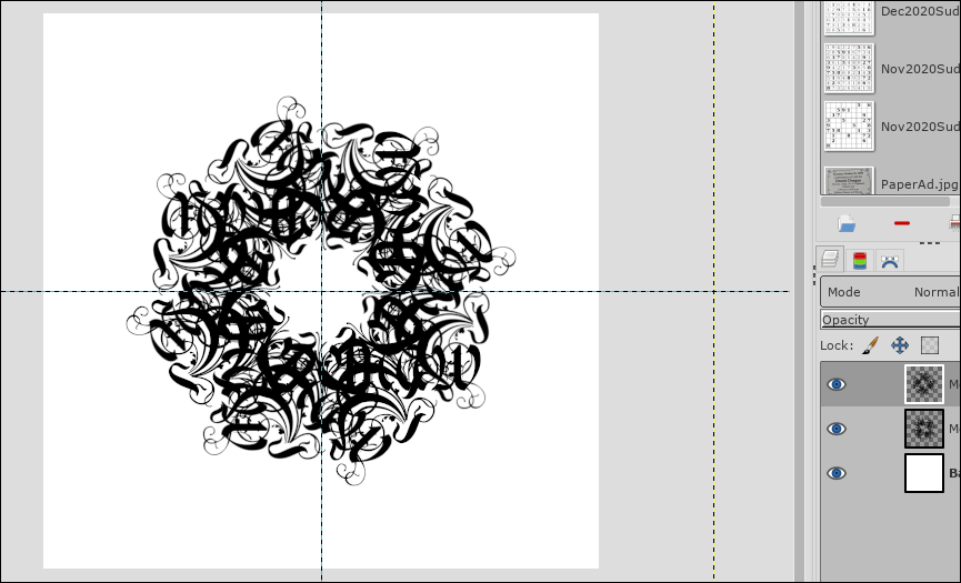 Now we can give it a little flair. In Pat625's tutorial, she had drawn two circles around her mandala. It looks really neat, so let's do it. Choose your ellipse tool and in the toolbox, tick the boxes for "Expand from center" and "Fixed aspect ratio" so we can make the circle perfectly round. Starting in the center, make the circle large enough for the text to be just inside. We want an actual circle there, so before you do anything else, choose Edit > Stroke Selection. Make sure your foreground color is black, then make your stroke 12 px. 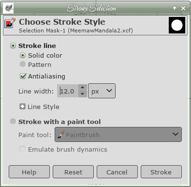 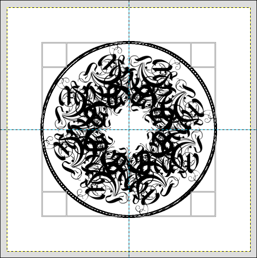 Before you do anything else, click Select > None. That will deselect the ellipse you just used. Repeat your circle again, using the ellipse tool, making this one inside the first. When you do Edit > Stroke the selection this time, make it 4 or 5 px. Merge down until you have the drawing on the top layer, and the background on the bottom layer. Remember to save your work. 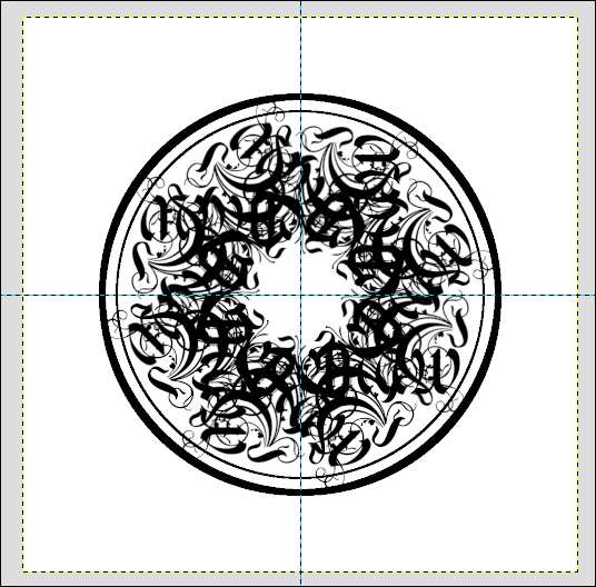 It already looks pretty neat! You can stop now, export it in the format of your choice, and let a child or grandchild color it if you wish. However, we can also add some color to it before we're finished. Right click on the top layer and choose Alpha To Selection. You will see the "walking ants" everywhere you have any black. Make the black layer invisible so you can see the result. 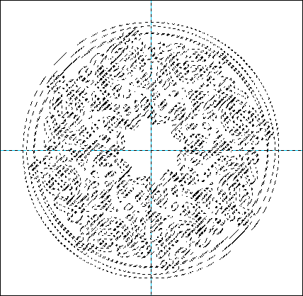 Add a new layer on top of the other two. Now, click on the Gradients tool, choose Radial gradient, and whichever gradient you want. Starting from the center, click and drag your mouse towards the outside. Remember, any time you don't like the result, you can always press CTRL + Z to undo it and try again. I chose the Caribbean Blues gradient, and I think I had to reverse it. In the mandala at the first of the article, I used the Sunrise gradient. 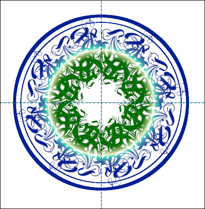 Again, you can stop here and export, but I'll show you a couple more things you can do. One thing you can do is to emphasize the colors of your mandala. If your selection is still active (we did Alpha to Selection earlier), create a new layer under the top layer. Choose Edit > Stroke Selection again. Use around 5 px for your stroke, and make it black. If you want more black, make it 6 or 7 px. 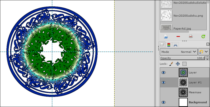 Another one is to bucket fill the background layer with color. That's easy. Just choose the background layer, choose the bucket fill tool and a color you want, and click. 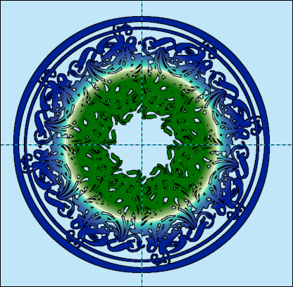 Another thing you can do, if you don't want to fill the background with color, is to add shadows instead. Choose your mandala layer (the color layer) and go to Filters > Light & Shadow > Drop Shadow. Change your shadow, blur radius and opacity to whatever looks good to you. 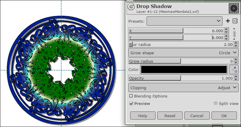 The first time I did this tutorial, the result was the first image below. The second image below is the second try. 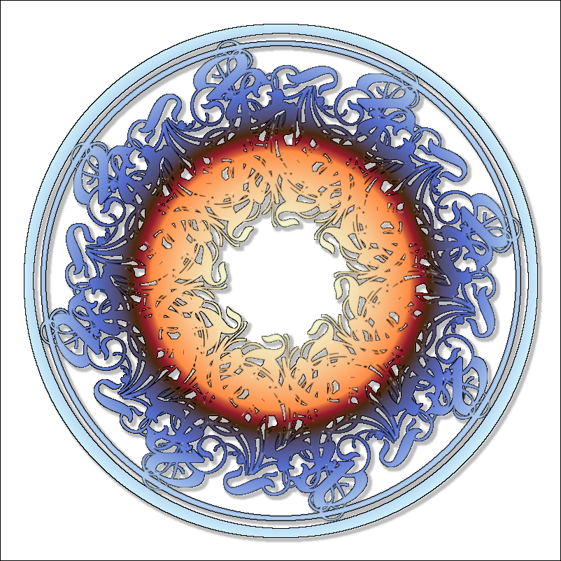 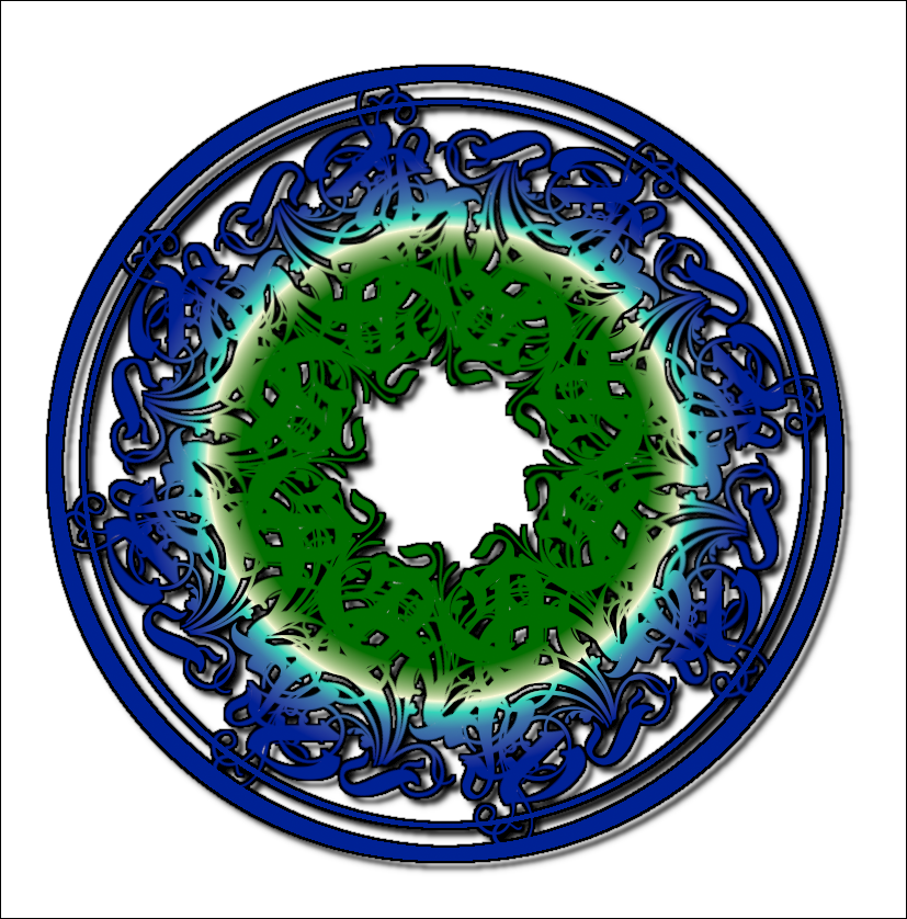 I hope you enjoyed this one. I thought it was fun! Depending on the colors and extra effects, they all look a bit different. |


