| Previous
Page |
PCLinuxOS
Magazine |
PCLinuxOS |
Article List |
Disclaimer |
Next Page |
GIMP Tutorial: Top GIMP Filters, Part 2 |
|
by Meemaw We were looking at Michael Davies' list of his top 10 GIMP filters. From the site Davies Media Design, we're looking at his top ten favorite GIMP filters. The list is:
Gaussian Blur I've used this filter (Filters > Blur > Gaussian Blur) to soften photos just a bit, but Davies points out that you can use it to fix a photo problem. Sometimes we want to use the subject of a photo, but not the background. After cutting away the background we're left with some rough edges on the subject. Gaussian Blur can help minimize them. In this image we have a white flower and many green leaves. Suppose I wanted to add this flower, but not the leaves, to another floral image. 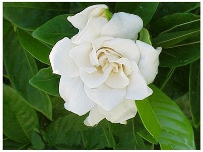 Using the "Intelligent Scissors" tool, I can draw around the image: 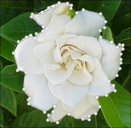 While I'm not too accurate, each line can be moved on your way around, before you click OK.  Notice that in several spots I have some green at the end of my petals. That probably won't bother anyone in the artwork I'm doing, but we all want to make things look as good as possible. Just setting Gaussian Blur at .24 (X and Y radius) will soften the edges a bit. 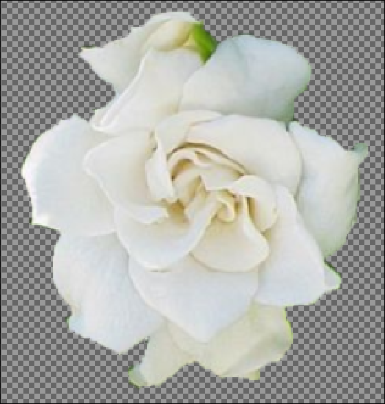 This filter could be most useful on a picture of a person with a background you didn't like. You could cut the person out and change the background to something you like better, or add them to another photo. Another neat effect is to draw a stroke around your cutout (you can put it in its own layer) and then use the Gaussian Blur on the stroke. Depending on the color of your stroke, you can make a sort of "glow" effect on your cutout. I found an adorable baby picture on Pixabay (all their stuff is free), cut out just the baby, then added a layer where I drew around her with a 3 px paintbrush. You could probably use as large an outline as you wanted, but I'm not sure I'd go much more than 5, depending on the effect I wanted. 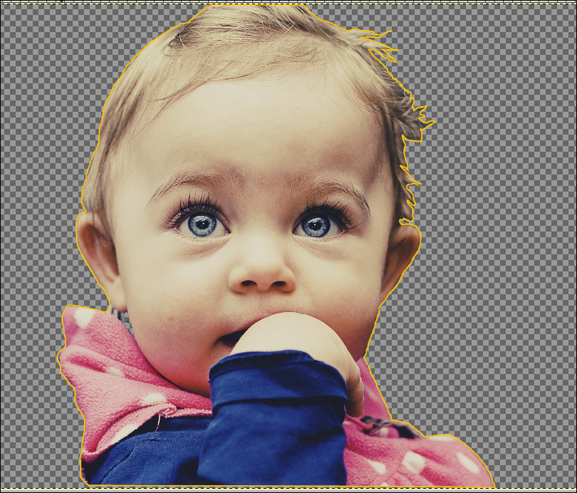 If I turn off that layer, the line goes away, but if I turn it on and use Gaussian Blur on it, I get a kind of shiny halo around her. It kind of de-emphasizes any mistakes I've made while cutting her out, and may even emphasize her soft hair. 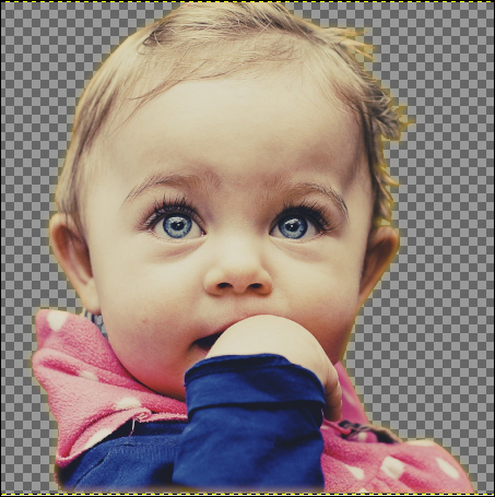 I imagine if my line was white instead of yellow, the blur would look silvery. That would be useful on many designs! Long Shadow This is a fun filter! When I first started experimenting with it, I used the gardenia I was using above. There are several settings here. The shadow can be adjusted according to size and direction, but also according to how you want the shadow to look. Using the gardenia, I left the length at 100 and the angle at 45 (changing the angle changes the direction of the shadow), then changed the shadow to a light green. 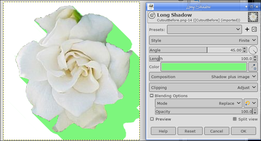 I thought that it would be good to find out how it looked with text (we put shadows on our text often, to emphasize the message of our text). The regular drop shadow looks completely different. The long shadow gives the effect of the text sort of zooming toward you. Depending on your settings, it can be solid like the one on the gardenia, or can fade out. The setting for the fade out is the Style setting at the top of the options window. You can see here the difference between the drop shadow and the long shadow.  Along with the shadow style are a couple of other settings that give interesting options. You can make the shadow very short, essentially creating 3D text, or you can make it fade out like I did above, plus set how soon it starts to fade out (in the case of fading, the length setting decides the length of the visible fade). Or, with the Composition setting, you can make the shadow visible and the text itself invisible. 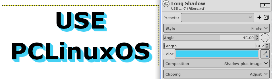 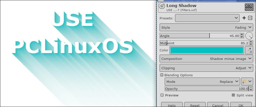 Vignette Vignette is basically a shadowed frame around the photo. Choose a photo and then choose Vignette (which is also in the Light and Shadows section of the filters). When you first start the filter, the default looks like this: 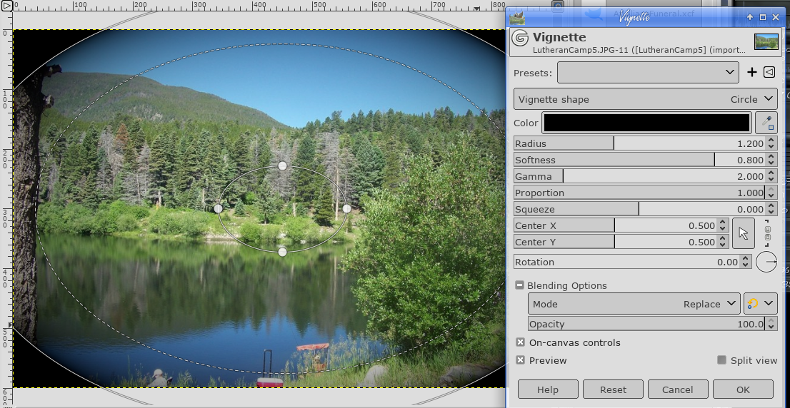 The shape can be a circle, square, diamond, or horizontal or vertical. You'll have to experiment to see what works best for your photo. The tutorial I'm referencing says that you should use this filter on nearly any photograph to accent it, but that it should barely show at all. The other settings will help you accomplish that. This picture of a Colorado mountain lake has the Vignette filter applied (below). It has ended up with a very faint shadow around the edges which emphasizes the center of the photo. 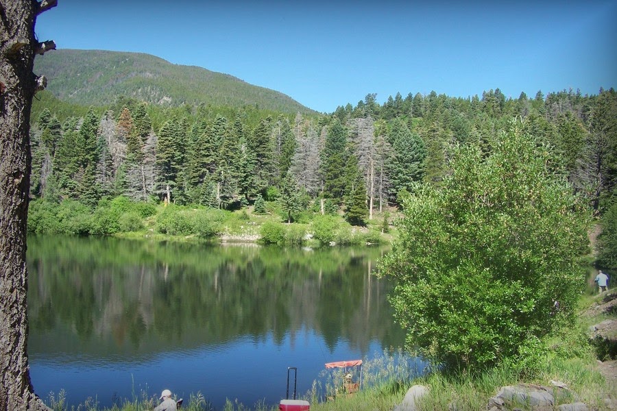 Add Border In Vignette, we added a hint of a border, but here, we'll actually add one. I'll use the same photo. Click Filters > Decor > Add Border. You will get four settings: 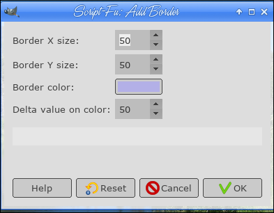 Border X and Border Y determine how wide, in pixels, you want your border. The border color is default white, but you can change to any color you want. Delta value on color makes some of the borders a different shade so it can look like the light is coming from a specific direction. I used the settings above and got this: 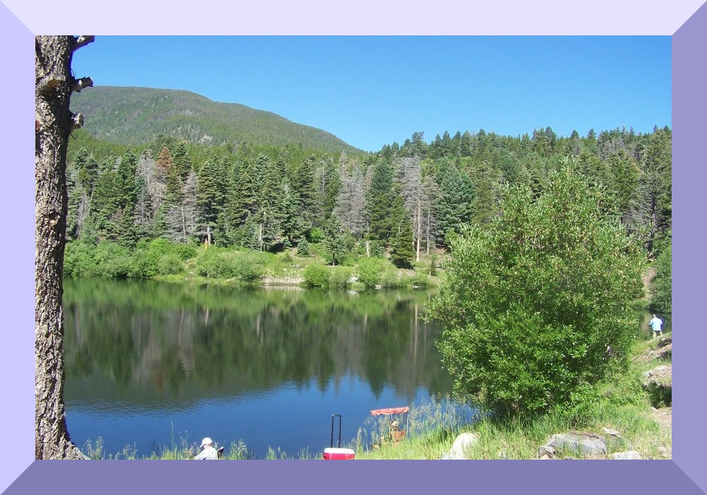 The Delta value is some sort of formula that shades part of the border differently. Setting it higher seems to darken it, but you should probably experiment. Bump Map We actually did Bump Map in the September, 2015 issue. It is essentially a way to incorporate the background texture into a graphic you have put in the image. We used text before, but could use some sort of logo if we wanted. Also, you should choose a background you'd like to use. I'll go back with the brick wall I used before because the effect is cool. I added, on another layer, a small logo that I made. 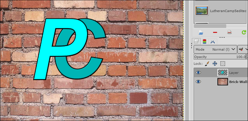 Choosing the layer that has the logo, click on Filters > Map > Bump Map. In the window that appears, first click on Aux. Input. Another window will open. On the left side is everything you have open in GIMP. When you click on your project, the layers will appear on the right side. You should choose the background texture you want to use. I chose the Brick Wall layer.  Once you choose the background, the effect will begin to be visible. The rest of the settings are for fine-tuning. The Compensate checkbox can lighten up your logo, if you think the bump map has darkened it up. The Ambient Light slider towards the bottom does mostly the same. Azimuth changes the direction of the light. Elevation makes the texture more prominent, but I think it's because of the elevation of the logo layer (how high off the background it is) because the higher number lessens the effect. Depth also makes the texture more prominent. I would say that you should play with these settings to get the effect you want. The picture below has the Split View activated, so you can see the before on the right and after on the left. When you are happy with your effect, click OK. 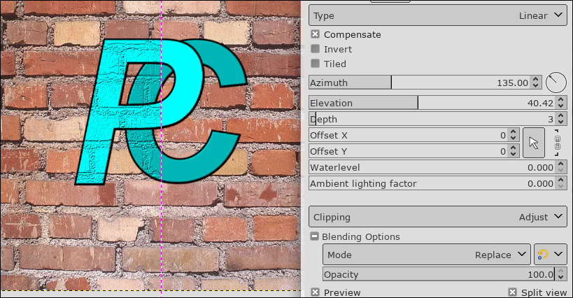 Little Planet This is a fun, different filter that works best with skyline photos. When you click Filters > Map > Little Planet, GIMP will rearrange your skyline into a circular pattern. You have zoom and rotate settings, along with another setting that can change the angle of the photo. 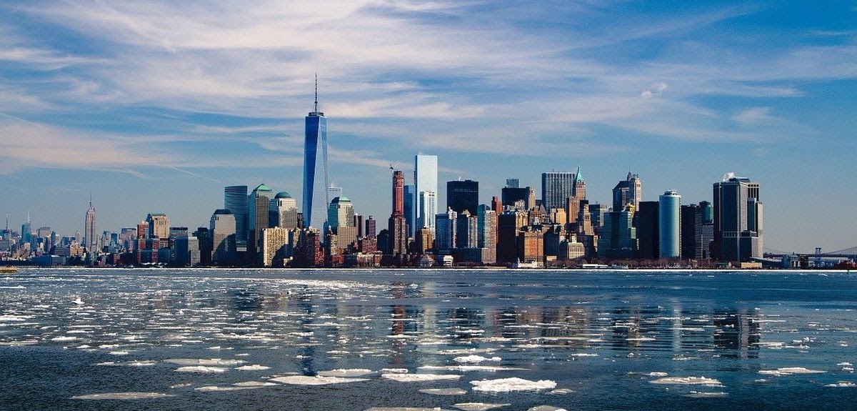 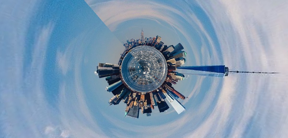 There are many more filters in GIMP, but these are some that could be used a lot. Many of them have settings you just have to mess with. I liked Davies' list, though, and I hope you did too. |