| Previous
Page |
PCLinuxOS
Magazine |
PCLinuxOS |
Article List |
Disclaimer |
Next Page |
Inkscape Tutorial: Bending Text Around A Corner |
|
by Meemaw
 It's kind of fun as well! Start by opening Inkscape and editing your document properties so your page has a black background and is in Landscape orientation. He suggests size B1 (which is 700 px by 1,000 px). The next thing to do is to create a 3D box using the 3D Box tool. You can make it however you want. My first try used the box that you see here, where the bottom isn't visible. 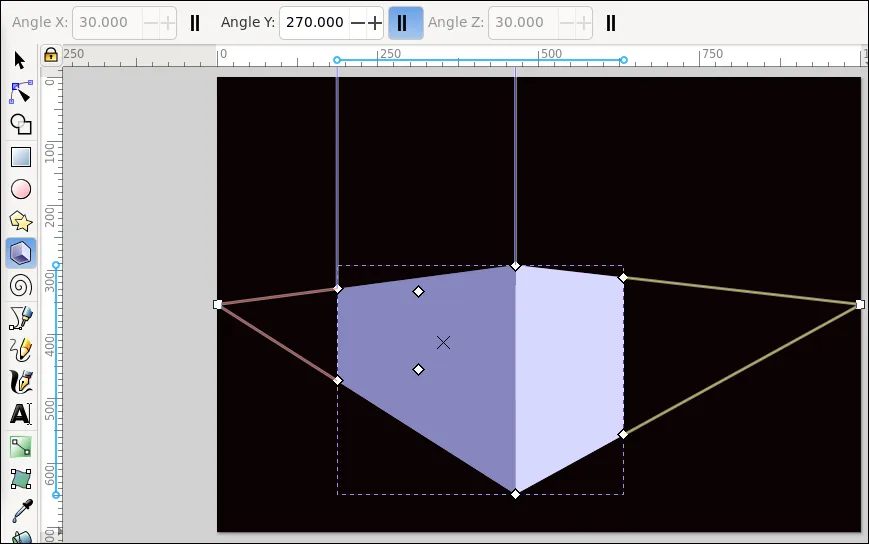 On the box you'll see a number of nodes that you can use to edit the box, but first, grab the “X” (you can see it in the left-hand surface), and move it around. You can manipulate it so the top or bottom is visible, it is closer or farther, or anywhere on the page. Also, in the toolbox above you'll see Angle X, Angle Y and Angle Z. X is the left side horizon (where the lines come together for perspective), Y is the horizon at the top, and Z is the right side horizon. Notice that the lines at the top are parallel, meaning that the Y perspective in an object this close to us is generally almost infinite. Anyway, for the purposes of this project, the setting for Y needs to be the parallel lines (so the front of the box is absolutely vertical). When you get it shaped the way you want it, change to the Selection tool, make the box bigger if need be, then click Path > Object to path. You'll notice at the bottom of the window that Inkscape says “Group of 6 objects in layer Layer 1” (meaning that the box is a group of 6 objects (sides) in the layer named Layer 1). Since we can't see the back of the box (and depending on how you drew it, we might only be able to see 2 sides), we can ungroup the sides and delete the ones we don't need. Select the box and click Object > Ungroup (or use the tool at the top). You'll see something like this: 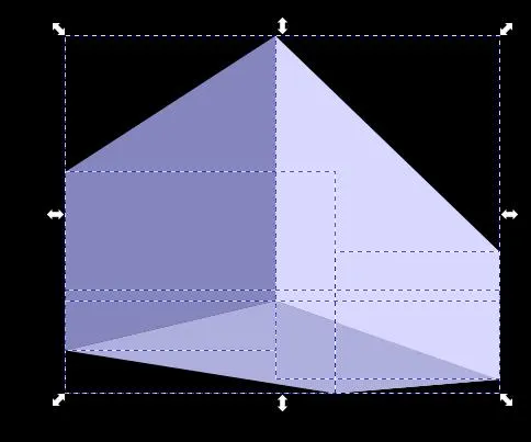
Every side has an outline, so click away from the box, then, holding down the 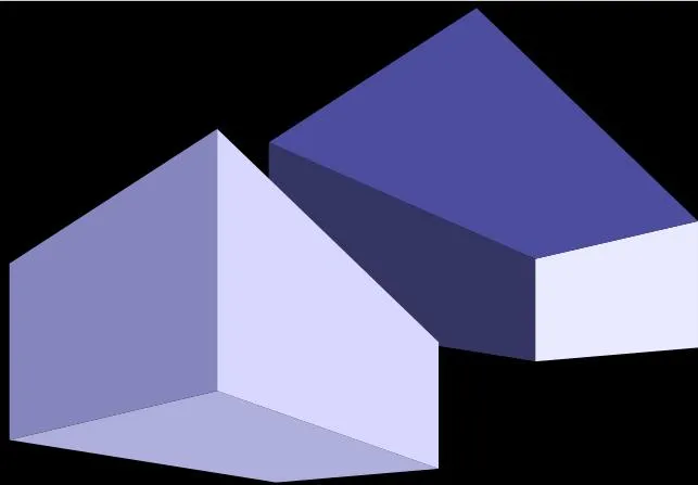
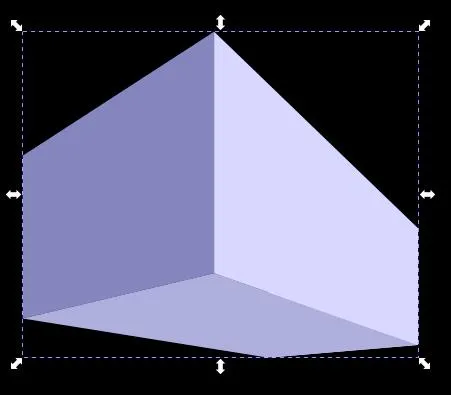 OK, now for the text. You can use any font you want, but these kinds of projects seem to work best with bold fonts. I used Bitstream Vera Sans Bold, around 150 pt, and reduced the space between the lines to .80 pt. Type your text, but since you are putting it on the surface of the box, you should probably make it more than one line.
PCLinuxOS When you get your text edited the way you want, change to the Selection tool and click Path > Object to path. With your text still selected, choose Path > Path Effects. When you get your menu, add the path effect Slice. 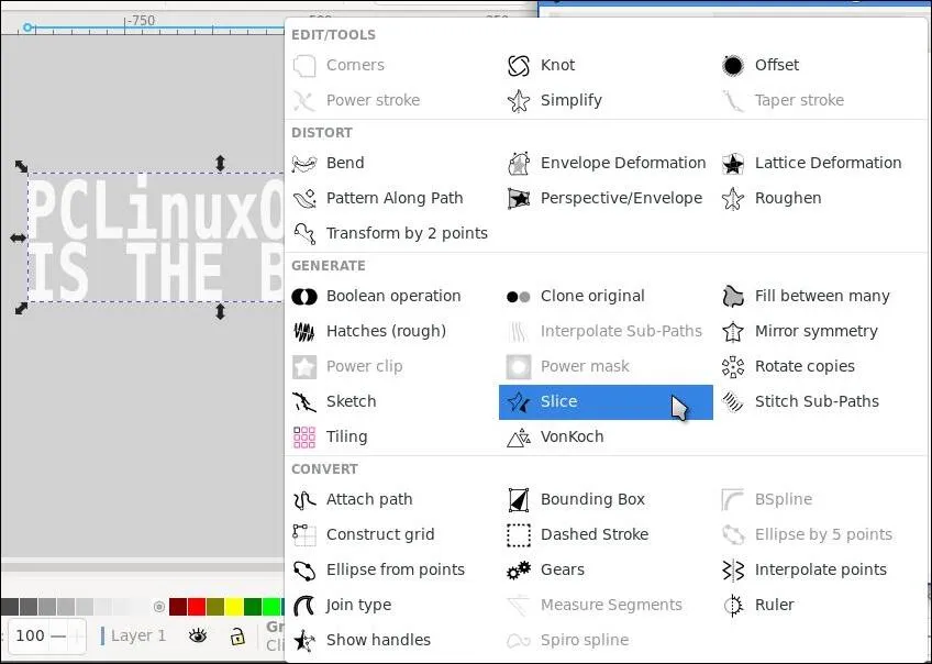 When you choose the Slice effect, you'll see that the box around the text has changed to being around the left half of the text. You may like that slicing point, but if not, there is a way to change it. Go to your nodes tool, grab the center node in that line, and move it left or right. Rick at IronEcho urges you to cut your letters somewhere other than exactly in the center, because it seems to look better. 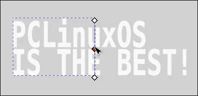 Then you can change back to the Selection tool and move your text apart. 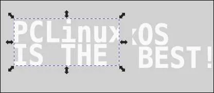 Now we work the magic. Choose the left side of the box and the left side of your text. Go to Extensions > Modify Path > Envelope Deformation. Your text should jump onto the box face selection. NOTE: If you get an error message about one of your selections being a group, it's probably the text. Inkscape made my text of two lines a group of 2 paths. The solution is to ungroup them, then click Object > Union. Go back and select the text and the box face, and go back to Extensions. It should work now. 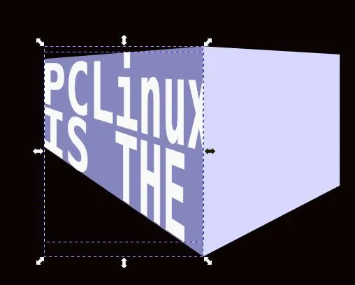 Using the same steps, do the right side. BEFORE you enable the extension, your text needs to be manipulated a bit — something about how the 3D Box tool works. If you leave the text as it is, it will be turned wrong on the box face. Do a horizontal flip, and then rotate it 90° to the left, and then it will look right. You might also have to move the text a tiny bit to line it up with the left face.  You can change the text color depending on which way the light is coming from as well. I left the left side while, but changed the right side to a medium gray, then I deleted the box faces.  My next try showed the bottom of the box as well. When you put the text on the bottom, you only have to rotate it 90° to the right. Have fun!  |


